

Designing a stunning digital hall of fame touchscreen display requires balancing visual impact, intuitive navigation, and meaningful storytelling to create recognition experiences that truly honor achievements. While the technology behind touchscreen displays has become increasingly sophisticated, the difference between displays that engage audiences and those that go ignored often comes down to fundamental design decisions about layout, hierarchy, and user experience.
Yet many organizations implementing digital recognition struggle with critical design questions: How do you organize unlimited content in a way that remains discoverable and inviting? What visual hierarchy helps users navigate naturally without instruction? How do you balance rich multimedia content with clean, uncluttered interfaces? What design elements transform passive viewing into active exploration? How do you ensure displays remain visually stunning while serving practical recognition goals?
This comprehensive guide explores proven design strategies for creating digital hall of fame touchscreen displays that captivate audiences, facilitate effortless exploration, and celebrate achievements with the dignity they deserve. From layout architecture and visual storytelling to interaction design and accessibility considerations, you’ll discover actionable principles that transform recognition technology into powerful community engagement tools.
Effective touchscreen display design goes far beyond simply digitizing existing recognition formats. The best implementations leverage interactive technology’s unique capabilities to create layered, exploratory experiences that invite audiences to discover connections, celebrate achievements, and engage with institutional heritage in ways traditional plaques never could. This requires thoughtful design that balances visual beauty with functional clarity, and inspiration with intuitive usability.

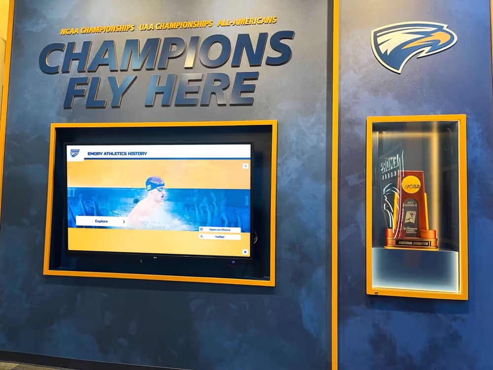
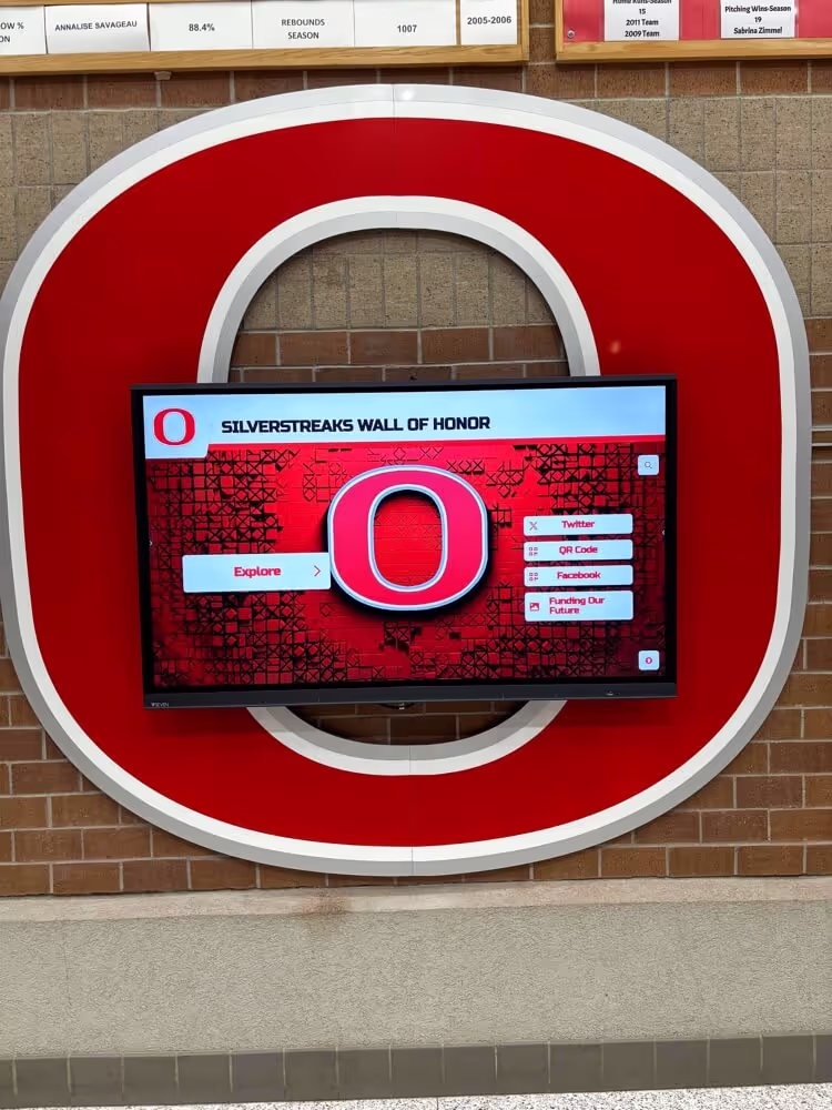
Effective touchscreen designs invite exploration through clear visual hierarchy and intuitive interaction patterns
Understanding Display Design Fundamentals
Before diving into specific layout strategies, understanding core design principles that make touchscreen displays effective helps guide all subsequent decisions.
The Unique Design Context of Recognition Displays
Hall of fame touchscreens serve different purposes than typical digital signage:
Emotional and Celebratory Purpose
Recognition displays carry significant emotional weight:
- Content honors real achievements and celebrates individual accomplishments
- Designs must convey respect, dignity, and appropriate gravitas
- Visual treatment should elevate achievements rather than trivialize them
- Aesthetic choices reflect institutional values and community identity
- Balance between celebration and restraint maintains appropriate tone
Unlike commercial digital signage designed primarily to capture attention and drive action, recognition displays create contemplative spaces where audiences connect meaningfully with achievement stories. This requires design restraint that lets content shine rather than overwhelming it with excessive visual effects.
Extended Engagement Sessions
Unlike quick-glance signage, recognition displays accommodate sustained interaction:
- Users spend 3-5 minutes or more exploring content when genuinely engaged
- Interface must remain clear and comfortable during extended viewing
- Content organization should support both focused searching and casual browsing
- Visual fatigue becomes a consideration with long interaction sessions
- Multiple user paths through content accommodate different exploration styles
This extended engagement time means design decisions that seem minor in isolation—like button placement, text size, or navigation patterns—compound across longer sessions, significantly affecting overall user experience.
Multi-Generational Audiences
Recognition displays must serve diverse users:
- Older adults who may be less familiar with touchscreen conventions
- Children and youth who expect smartphone-like responsiveness
- Users with varying abilities requiring accessibility accommodations
- First-time visitors with no prior context or training
- Returning users seeking specific content efficiently
This diversity requires design flexibility that makes displays instantly usable for newcomers while remaining efficient for experienced users, all without requiring instructions or explanations.
Core Design Principles for Touchscreen Recognition
Several fundamental principles guide effective recognition display design:
Visual Hierarchy and Information Architecture
Effective displays organize content through clear visual structure:
- Most important content receives greatest visual emphasis through size, color, or position
- Related content groups together logically with visual connection
- Navigation paths follow natural reading and scanning patterns
- White space separates distinct sections preventing visual confusion
- Typography establishes clear hierarchy from headings through body text
- Color guides attention to priority elements without overwhelming
According to user experience research, visitors make initial judgments about information architecture within seconds, with clear visual hierarchy determining whether they engage or move on. Displays that visually overwhelm or confuse lose audiences immediately, regardless of content quality.
Progressive Disclosure of Information
Recognition content often includes substantial detail requiring thoughtful revelation:
- Home screens highlight featured content without overwhelming options
- Profile pages reveal increasingly specific information as users explore
- Layered navigation enables both quick browsing and deep investigation
- Search and filtering provide direct paths to specific content
- Breadcrumb trails help users understand location within content hierarchy
- Related content suggestions encourage continued exploration
This progressive approach prevents overwhelming users with all available content simultaneously while ensuring comprehensive information remains accessible for those seeking depth.
Consistency and Predictability
Reliable interaction patterns build confidence and enable natural exploration:
- Similar functions use consistent visual treatment and location throughout
- Navigation controls appear in expected locations based on interface conventions
- Touch interactions behave predictably with appropriate visual feedback
- Content layouts follow consistent templates maintaining familiar structure
- Color, typography, and visual elements maintain systematic application
- Unexpected behaviors or inconsistencies create confusion and frustration
When users can predict how interfaces will behave based on visual cues, they explore confidently without hesitation or second-guessing. Learn about creating intuitive interactive hall of fame experiences that leverage these design principles effectively.

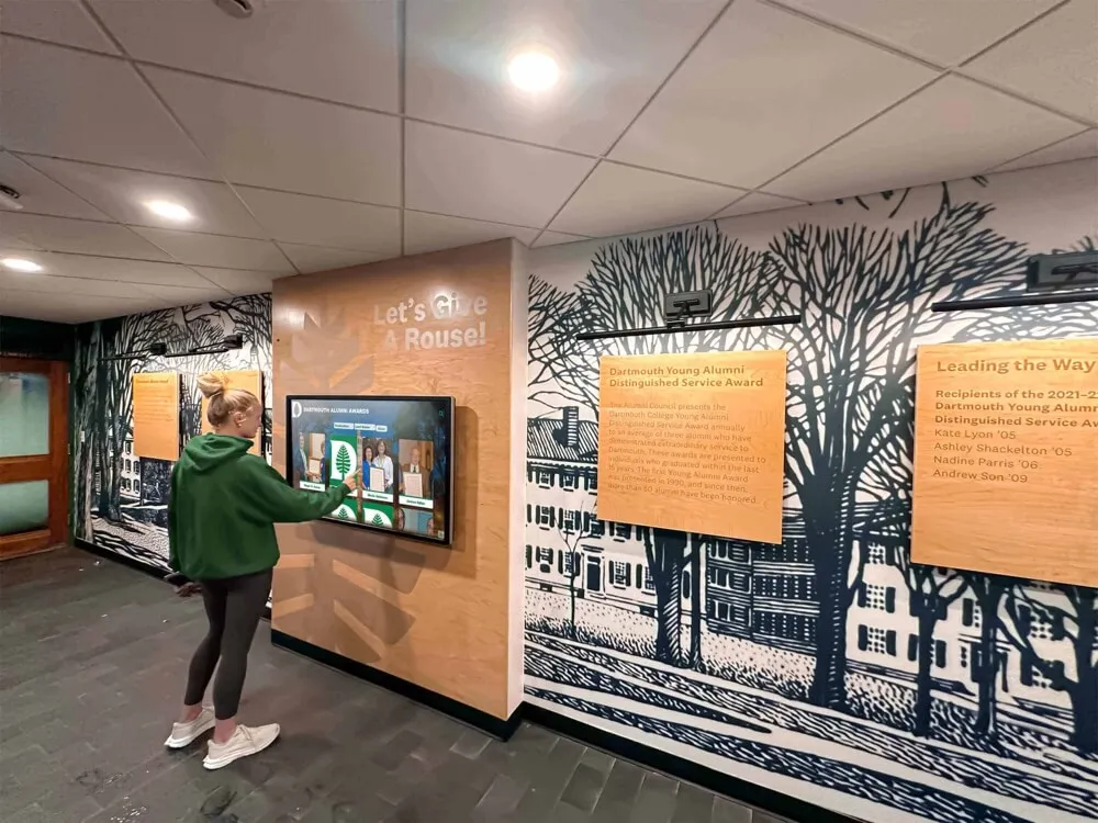
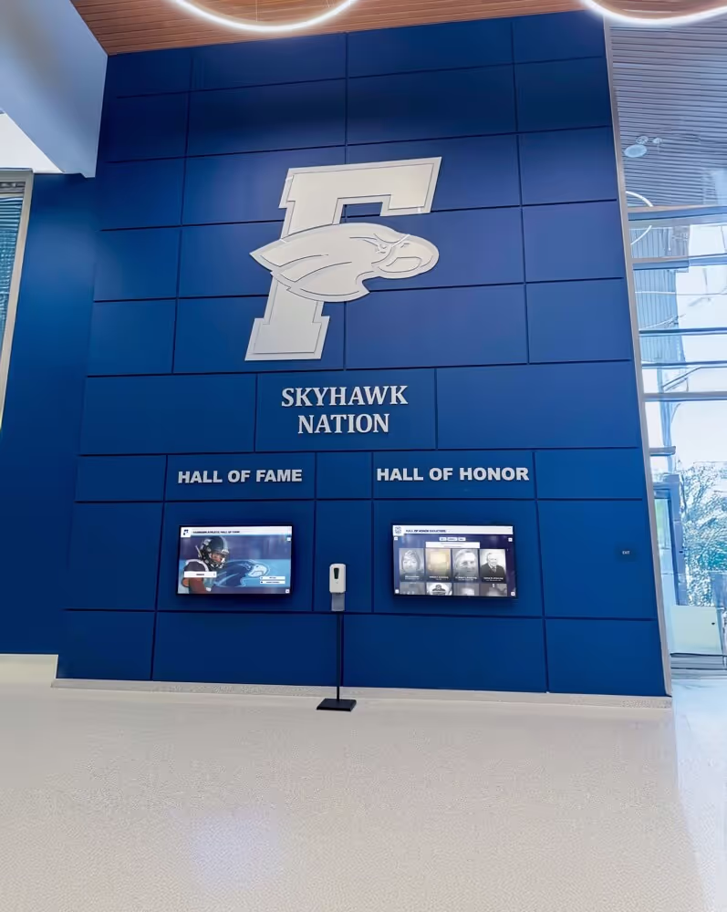
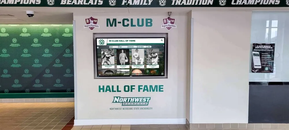
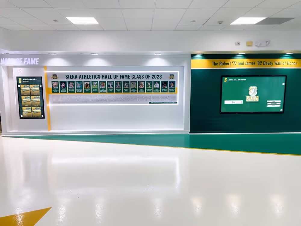
Intuitive design enables users of all ages to explore recognition content confidently without instruction
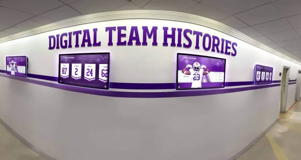
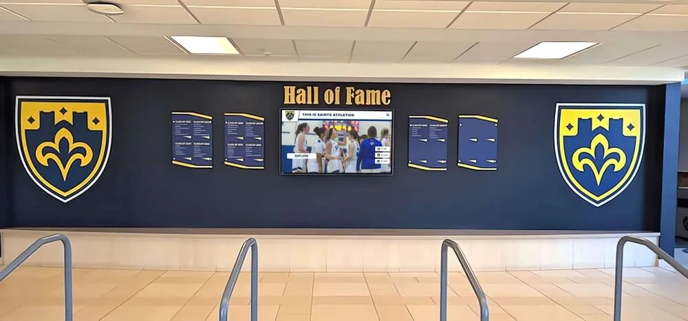
Layout Architecture and Screen Organization
The foundational layout structure determines whether users can navigate content effectively or become lost in complexity.
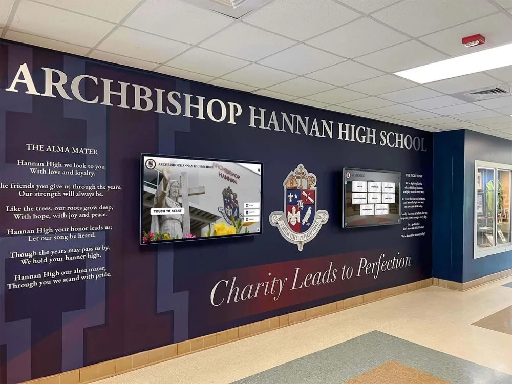
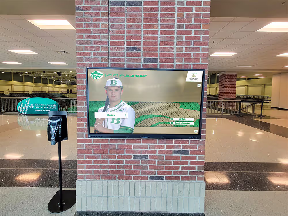
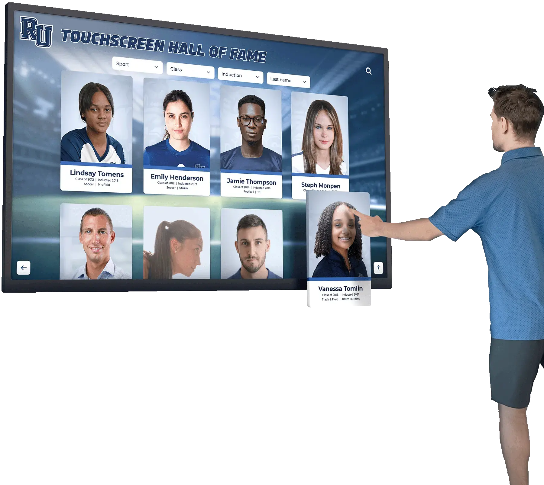
Home Screen Design Strategies
The initial screen visitors encounter establishes expectations and invites exploration:
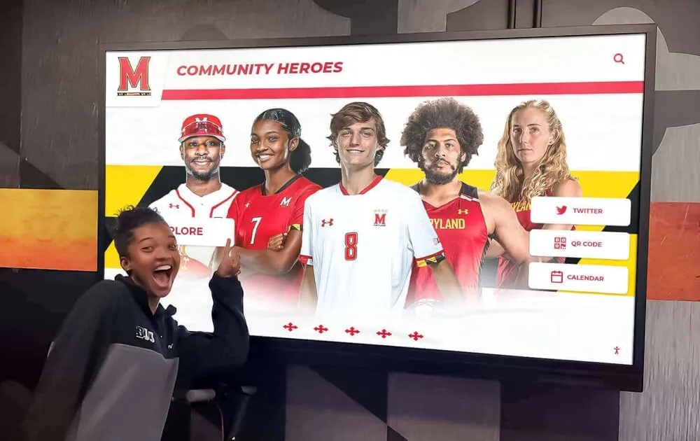
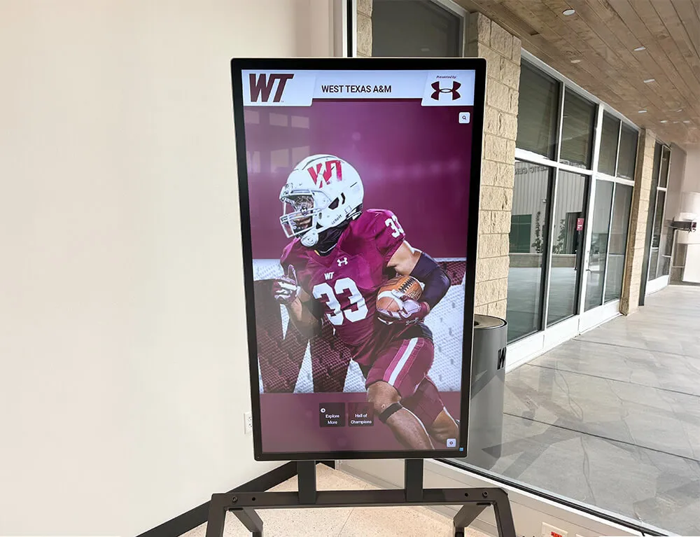
Featured Content Approach
Highlighting select achievements creates engaging entry points:
- Rotating featured profiles showcase diverse achievements and eras
- “Newest Inductees” sections promote recent recognition
- “On This Day” historical connections create timely relevance
- Achievement milestones and anniversaries gain prominent display
- Video highlights play automatically to capture attention and demonstrate interactivity
- Clear calls-to-action invite deeper exploration beyond featured content
Featured content serves dual purposes: capturing attention from passersby while demonstrating the depth of available content to engaged users. This attracts initial interest while signaling substantial archives worthy of extended exploration.
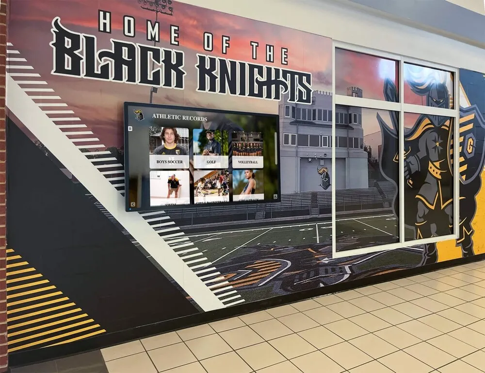
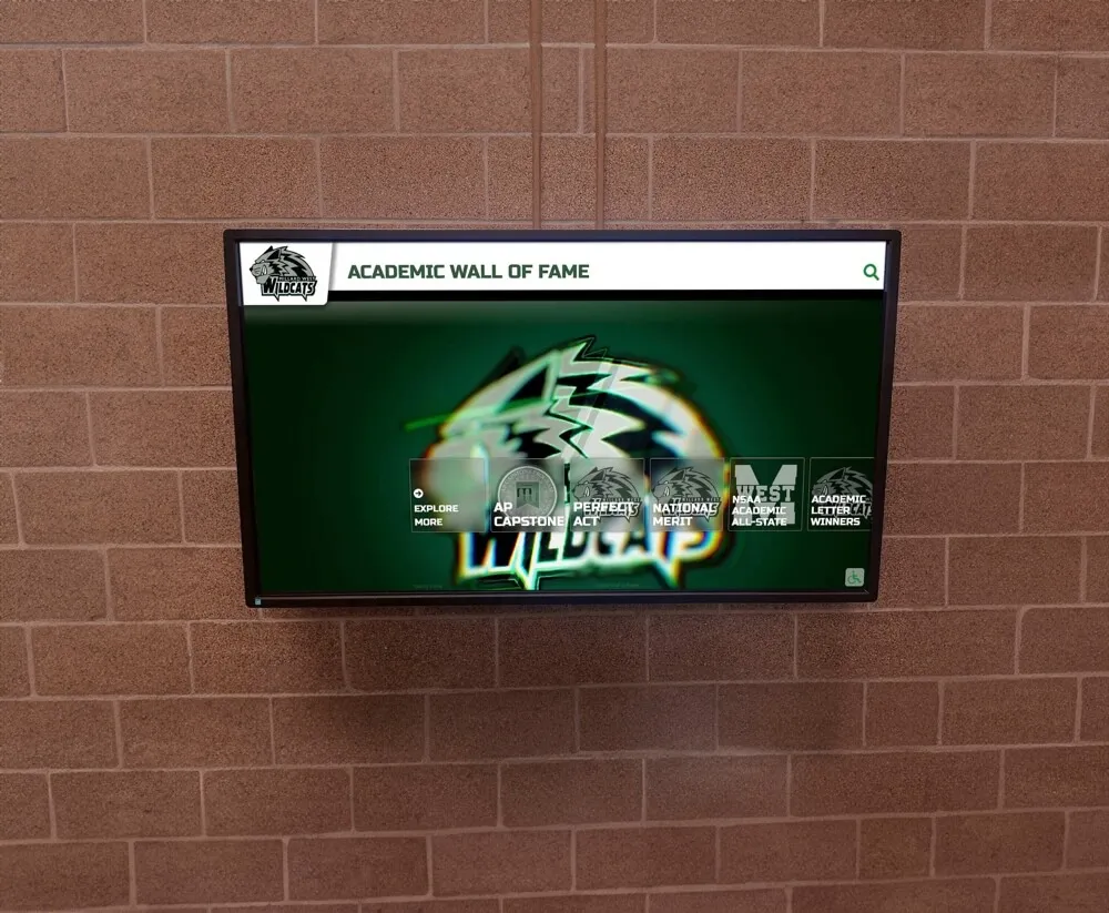
Category-Based Entry Points
Organizing access by logical categories aids navigation:
- Sport or program categories for athletic recognition
- Achievement types (championships, records, individual honors, etc.)
- Time-based organization (decades, years, or eras)
- Alphabetical access for finding specific individuals
- Department or activity groupings for academic recognition
- Multiple simultaneous categorization supporting various user goals
Effective category structures reflect how users naturally think about content rather than imposing arbitrary organizational schemes. Test category logic with representative users before finalizing to ensure organization matches mental models.
Search-Forward Design
Some displays prioritize search as primary navigation:
- Prominent search field with clear labeling and invitation to use
- Auto-complete suggestions appearing as users type
- Recent searches showing common queries
- Recommended searches prompting popular content
- Search results with filtering options refining large result sets
- “Browse all” options for those preferring non-search exploration
Search-forward designs work particularly well for displays with very large databases where browsing becomes unwieldy, though they should always provide browsing alternatives for users who prefer that approach. Discover strategies for organizing academic recognition programs across diverse achievement categories.
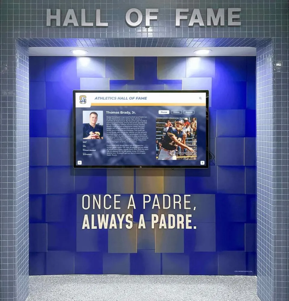
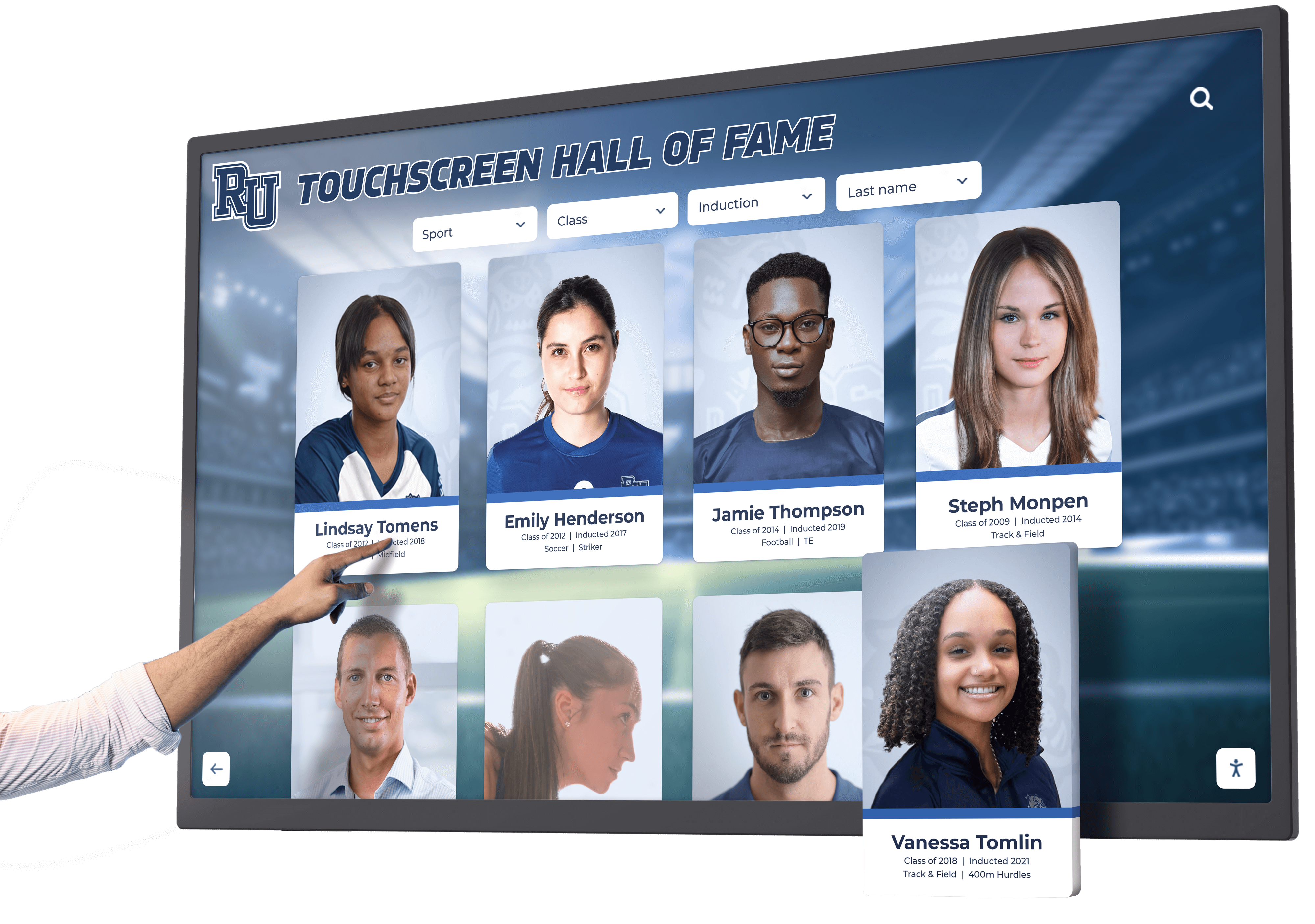
Profile Page Layout Patterns
Individual achievement profiles form the core content requiring thoughtful design:
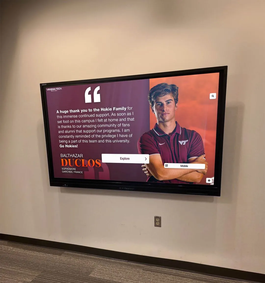
Hero Image and Primary Information
Profile pages typically open with key information immediately visible:
- Large, high-quality photograph establishing personal connection
- Name displayed prominently with clear, readable typography
- Primary achievement or accomplishment highlighted
- Years of participation, graduation, or achievement dates
- Quick facts or statistics providing immediate context
- Clear visual distinction from surrounding interface elements
This “above the fold” content (visible without scrolling) should provide enough information that users quickly understand whose profile they’re viewing and why that person merits recognition.
Content Sections and Organization
Additional profile information organizes into logical sections:
- Biographical information and background context
- Detailed achievement descriptions and accomplishments
- Career statistics or quantitative measures where applicable
- Photo galleries showing multiple images chronologically or thematically
- Video content including highlights, interviews, or ceremonies
- Documents such as articles, certificates, or programs
- Related achievements and connected individuals
- Social sharing options enabling content distribution
Each section should be visually distinct yet cohesive, with consistent styling that maintains recognizability while allowing section-specific design requirements.
Progressive Content Revelation
Long profiles benefit from revealing content gradually:
- Expandable sections starting collapsed for overview
- “Read more” links revealing additional paragraphs
- Thumbnail galleries expanding to full-screen viewing
- Tabbed interfaces separating biography, statistics, media, and other content types
- Scroll-based revelation on touch-optimized displays
- Clear indicators showing additional content exists
This approach prevents overwhelming users while ensuring comprehensive content remains accessible. Balance completeness with digestibility based on typical content depth in your archives.

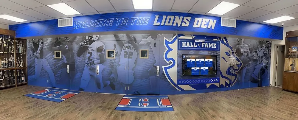
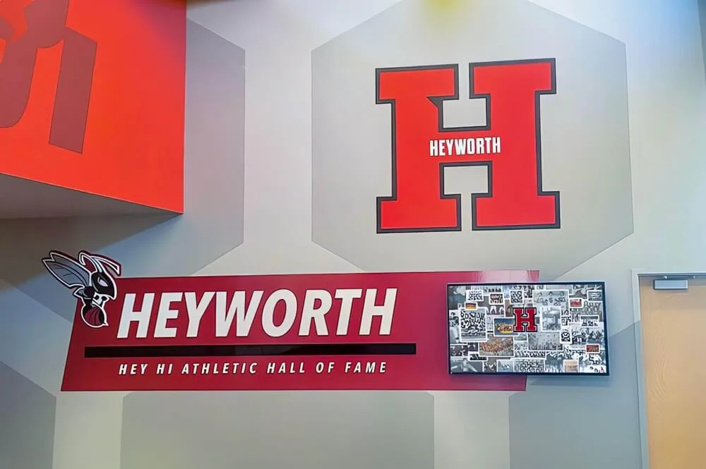
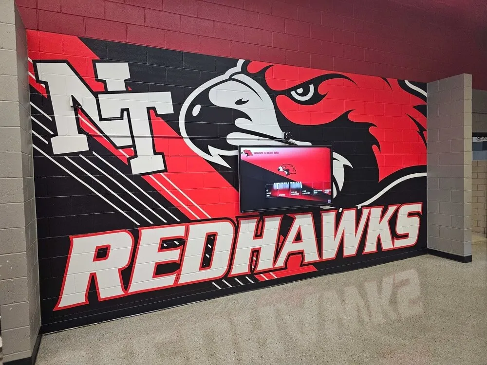
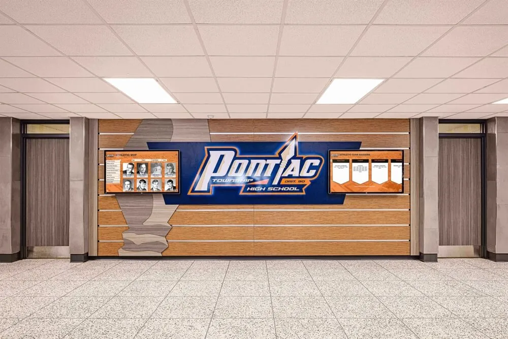
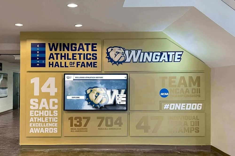
Professional kiosk installations create dedicated recognition destinations while maintaining clean, uncluttered visual presentation
Visual Design and Aesthetic Considerations
Layout architecture provides structure, but visual design creates emotional impact and communicates institutional identity.
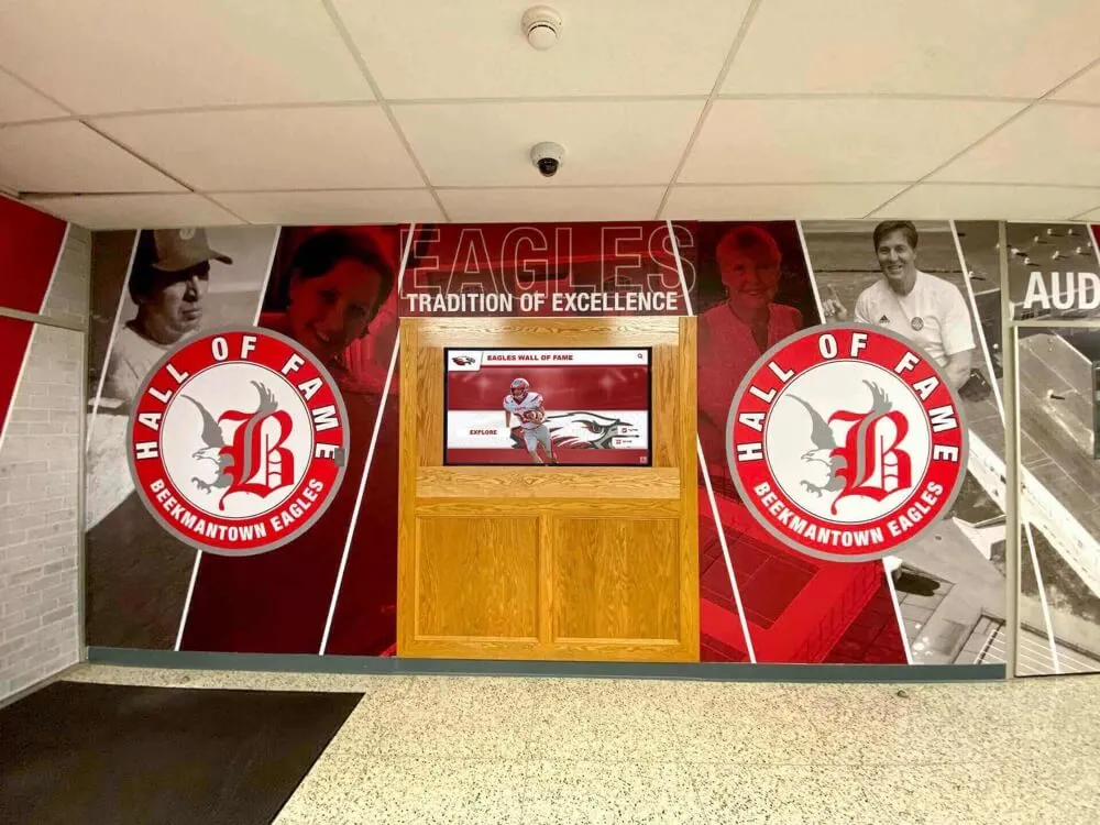
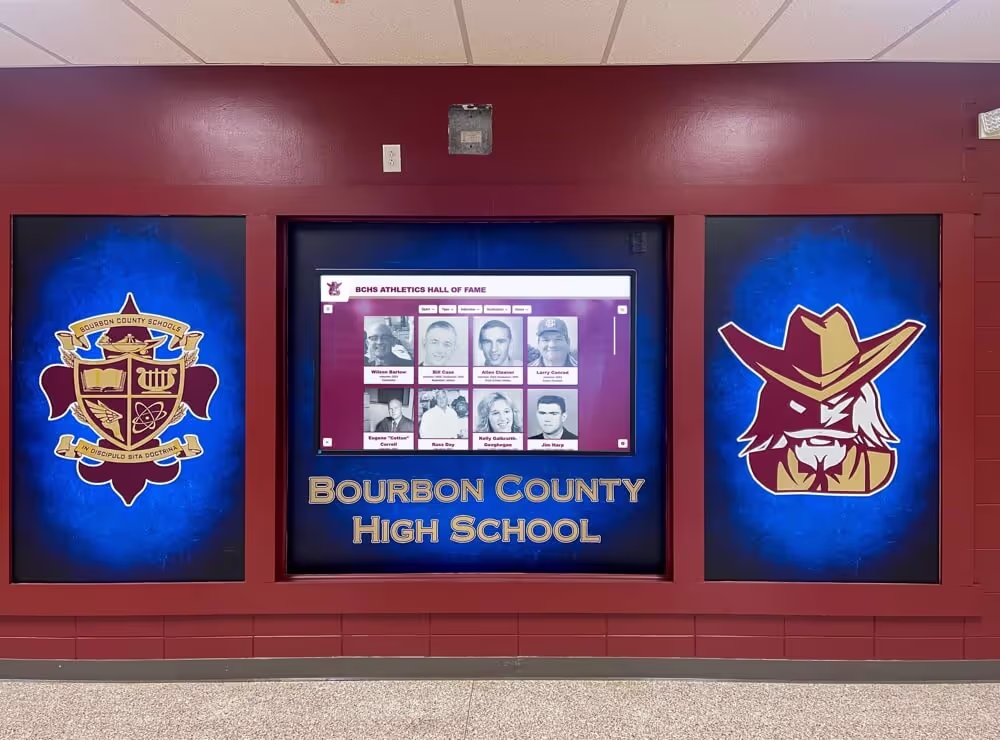
Color Strategy and Institutional Identity
Color choices significantly affect recognition display effectiveness:
Institutional Color Integration
School or organization colors establish immediate connection:
- Primary institutional colors applied consistently throughout interface
- Color used to establish visual hierarchy and guide attention
- Accent colors highlighting interactive elements and calls-to-action
- Neutral backgrounds preventing color fatigue during extended viewing
- Sufficient contrast ensuring readability across all color combinations
- Testing color choices on actual display hardware under facility lighting
Many schools struggle balancing prominent institutional color presence with readable, comfortable interfaces. Generally, institutional colors work best as accent and highlight colors rather than dominating entire interfaces, with neutral backgrounds supporting extended comfortable viewing.
Color Psychology and Recognition Context
Different color strategies create different emotional responses:
- Bold, saturated colors convey energy, excitement, and celebration
- Muted, sophisticated palettes suggest tradition, achievement, and respect
- High-contrast combinations ensure accessibility and readability
- Consistent color coding helps users navigate content categories
- Avoid color combinations that compete visually or create fatigue
- Test color choices with representative users across age ranges
The appropriate color approach depends on institutional identity and recognition context. Athletic recognition often embraces bold, energetic color, while academic or professional recognition may benefit from more restrained sophistication.
Adapting to Environmental Context
Display environment affects color effectiveness:
- Bright lobbies with natural light require different color choices than dim hallways
- Wall colors and surrounding design influence color perception on displays
- Reflection and glare considerations affect color visibility
- Time-of-day lighting changes may require brightness and contrast adjustment
- Adjacent physical recognition should complement digital display colors
Visit installation locations at various times of day, observe lighting conditions, and test color choices on actual hardware before finalizing design specifications. Learn about comprehensive digital recognition display implementation that addresses environmental factors.
Typography and Readability
Text forms the foundation of recognition content requiring careful typographic treatment:
Font Selection Criteria
Recognition displays need highly readable typography:
- Sans-serif fonts generally perform better on screens than serif fonts
- Avoid decorative or script fonts except for very large headings
- Font families with multiple weights support hierarchy without font changes
- Test font rendering on actual display hardware at various sizes
- Ensure font licenses permit embedding in digital display applications
- Consider multilingual support if serving diverse communities
According to digital typography research, fonts designed specifically for screen display perform better than print-optimized fonts, with factors like x-height, letter spacing, and stroke weight affecting readability significantly at display distances.
Size and Hierarchy Guidelines
Text must be readable from typical viewing distances:
- Heading text: 72-120 points for primary headings visible from 10+ feet
- Subheadings: 48-72 points for section headings readable from 6-8 feet
- Body text: 32-48 points for comfortable reading from 3-5 feet
- Caption text: 24-32 points for supplementary information
- Navigation elements: 36-60 points for clear button labels
- Adjust sizes based on actual viewing distances in your facility
These sizes are substantially larger than typical web or print typography because viewing distances differ dramatically. What appears enormous on laptop screens may be barely readable when viewed from display’s actual usage distance.
Line Length and Spacing
Text layout affects comprehension and reading comfort:
- Limit line length to 50-75 characters for optimal readability
- Increase line spacing to 1.5-2x font size for comfortable reading
- Use generous margins preventing text from extending to screen edges
- Break long content into short paragraphs with spacing between
- Align text left for natural reading flow (not centered or justified)
- Ensure adequate contrast between text and background (4.5:1 minimum)
Users viewing displays while standing tire more easily than seated readers, making comfortable text presentation especially important for recognition applications involving substantial reading.
Imagery and Multimedia Integration
Visual content brings recognition to life but requires thoughtful integration:
Photography Treatment and Standards
Photo quality dramatically affects recognition professionalism:
- Establish minimum resolution standards ensuring clarity on large displays (300+ DPI at display size)
- Consistent aspect ratios prevent awkward cropping or stretching
- Color correction and enhancement ensuring professional appearance
- Consistent framing and composition across archive creating cohesion
- Copyright clearance and permission documentation for all imagery
- Backup preservation of original high-resolution files
Many organizations inherit historical photos of varying quality. Consider professional restoration for significant images, and establish clear standards for new photography ensuring consistent quality going forward.
Video Content Integration
Video enhances storytelling but introduces design challenges:
- Auto-play considerations balancing attention-getting with annoyance
- Video player controls with touch-optimized buttons
- Captions and transcripts supporting accessibility and silent viewing
- Streaming optimization ensuring smooth playback without buffering
- Aspect ratio handling for various source video formats
- Playlist or related video suggestions encouraging continued engagement
Video content often generates highest engagement but requires technical infrastructure supporting smooth playback and administrative workflow for content creation. Explore effective digital storytelling strategies that leverage multimedia content.
Graphic Elements and Ornamentation
Decorative elements should enhance rather than distract:
- Subtle background patterns or textures adding visual interest without overwhelming
- Institutional marks, crests, or logos reinforcing identity and authenticity
- Divider elements separating sections while maintaining visual flow
- Icons supporting navigation and content categorization
- Frames or borders highlighting featured content appropriately
- Animation and motion used sparingly for specific emphasis
The key is ensuring graphic elements support content recognition rather than competing for attention. When in doubt, simplify—clean, content-focused designs rarely age poorly, while trendy decoration often looks dated quickly.

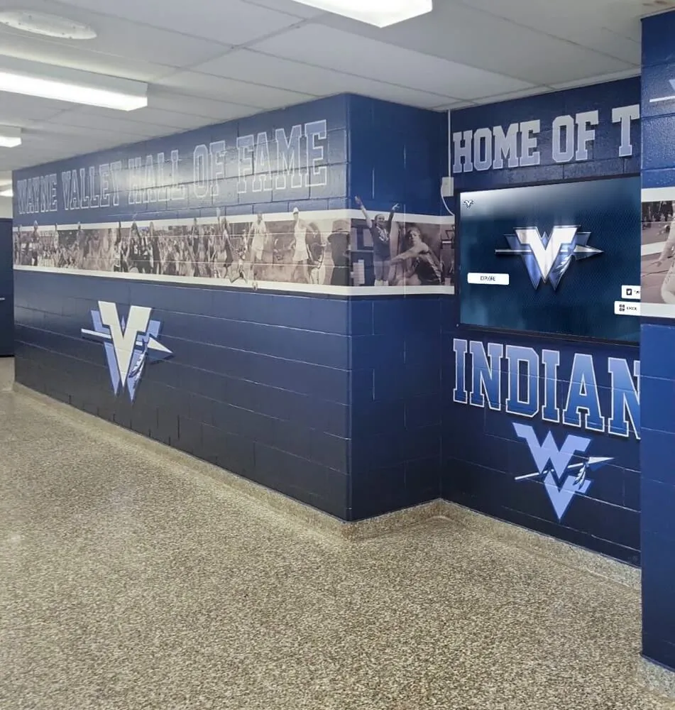
Cohesive visual design integrates digital displays with surrounding physical recognition and facility aesthetics
Interaction Design and Touch Optimization
Touchscreen interfaces require different design considerations than mouse-based or mobile applications.
Touch Target Sizing and Placement
Physical finger interaction imposes specific design constraints:
Minimum Touch Target Dimensions
Reliable touch interaction requires adequate button sizing:
- Primary buttons and navigation elements: 60-80 pixels minimum (approximately 15-20mm at display resolution)
- Secondary controls and less frequent actions: 44-60 pixels minimum
- Increase sizes for elderly users or accessibility optimization
- Add invisible padding around small visual elements expanding actual touch target
- Test all interactive elements with actual fingers on installed hardware
- Avoid placing small touch targets adjacent to each other
According to human factors research, the average adult fingertip measures 8-10mm, requiring touch targets of at least 9-12mm for comfortable, accurate selection. Many organizations set 15mm minimum targets to accommodate larger fingers and less precise touches.
Strategic Placement and Reach Zones
Touch target location affects usability significantly:
- Primary navigation positioned in natural thumb/finger reach areas
- Most important actions in most accessible screen regions
- Frequently-used controls in consistent, predictable locations
- Avoid critical buttons in extreme corners or edges requiring stretch
- Consider both left and right-handed users when possible
- Test placement with users of various heights and reach capabilities
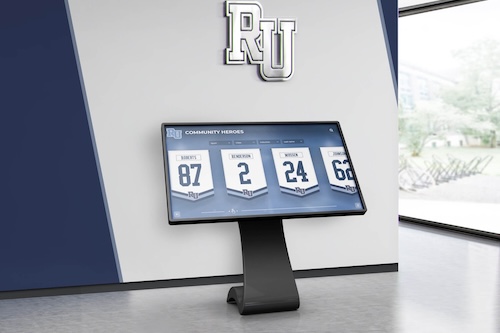
For freestanding kiosk displays, the middle two-thirds of screen height generally provides most comfortable interaction zones. Wall-mounted displays require consideration of mounting height and viewing angle.
Navigation Patterns and User Flows
Clear navigation architecture enables confident exploration:
Primary Navigation Strategies
Several navigation patterns work effectively for recognition displays:
Persistent Navigation Bar
- Always-visible top or side bar containing primary navigation options
- Works well for displays with 5-8 primary content categories
- Provides constant orientation regardless of location in content
- Familiar pattern from web browsing reducing learning curve
- Can consume significant screen real estate limiting content space
Hub-and-Spoke Model
- Central home screen with paths radiating to content areas
- Users return to home screen between content explorations
- Simpler for less tech-savvy audiences
- May require extra steps for users moving between content areas
- Creates clear mental model of content organization
Contextual Navigation
- Navigation options change based on current content
- More complex but potentially more efficient for advanced users
- Requires excellent visual communication of available options
- Can confuse users unsure of navigation location
- Benefits from breadcrumb trails showing current location
The appropriate pattern depends on content complexity, user sophistication, and institutional preferences. Consider testing multiple approaches with representative users before committing to final implementation.
Search and Filter Functionality
For displays with substantial archives, search becomes essential:
- Prominent search placement with clear affordance
- Auto-complete suggestions speeding entry and reducing errors
- Filter options visible in result views enabling refinement
- Sort options supporting various browsing preferences
- Clear result counts setting expectations
- Easy return to search from results for refinement
Effective search transforms potentially overwhelming databases into accessible resources. Organizations with hundreds or thousands of profiles should prioritize robust search functionality.
Feedback and Interaction Confirmation
Touchscreens must provide clear feedback confirming actions:
Visual Feedback Mechanisms
Users need immediate confirmation that touches registered:
- Button state changes on touch (color shift, scale change, etc.)
- Transition animations showing navigation occurring
- Loading indicators during content retrieval
- Confirmation screens for significant actions
- Error messages explaining problems clearly
- Success confirmations for form submissions
According to interaction design research, interface feedback should occur within 100 milliseconds of touch for users to perceive immediate response. Delays create uncertainty about whether touch registered successfully.
Audio Feedback Considerations
Sound can enhance touchscreen interaction:
- Subtle click or tap sounds confirming touches
- Audio previews of video content
- Spoken feedback supporting accessibility
- Volume controls enabling personal preference
- Environmental considerations preventing annoying nearby spaces
- Mute capabilities for quiet environments
Many recognition displays operate in environments where audio enhancement is appropriate, though some locations require silent operation. Design for flexibility accommodating various settings. Learn about creating engaging honor roll recognition displays with appropriate interaction feedback.

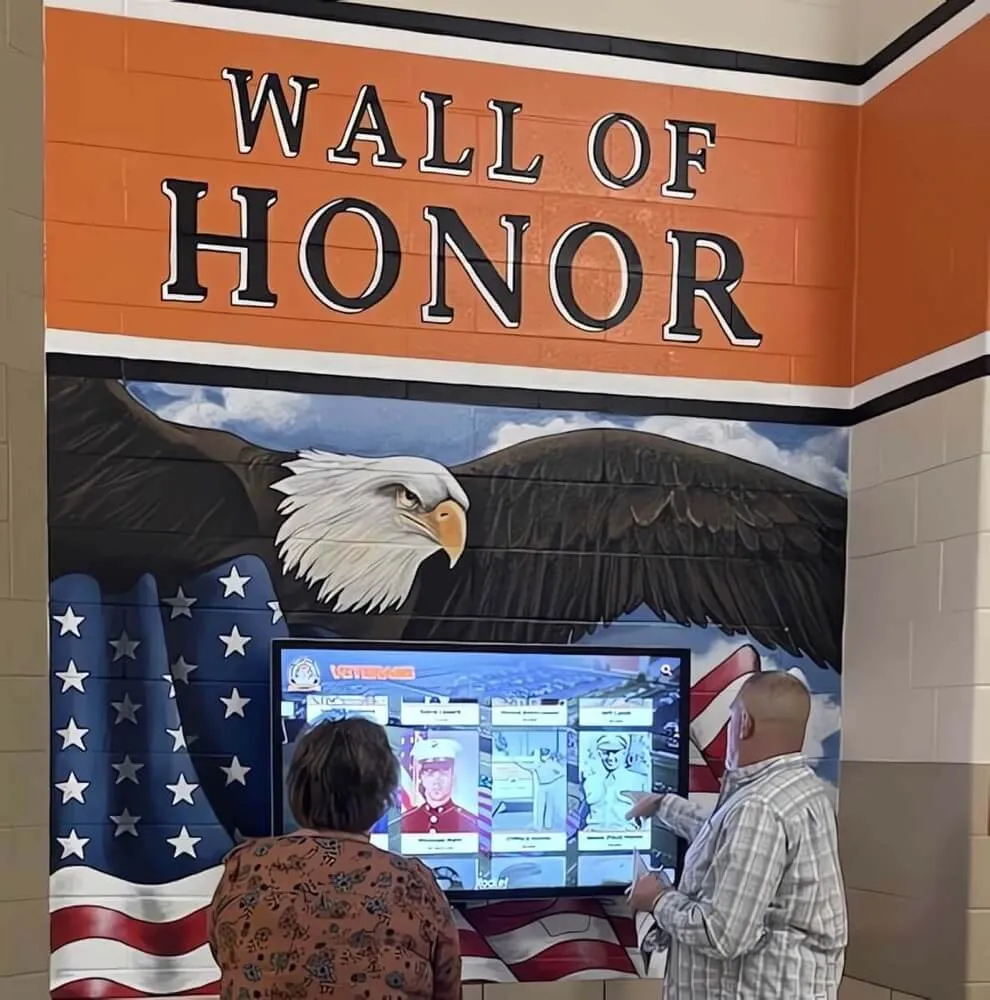
Clear visual hierarchy and intuitive navigation enable visitors to explore recognition independently and confidently
Content Strategy and Information Design
Effective displays require thoughtful content strategy beyond visual design.
Content Hierarchy and Priority
Not all recognition content carries equal importance requiring prioritization:
Featured Content Selection Criteria
Featured profiles and highlights should represent:
- Recent achievements maintaining currency and relevance
- Significant historical milestones connecting past and present
- Diverse achievement categories showcasing program breadth
- Various demographic representation ensuring inclusive recognition
- Compelling visual content (strong photos, video highlights)
- Stories connecting to current audiences and institutional goals
- Timely content relating to seasons, anniversaries, or events
Rotate featured content regularly maintaining fresh reasons to re-engage displays rather than showing identical content continuously.
Profile Completeness Standards
Establish content standards ensuring quality across archives:
- Required biographical elements every profile must include
- Optional enhanced content when available (video, documents, etc.)
- Photo quality minimums and preferred specifications
- Text length guidelines preventing excessive or insufficient detail
- Sourcing documentation for facts and statistics
- Permission documentation for photos and personal information
Consistent standards create professional uniformity while acknowledging that historical content may have different available material than recent recognition.
Writing for Touchscreen Displays
Digital reading requires different writing approaches than print:
Scanability and Information Layers
Screen-based content should support scanning:
- Front-load important information in first sentences
- Use descriptive subheadings creating meaningful structure
- Break long paragraphs into shorter chunks
- Highlight key points with bold text or callouts
- Use bulleted and numbered lists for easy scanning
- Provide complete stories but enable quick comprehension for scanners
According to digital usability research, web users read only about 20-28% of words on pages, instead scanning for relevant information. Recognition content should accommodate both complete reading and efficient scanning.
Tone and Voice Guidelines
Recognition writing should balance several considerations:
- Respectful, dignified tone honoring achievements appropriately
- Accessible language avoiding jargon or overly complex terminology
- Active voice creating more engaging narrative than passive constructions
- Specific details and examples bringing achievements to life
- Consistency across profiles maintaining uniform style
- Authenticity avoiding inflated language or excessive superlatives
The appropriate tone varies by institutional culture and recognition context. Academic recognition often maintains more formal language than athletic recognition, while corporate environments may prioritize professional business writing.
Multimedia Content Guidelines
Beyond text, effective displays integrate various media types:
Photo Gallery Curation
Profile photo galleries should tell visual stories:
- Lead image showing recognizee clearly and professionally
- Action shots capturing achievement moments
- Candid photos showing personality and character
- Historical photos providing context and timeline
- Team or group photos connecting to others
- Photo captions providing context and identification
- Chronological or thematic organization creating narrative
Photo selection requires balance between available imagery and storytelling effectiveness. Sometimes fewer high-quality images serve better than many mediocre photos.
Video Content Strategy
Video enhances recognition but requires production effort:
- Keep videos short (60-180 seconds ideal for most profiles)
- Start with compelling hook capturing attention immediately
- Include captions making content accessible in silent viewing
- Optimize files for smooth streaming playback
- Create consistent video styling across content library
- Balance professional production with authentic documentation
- Consider user-generated content when appropriate
Video production represents significant investment, so prioritize for featured profiles, recent inductees, or historically significant honorees rather than attempting comprehensive video for all profiles.
Accessibility and Inclusive Design
Recognition displays should serve all community members regardless of abilities.
Physical Accessibility Considerations
Hardware installation affects accessibility directly:
Display Positioning Standards
Accessible displays follow specific guidelines:
- Screen bottom edge at 40 inches maximum height above floor for wheelchair users
- Controls within 48 inches maximum reach height from floor
- Minimum 30x48 inch clear floor space in front of displays
- Adequate maneuvering space enabling wheelchair approach
- Mounting angle and tilt for comfortable viewing from various heights
- Adequate lighting ensuring visibility without glare
Many recognition displays install higher than optimal for wheelchair accessibility to serve standing viewers better. Consider dual-height installations or angled mounting accommodating diverse users.
Alternative Input Methods
Beyond touchscreen, consider additional access:
- Voice control for hands-free navigation
- Physical buttons or controls supplementing touch
- Remote web access enabling exploration from personal devices
- Printed QR codes linking to web-accessible content
- Staff assistance protocols for users needing support
Digital Accessibility Features
Software design must accommodate various abilities:
Visual Accessibility
Display content should serve users with vision differences:
- Text size controls enabling enlargement for low vision
- High-contrast modes improving readability
- Screen reader compatibility for blind users
- Alternative text descriptions for all images
- Video captions and transcripts for all multimedia
- Color contrast meeting WCAG 2.1 AA standards (4.5:1 minimum for text)
- Avoid color as sole information differentiator
Cognitive Accessibility
Design should support various cognitive abilities:
- Simple, consistent navigation reducing cognitive load
- Clear language avoiding complex terminology
- Logical information organization following expected patterns
- Adequate time for reading and interaction without forced progression
- Forgiving interaction allowing mistake correction
- Clear error messages explaining problems and solutions
According to accessibility research, design accommodating disabilities often improves usability for all users, not just those with specific needs. Learn about creating inclusive digital recognition programs that serve entire communities.

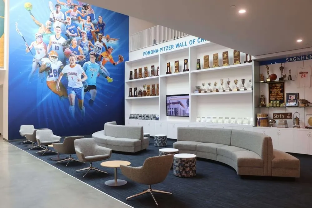
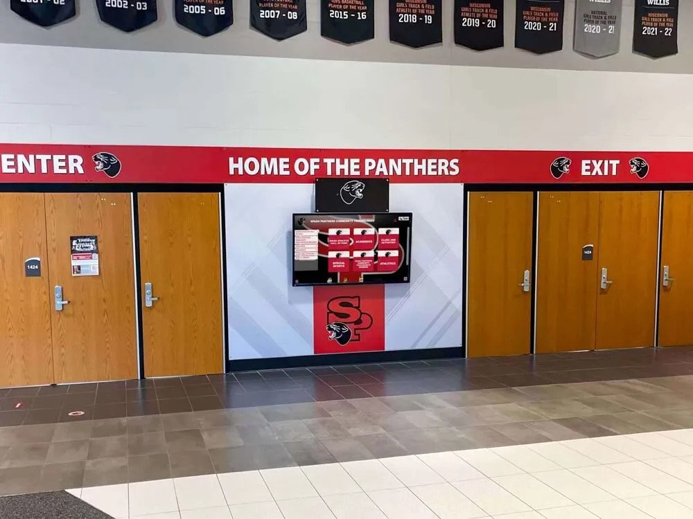
Professional installations integrate with facility aesthetics while maintaining clear visibility and accessibility
Testing and Iteration
Great display design emerges through testing and refinement rather than single perfect specifications.
Pre-Launch Testing Strategies
Test designs before full implementation:
Prototype Testing
Create testable prototypes before final development:
- Paper prototypes validating basic layout and navigation
- Click-through wireframes testing user flows
- High-fidelity mockups evaluating visual design
- Working prototypes on actual display hardware
- Test with representative users across age ranges and abilities
- Observe actual interaction identifying confusion or difficulty
Prototype testing reveals design problems when they’re still easy and inexpensive to fix, before committing to full development and content creation.
Pilot Programs
Launch to limited audiences before complete rollout:
- Install in single location gathering real-world usage data
- Monitor analytics identifying popular and ignored content
- Solicit feedback from pilot location users
- Observe actual interaction patterns and session durations
- Identify technical issues in real operating environments
- Refine design based on pilot learning before broader deployment
Pilot programs balance learning benefits against implementation momentum. Many organizations pilot for 4-8 weeks before broader launches.
Ongoing Optimization
Launch represents beginning, not conclusion of design development:
Analytics and Usage Monitoring
Track display performance systematically:
- Session duration and engagement time trends
- Popular content and frequently accessed profiles
- Search queries revealing user intent
- Navigation paths showing common exploration patterns
- Abandonment points where users leave interfaces
- Error frequency and types indicating design problems
Analytics-driven iteration ensures design serves actual user needs rather than assumed preferences.
Regular Content Audits
Maintain content quality over time:
- Review featured content rotation maintaining freshness
- Update profile information ensuring accuracy
- Archive or remove outdated content
- Identify and fill content gaps
- Improve lower-performing profiles based on engagement data
- Refresh visual design elements preventing dated appearance
Recognition displays should evolve continuously rather than remaining static after implementation. Organizations treating displays as ongoing programs rather than one-time projects achieve significantly better long-term results. Explore approaches for maintaining digital record boards throughout the year.
Advanced Design Considerations
Several additional factors affect recognition display effectiveness:
Branding and Institutional Identity
Recognition displays should reinforce organizational identity:
Visual Consistency Across Touchpoints
Coordinated design creates unified experience:
- Display design reflecting website visual language
- Consistent color, typography, and graphic treatment
- Cohesive approach to photography and media styling
- Related printed materials using complementary design
- Physical facility aesthetics influencing digital design
- Balance between digital display design and surrounding recognition
Inconsistent design across touchpoints creates confusion and dilutes institutional identity, while unified design reinforces brand recognition and professionalism.
Flexibility for Sub-Brands
Large organizations may need design variation:
- Athletic recognition distinctly styled from academic recognition
- Different schools or departments maintaining identity within system
- Seasonal design variations for time-limited content
- Special event theming for ceremonies or celebrations
- Template systems enabling consistency within flexibility
- Clear guidelines defining acceptable customization scope
Performance and Technical Optimization
Design decisions affect technical performance:
File Size and Loading Performance
Optimize media ensuring smooth performance:
- Compress images maintaining quality while reducing file size
- Optimize video encoding for streaming efficiency
- Lazy-load off-screen content improving perceived performance
- Cache frequently-accessed content reducing server load
- Minimize complex animations consuming processing resources
- Test performance on actual display hardware under real conditions
Slow, stuttering displays frustrate users and reduce engagement regardless of content quality. Performance should be non-negotiable design requirement.
Cross-Device Compatibility
Many modern recognition platforms extend beyond physical displays:
- Web-responsive design serving desktop and mobile browsers
- Consistent experience across various screen sizes and devices
- Touch optimization for tablets and phones
- Keyboard navigation for desktop users
- Print-friendly profile layouts for physical sharing
- Social media card optimization for link sharing
Cross-device consistency ensures recognition reaches audiences wherever they access content while maintaining quality and usability.
Conclusion: Designing for Impact and Engagement
Creating stunning digital hall of fame touchscreen display layouts requires balancing competing considerations—visual impact and functional clarity, comprehensive content and digestible presentation, institutional identity and user accessibility, innovation and familiarity. The most effective designs make interaction feel natural and effortless, allowing content and achievement stories to take center stage rather than the technology presenting them.
Throughout this guide, we’ve explored design strategies spanning layout architecture, visual aesthetics, interaction patterns, content strategy, and accessibility—all contributing to displays that truly engage audiences and honor achievements appropriately. Yet the most important insight may be that great design emerges through iteration and user testing rather than theoretical perfection. The organizations creating the most effective recognition displays embrace continuous learning, regularly gathering user feedback, monitoring analytics, and refining experiences based on actual usage rather than assumptions.
Ready to design a digital hall of fame touchscreen display that captivates your community? Modern interactive recognition solutions combine sophisticated design capabilities with intuitive content management, enabling organizations to create professionally-designed recognition experiences without requiring dedicated design staff. Solutions like Rocket Alumni Solutions provide purpose-built platforms specifically designed for recognition applications, with professionally-designed templates, customization flexibility, and expert implementation guidance ensuring displays that honor achievements beautifully while engaging audiences effectively.
Whether you’re planning your first digital recognition implementation or enhancing existing systems, focus on design decisions that serve your specific community’s needs, reflect your institutional identity authentically, and create experiences that invite exploration rather than simply displaying information. Technology enables new recognition possibilities, but thoughtful human-centered design transforms those possibilities into meaningful community engagement.
Your community’s achievements deserve recognition that celebrates accomplishments with dignity, engages audiences emotionally, and preserves institutional heritage accessibly. With thoughtful design strategy, attention to user experience fundamentals, and authentic commitment to continuous improvement, you can create digital hall of fame touchscreen displays that inspire current participants, strengthen community bonds, and honor excellence in ways that resonate for generations.
The most successful recognition displays aren’t those with the most sophisticated technology or the most elaborate visual effects—they’re the ones designed with genuine understanding of how people explore, discover, and connect with achievement stories. Start with that understanding, let it guide every design decision, test with real users, and iterate based on their experience. That user-centered approach, more than any specific design choice, ensures recognition displays that truly serve communities effectively.
Ready to begin designing your digital recognition display? Start by observing how current audiences interact with existing recognition, understanding what they seek and how they explore, then let those insights guide layout decisions, visual hierarchy, navigation patterns, and content strategy that serve authentic needs rather than assumed preferences.