Digital Hall of Fame Focus Appearance Audit: A WCAG 2.2 Checklist
- Home /
- Digital Hall of Fame Insights & Resources /
- Digital Hall of Fame Focus Appearance Audit: A WCAG 2.2 Checklist
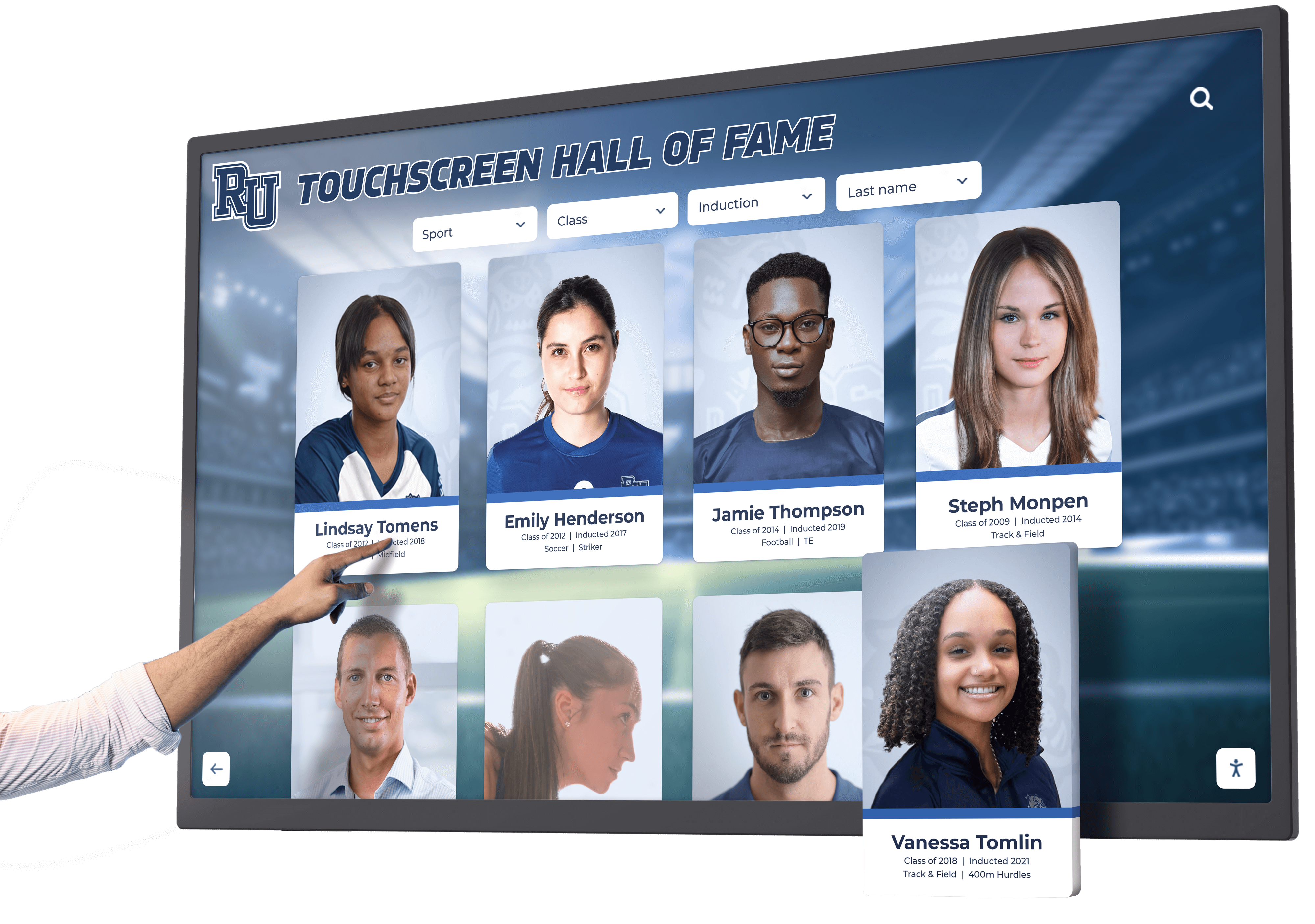
The Easiest Touchscreen Solution



Live Example: Rocket Alumni Solutions Touchscreen Display
Interact with a live example (16:9 scaled 1920x1080 display). All content is automatically responsive to all screen sizes and orientations.
A digital hall of fame focus appearance audit is the process of systematically verifying that every interactive element on a school’s recognition platform—inductee card links, sport-category filter controls, search input fields, video tribute player controls, modal dialog buttons, and kiosk navigation arrows—displays a keyboard focus indicator that meets the minimum area and contrast requirements introduced by WCAG 2.2 Success Criterion 2.4.11 Focus Appearance (Level AA). Prior to WCAG 2.2, SC 2.4.7 Focus Visible required only that a keyboard focus indicator be present; it imposed no measurable size or contrast threshold, which left room for nearly invisible outlines—a 1-pixel dotted ring on a white background, or a blue glow suppressed by a global outline: none in the site’s stylesheet—to pass the criterion technically while remaining impossible to perceive in practice. WCAG 2.2 closes that gap by requiring the focus indicator to meet a minimum enclosed area (at least the perimeter of the unfocused component at one CSS pixel wide) and a contrast ratio of at least 3:1 between the focused and unfocused states, and a separate 3:1 contrast ratio between the indicator and adjacent colors. This guide gives school administrators, athletic directors, IT staff, and recognition-program managers a complete audit workflow, a reusable WCAG 2.2 checklist, and numbered remediation steps to bring every interactive component on a hall of fame platform into compliance with SC 2.4.11 before the next nomination season opens or a new recognition display launches.
When an alumni association member navigates a digital hall of fame directory using only a keyboard—tabbing through inductee portraits to find a former coach’s profile—the only visual signal telling them which card is currently selected is the focus indicator. On many recognition platforms that launched under WCAG 2.1, that indicator is a thin browser-default outline that was never sized or styled to meet any measurable contrast requirement. Against a dark navy card background or a patterned hallway mural used as a page banner, a default black dotted outline may be effectively invisible. The visitor tabs forward without knowing where they are on the page.
WCAG 2.2 Success Criterion 2.4.11 Focus Appearance introduces the first measurable standards for what a keyboard focus indicator must look like—not just that one must exist.
The digital hall of fame focus appearance audit is the systematic check that confirms every interactive element’s focus indicator is large enough, high-contrast enough, and consistently visible across every page template and component state in the recognition platform.

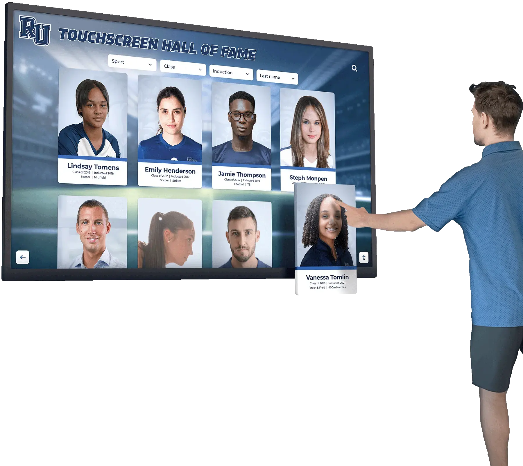
Every interactive element on a hall of fame display—inductee portrait cards, navigation arrows, filter controls—must show a focus indicator that meets WCAG 2.2 SC 2.4.11 minimum area and contrast requirements when navigated by keyboard
Program Snapshot: Focus Appearance Audit Scope for School Hall of Fame Sites
Map the audit scope before opening a browser or running any tooling. The table below defines the key parameters for schools at any stage of digital recognition, from a newly launched platform to a multi-decade athletic archive.
| Planning Element | Details |
|---|---|
| Primary Audience | Athletic directors, IT administrators, school web managers, facilities coordinators, accessibility compliance leads, recognition-program owners |
| What Is Being Audited | Every keyboard-focusable element on every public-facing page template: inductee card links, search fields, sport-category filter controls, video tribute players, carousel navigation, modal dialog buttons, year-range pickers, pagination controls, social sharing widgets, and kiosk navigation menus |
| WCAG Criterion | 2.4.11 Focus Appearance — Level AA (introduced in WCAG 2.2); extends and supersedes 2.4.7 Focus Visible — Level AA (WCAG 2.1); related to 1.4.3 Contrast (Minimum) — Level AA |
| Tools Required | A modern browser (Chrome, Firefox, or Edge), a physical keyboard, browser DevTools color picker, a WCAG contrast ratio checker (built-in DevTools accessibility panel in Chrome or a browser extension), and the browser’s Accessibility Inspector |
| Time Investment | 45–90 minutes for a full audit across all page templates; 20 minutes for a targeted spot-check after any CSS theme update or component library upgrade that touches color, outline, or border properties |
| Failure Consequence | Keyboard-only visitors cannot reliably determine which element currently has focus; navigation becomes guesswork, and visitors who rely on keyboard—due to motor disability, preference, or device type—cannot use the recognition platform effectively |
| Pass Condition | Every keyboard-focusable element displays a focus indicator that: encloses the component, has a contrast ratio of at least 3:1 between focused and unfocused states, has a contrast ratio of at least 3:1 against all adjacent colors, and is not entirely obscured by other page content |
| ADA Relevance | Public school recognition websites served to alumni, parents, community members, and visitors with disabilities are subject to digital accessibility standards; WCAG 2.2 SC 2.4.11 at Level AA is a baseline criterion for any organization targeting WCAG 2.2 AA compliance |
What Is Focus Appearance Under WCAG 2.2?
WCAG 2.2 Success Criterion 2.4.11 Focus Appearance (Level AA) states that when a user interface component receives keyboard focus, both of the following must be true:
- The focus indicator encloses the focused component and has a contrast ratio of at least 3:1 between the same pixels in the focused and unfocused states.
- The focus indicator area meets the minimum size threshold: at least the perimeter of the unfocused component’s bounding box multiplied by one CSS pixel in width—in practical terms, at minimum a one-CSS-pixel-thick solid outline surrounding the entire component. Additionally, the indicator must have a contrast ratio of at least 3:1 against every adjacent color where the indicator meets the surrounding page surface.
- The item receiving focus is not entirely hidden by author-created content (such as a sticky navigation bar, a cookie consent banner, or a floating filter panel overlapping the focused element).
These three requirements differ meaningfully from the prior standard.
What WCAG 2.4.7 Required (and Where It Left Gaps)
WCAG 2.1 SC 2.4.7 Focus Visible required only that “any keyboard operable user interface has a mode of operation where the keyboard focus indicator is visible.” It did not specify a minimum size or a minimum contrast ratio. A one-pixel dotted outline in any color, on any background, satisfied the criterion technically—even if it was imperceptible to most sighted keyboard users. Recognition platforms that last audited under WCAG 2.1 AA may have passing audit records for Focus Visible that include focus indicators that would fail WCAG 2.2 SC 2.4.11.
The Three WCAG 2.4.11 Requirements in Plain Language
Minimum area: The focus indicator must visually surround the entire focused component. It cannot be a small dot or an underline on part of the component’s text—it must enclose the full element. The enclosed area must be at least the perimeter of the unfocused component drawn as a one-CSS-pixel-wide border. For most interactive elements, a two-pixel solid outline placed just outside the bounding box satisfies this requirement and provides a visible margin.
Minimum contrast—change of state: The pixels that form the focus indicator must have a contrast ratio of at least 3:1 between their appearance in the focused state and their appearance in the unfocused state. This requirement prevents low-contrast “barely visible” outlines: if the focused-state outline is dark blue and the unfocused-state background is also dark blue, the contrast between the two states is insufficient regardless of whether a line is technically present.
Minimum contrast—against adjacent colors: The focus indicator must also have a contrast ratio of at least 3:1 against all colors directly adjacent to it on the page. A white outline on a light gray page background fails this requirement. A white outline with a one-pixel dark offset shadow that separates it from the background meets it, because the shadow acts as the high-contrast interface layer.
Not fully obscured: The focused element must not be completely hidden from view. A focused link behind a sticky header fails this requirement; a focused element that is partially visible—even clipped by a sticky bar at the top—does not fail (partial concealment is permitted, full concealment is not).
Why These Requirements Matter on Hall of Fame Kiosks and Web Directories
Recognition platforms carry a structural risk for focus appearance failures for three reasons:
Dark-background card grids: Inductee portrait cards on a hall of fame site often use dark navy, deep burgundy, or black card backgrounds against which the browser’s default blue or black focus outline has insufficient contrast. The change between “no visible outline on a dark card” and “a thin dark outline on a dark card” may be imperceptible.
Custom CSS that suppresses the default outline: Many recognition platform themes include outline: none or outline: 0 in their base stylesheet to eliminate the default browser focus ring, intending to replace it with a custom styled indicator. If the replacement indicator was never implemented, or was implemented at insufficient contrast, every interactive element on the site may have no visible focus indicator at all—a complete failure of both 2.4.7 and 2.4.11.
Embedded third-party components: Video tribute players, social sharing widgets, and sponsor badge iframes bring their own CSS. A YouTube embed or Vimeo player may suppress or override the host page’s focus styles within the iframe, meaning the player controls have no visible focus indicator even if the surrounding page passes the audit.
Content Architecture: Where Focus Appearance Failures Occur on Recognition Pages
A digital hall of fame platform distributes focusable interactive elements across four page template types. The audit must cover each template separately because focus styles may vary between the home page theme, index page components, profile page embeds, and kiosk interface templates.
Home Page and Featured Inductee Carousels
The home page concentrates the highest density of focus-appearance risk. Carousel navigation controls (previous/next arrows, dot indicators) are frequently styled as small icon-only buttons that are visually clear for mouse users but carry inadequate focus indicators for keyboard users. Arrow controls set against a hero image background introduce adjacent-color contrast problems: the background changes across the image’s color range, and a static-color outline cannot guarantee 3:1 contrast against every pixel it borders.
Search input fields on the home page are another common failure point. Many recognition themes style the search field with a light-colored border that changes subtly on focus—a border-color shift from light gray to medium gray that does not meet the 3:1 contrast threshold between focused and unfocused states.
Sport-Category Index Pages and Filter Controls
Filter panel controls—sport-category checkboxes, era-range pickers, gender toggle buttons—are presented in groups. When a filter accordion is expanded, each checkbox inside it must show a focus indicator meeting SC 2.4.11. The challenge is that checkboxes and radio buttons use browser-native rendering, and their default focus styles vary between browsers and operating systems. On macOS Safari, native checkboxes receive a system-level blue ring that may or may not meet the 3:1 contrast requirement against the filter panel’s background color. On Windows Chrome, the default checkbox focus style changed between versions 100 and 110. Testing on the specific browser versions used by the school’s intended audience—including the browser embedded in kiosk hardware—is essential.
Inductee Profile Pages
Profile pages contain the most diverse set of focusable components and therefore carry the highest aggregate focus appearance risk. The components that most frequently fail SC 2.4.11:
| Component | Common Failure Mode | Why It Fails 2.4.11 |
|---|---|---|
| Video tribute player controls | Third-party iframe suppresses host page focus styles | Player controls show no indicator or an insufficient one when the iframe overrides CSS |
| Photo gallery lightbox trigger | Custom icon button with outline: none and no replacement style | No focus indicator present; complete failure |
| Biography accordion toggle | Border-color shift from transparent to a low-contrast color | Contrast between focused and unfocused states is below 3:1 |
| Social sharing buttons | Icon-only buttons with a faint glow instead of a solid indicator | Glow area may not meet the minimum enclosed area requirement |
| Nomination form link | Underline-only focus style | Underline does not enclose the component; fails minimum area |
| Related inductee card links | Dark-on-dark outline insufficient contrast | Fails 3:1 contrast between focused and unfocused states |
Schools that have implemented recognition kiosk displays in gymnasium lobbies and athletic hallways should extend the focus appearance audit to the kiosk interface template separately from the web directory. Kiosk interfaces frequently use a stripped-down browser view in which keyboard navigation is a secondary interaction mode, making focus indicator problems easier to overlook during initial deployment.
Search Results Pages
Search results pages generate inductee cards dynamically based on query parameters. Because each card is rendered from the same template, every card link in the results grid shares the same focus style. A single focus appearance failure on one card is a failure on every card in every results page. The highest risk on results pages is a card template that relies on a box-shadow for its focus indicator—a glowing outer shadow that may or may not enclose the full bounding box and may not meet the area or contrast requirements of SC 2.4.11.
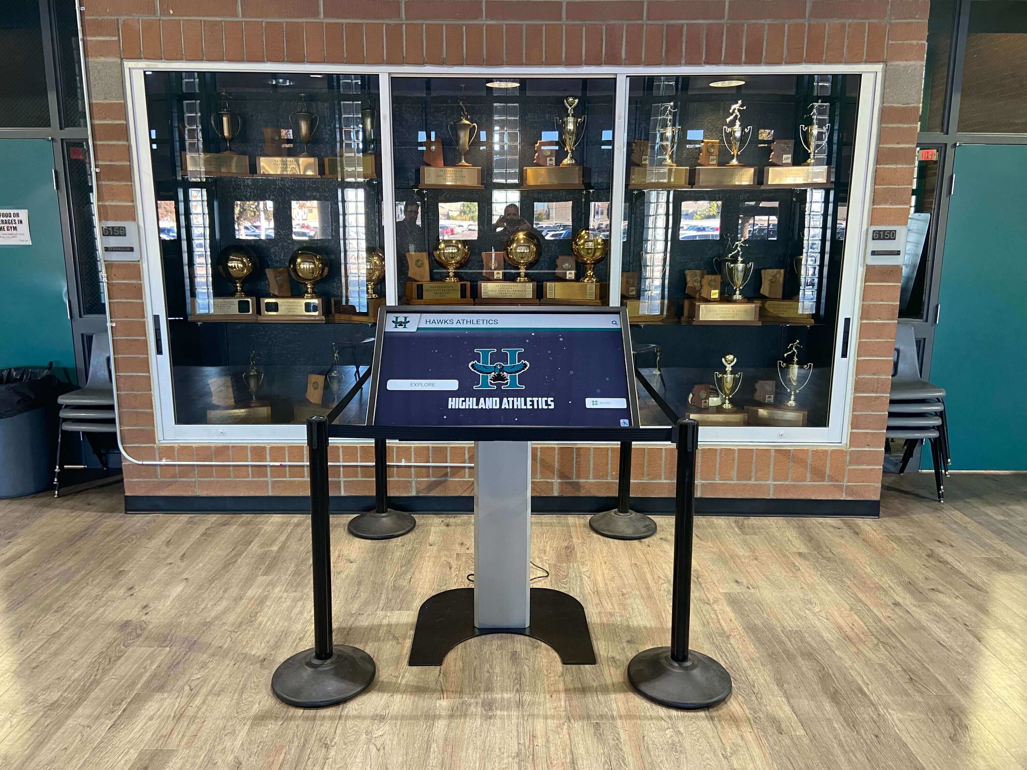
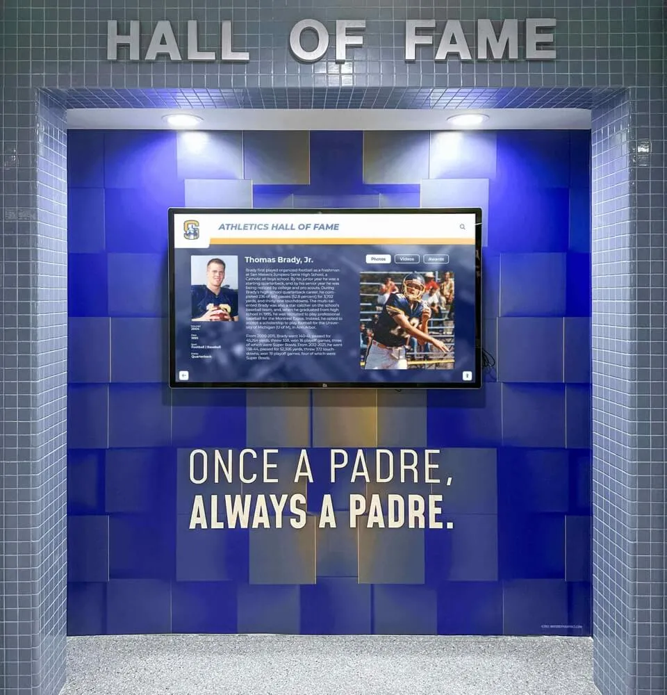
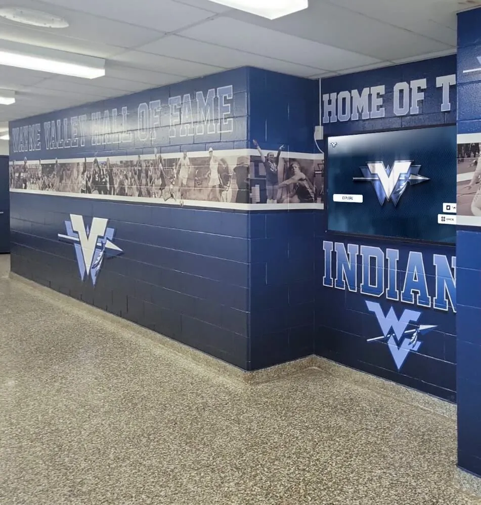
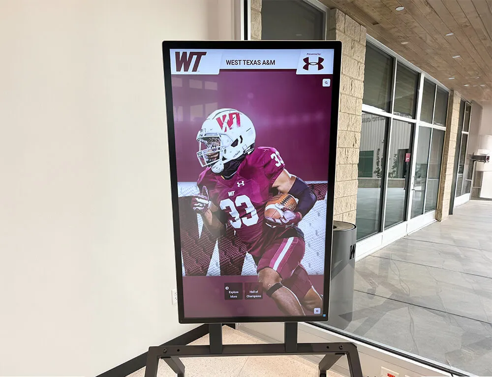
Hall of fame kiosk interfaces installed in trophy cases and school lobbies must pass a focus appearance audit for their interactive navigation controls—keyboard-accessible kiosk deployments are increasingly common in schools that support visitors who use keyboard devices
Step-by-Step Digital Hall of Fame Focus Appearance Audit Workflow
Run the following steps in sequence across all page template types. Document every finding in the issue log at the end of this section before moving to remediation.
Step 1: Check the Site Stylesheet for Global Focus Suppression
Before testing any live page, inspect the site’s CSS for global outline overrides that remove the default browser focus indicator. Open Chrome DevTools and navigate to the Sources panel, or use the Network panel to locate the main CSS file. Search for the following patterns:
/* Common focus suppression patterns to search for */
* { outline: none }
* { outline: 0 }
:focus { outline: none }
:focus { outline: 0 }
a:focus { outline: none }
button:focus { outline: none }
input:focus { outline: none }
If any of these patterns are found, every element they target will have no default focus indicator. The presence of any global outline: none rule means the audit will likely find widespread failures, and remediation must begin at the stylesheet level before component-level fixes are applied.
Also search for :focus-visible { outline: none }. This pattern is increasingly common in themes that adopted the :focus-visible pseudo-class to hide focus rings from mouse users but then suppressed them for keyboard users as well.
Step 2: Establish the Baseline Tab Sequence on the Home Page
Open the recognition website in Chrome with no browser extensions active. Click the browser’s address bar, then press Tab to place focus on the first interactive page element. Tab through every focusable element on the home page without using the mouse. For each element that receives focus, observe and record:
- Is a focus indicator visible? If no visible change occurs when the element receives Tab focus, record a complete-failure finding.
- Does the indicator enclose the element? An underline, a partial left border, or a background color shift that does not surround the full bounding box fails the minimum area requirement.
- Is the indicator color distinct from the element’s unfocused appearance? If the element looks essentially the same focused versus unfocused, record a contrast-change failure.
Record the element type (link, button, input), the page region (navigation, carousel, search), and the failure type for each finding before moving to the next element.
Step 3: Measure the Contrast Ratio of Each Focus Indicator
For each element that displays a focus indicator (even a subtle one), use the Chrome DevTools color picker to identify the exact color of the focus indicator and the exact color of the background it appears against.
- Open Chrome DevTools → Elements panel.
- Navigate keyboard focus to the target element.
- In the Computed tab, locate the
outline-colororbox-shadowvalue that creates the visible indicator. - Use the DevTools Accessibility panel → Color Contrast field to check the ratio, or enter the hex values in a WCAG contrast checker.
Two contrast ratios must be checked for each indicator:
- Focused vs. unfocused state: The contrast ratio between the indicator pixels in focused state and those same pixels in unfocused state. This measures how much the indicator changes the appearance of the element on focus.
- Indicator vs. adjacent background: The contrast ratio between the indicator color and the page background color (or card color) immediately adjacent to the indicator’s outer edge.
Both must be at least 3:1. Record the measured ratio for each element in the issue log.
Step 4: Verify the Focus Indicator Area
For any focus indicator that passes the contrast checks, verify that it encloses the full component and meets the minimum area requirement. The practical test is visual: does the indicator visibly surround the entire interactive element on all four sides? A focus ring that only appears on two sides (a top and bottom border change), or that only highlights part of the text within a link, fails the minimum area requirement.
For custom components that use a box-shadow as the focus indicator, the outer glow must be large enough to form a continuous ring around the component. Open the DevTools Element panel and inspect the box-shadow value. A box-shadow: 0 0 0 2px #color creates a two-CSS-pixel solid ring with no blur, which meets the minimum area requirement. A box-shadow: 0 0 6px rgba(0,0,0,0.5) creates a blurred glow whose area depends on the blur radius and whose effective enclosed edge is difficult to measure; these require manual visual confirmation against the minimum-area standard.
Step 5: Test Third-Party Embeds and Iframes
Navigate to an inductee profile page that includes a video tribute embed. Tab into the video player and observe the focus indicator on each player control (play/pause, volume, captions, full-screen). Third-party embeds render inside a separate browsing context; the host page’s CSS does not apply inside the iframe. The player vendor’s CSS determines the focus appearance of every control inside the embed.
If the player controls show no visible focus indicator, or show an indicator that clearly fails the contrast requirements (such as a nearly transparent ring on a dark video background), record a third-party component finding. Note that remediation options for third-party iframes are limited: the host page cannot directly restyle controls inside an iframe cross-origin. Remediation for these findings typically requires either replacing the embed with an accessible custom player or contacting the platform vendor for a configuration option that enables compliant focus styles.
Step 6: Test Sticky Headers and Overlapping Content
Scroll to a position mid-page where a sticky navigation bar or filter panel is visible at the top of the viewport. Tab forward through the interactive elements below the sticky bar. When focus reaches an element that is partially or fully obscured by the sticky bar, observe whether the element receiving focus is entirely hidden. If the focused element scrolls into view automatically (many browsers scroll focused elements into view), confirm that the scroll positions the element so the focus indicator is not entirely behind the sticky content.
A focused element that is completely invisible behind a sticky header fails the “not fully obscured” requirement of SC 2.4.11. A focused element that is partially clipped—the top portion of its focus ring is hidden but the element itself is visible—does not fail this specific requirement, though it may warrant a fix for usability.
Step 7: Test the Kiosk Interface Template Separately
If the recognition platform runs a separate template for the wall-mounted kiosk interface (a touch-first layout with larger cards and fewer navigation elements), apply steps 1 through 6 to the kiosk template independently. Kiosk templates frequently omit the hover and focus styles included in the web directory template, because kiosk design is assumed to be touch-only. Schools that support keyboard input at kiosk stations—for administrative access, or for visitors with motor disabilities who bring keyboard devices—must ensure the kiosk template passes the same SC 2.4.11 requirements as the web directory.
Numbered Remediation Steps
When the audit identifies focus appearance failures, apply the following fixes in priority order.
1. Remove global outline: none overrides from the stylesheet and replace with :focus-visible scoping.
A global outline: none removes every browser-default focus indicator. Replace this rule with a :focus:not(:focus-visible) exclusion that hides the focus ring only for mouse-initiated focus events, while preserving it for keyboard-initiated focus.
/* Remove this pattern entirely: */
/* * { outline: none } */

/* Replace with: */
*:focus:not(:focus-visible) {
  outline: none;
}

*:focus-visible {
  outline: 3px solid #005fcc;
  outline-offset: 2px;
}
This approach preserves keyboard focus visibility while eliminating the focus ring for pointer interactions that mouse users find visually noisy.
2. Style a compliant global focus indicator using :focus-visible.
After removing the global suppression, define a site-wide focus style that meets SC 2.4.11. The indicator color must have a 3:1 contrast ratio against both the focused and unfocused background colors that appear across the site. For recognition platforms with dark card backgrounds and light page backgrounds, a single-color outline cannot guarantee 3:1 contrast against all adjacent surfaces. Use an outline with an offset to create separation, paired with a contrasting shadow:
:focus-visible {
  outline: 3px solid #005fcc;
  outline-offset: 2px;
  box-shadow: 0 0 0 5px rgba(0, 95, 204, 0.2);
}
Alternatively, use a two-color technique: a dark outer ring and a white inner ring (or vice versa) to ensure the indicator contrasts with both dark and light adjacent surfaces.
:focus-visible {
  outline: 3px solid #ffffff;
  box-shadow: 0 0 0 5px #005fcc;
  outline-offset: 2px;
}
3. Override focus styles on dark-background card components.
Inductee card links on dark backgrounds require a focus indicator styled for dark adjacent colors. Apply a component-specific :focus-visible override:
.inductee-card a:focus-visible,
.inductee-card button:focus-visible {
  outline: 3px solid #ffffff;
  outline-offset: 3px;
  box-shadow: 0 0 0 6px #1a1a2e;
}
The white outline contrasts against the dark card, and the dark outer shadow contrasts against the white outline, ensuring the indicator is readable against both the card interior and the surrounding page surface.
4. Replace box-shadow glow indicators with solid outlines.
Blurred box-shadow glows do not reliably meet the minimum enclosed-area requirement of SC 2.4.11 because their effective edge is diffused. Replace glow-style focus indicators with a solid outline or a zero-blur box-shadow that creates a crisp, measurable ring:
/* Replace blurred glow: */
/* button:focus-visible { box-shadow: 0 0 8px rgba(0,100,200,0.7); } */

/* With a solid ring: */
button:focus-visible {
  outline: 3px solid #005fcc;
  outline-offset: 2px;
}
5. Verify and fix form input focus indicators.
Search fields, nomination form fields, and filter checkboxes often inherit a border-color change as their focus indicator. A border-color change meets the minimum area requirement only if the border runs around the full element and the contrast between focused and unfocused border colors is at least 3:1. Supplement border-color changes with an outline to ensure the area requirement is met independently of the border measurement:
input:focus-visible,
select:focus-visible,
textarea:focus-visible {
  border-color: #005fcc;
  outline: 2px solid #005fcc;
  outline-offset: 1px;
}
6. Manage focus indicators inside carousel and slider components.
Carousel navigation controls (previous/next arrows, dot indicators) often reset focus to the active slide on each advance, causing the focus indicator to appear on the slide content rather than the control. Ensure carousel navigation buttons receive :focus-visible styles, and ensure the CSS specificity of the carousel component’s stylesheet does not override the global focus style:
.carousel__nav-button:focus-visible,
.carousel__dot:focus-visible {
  outline: 3px solid #005fcc !important;
  outline-offset: 4px;
}
The !important flag overrides the inline styles many carousel libraries apply.
7. Add a skip-the-player focus mechanism for third-party video iframes. When a third-party video embed cannot be restyled at the host-page level, add a visually positioned element immediately after the iframe in the DOM that receives Tab focus and provides a keyboard-accessible exit path. This does not resolve the focus appearance failure inside the iframe, but it prevents the iframe from becoming a focus trap and provides a labeled exit for keyboard users.
<div class="video-wrapper">
  <iframe src="..." title="Inductee tribute video for [Name]" allowfullscreen></iframe>
</div>
<a href="#after-video" class="skip-video-link visually-hidden-focusable">
  Skip video player
</a>
<span id="after-video" tabindex="-1"></span>
Contact the video platform vendor to request CSS configuration options that enable a compliant focus indicator inside the iframe.
8. Fix sticky-header obscuring by adding a scroll-margin-top offset to all focusable elements.
When keyboard focus moves to an element partially obscured by a sticky navigation header, add a scroll-margin-top value to all focusable elements equal to the height of the sticky header. This causes the browser to scroll focused elements into view with enough clearance to prevent the sticky header from covering the focus indicator:
a:focus,
button:focus,
input:focus,
[tabindex]:focus {
  scroll-margin-top: 80px; /* match the sticky header height */
}
9. Verify all fixes against the contrast requirements before deploying. After each style change, use Chrome DevTools’ built-in contrast checker to confirm the focus indicator meets the 3:1 requirement for both the state-change contrast (focused vs. unfocused) and the adjacent-color contrast. Do not rely solely on visual inspection—the DevTools contrast value is the authoritative measurement.
10. Test every fix across the browsers and device profiles used by the school community.
Focus styles render differently across Chrome, Firefox, Safari, and Edge, and across macOS, Windows, and Android. A :focus-visible style that passes on Chrome Windows may render differently on Safari macOS due to system-level focus indicator overrides. Test on at least Chrome (Windows and macOS), Firefox, and Safari before marking any finding resolved.
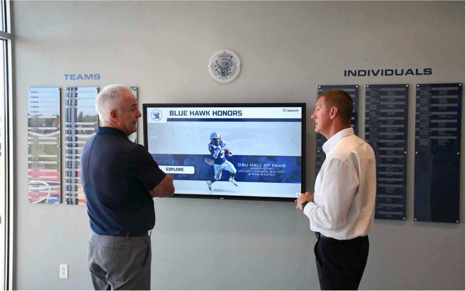
Visitors navigating a digital hall of fame by keyboard—including those using assistive input devices—depend on a visible, high-contrast focus indicator to track their position across inductee cards, filter controls, and navigation elements
Execution Timeline: Plan, Audit, Fix, Verify
| Phase | Activities | Responsible Party | Cadence |
|---|---|---|---|
| Plan | Inventory all interactive component types across every page template; identify components sourced from third-party embeds or iframes; obtain the platform’s CSS files and search for global outline overrides; confirm which browser versions are in use on any wall-mounted kiosk hardware | IT lead or web administrator | Once at platform launch; once after any major theme upgrade or component library update |
| Audit | Run the seven-step focus appearance audit across home page, index pages, profile pages, search results, and kiosk interface; measure contrast ratios for every focus indicator using DevTools; document findings in the issue log with element type, failure category, and measured contrast value | IT staff or web administrator | At platform launch; before each academic year or induction season; immediately after any CSS deployment that touches color, border, outline, or box-shadow properties |
| Fix | Remove global outline: none overrides; implement site-wide :focus-visible style meeting SC 2.4.11; apply component-specific overrides for dark-background cards, carousel controls, and form inputs; add scroll-margin-top for sticky header clearance; coordinate with video platform vendor for iframe focus styles | Developer or platform vendor | High-priority findings (complete absence of focus indicator) within 48 hours; medium-priority findings (insufficient contrast or area) within 14 days; third-party iframe findings within 30 days or vendor response SLA |
| Verify | Repeat steps 2 through 6 of the audit workflow after each fix deployment; confirm measured contrast ratios meet 3:1; confirm no regression in adjacent components whose styles may have been affected by the global :focus-visible change | IT staff | Immediately after each fix is deployed to the live site |
| Document | Record audit date, page templates tested, findings by component type and failure category, contrast ratios measured, fixes applied with CSS selectors and values, and verification results; retain for accessibility compliance records | Administrative lead | Each audit cycle; retained for three years or the duration of the recognition program’s operation |
Schools comparing recognition platform options before committing to a vendor should ask specifically about SC 2.4.11 compliance and whether the platform’s default theme ships with compliant focus indicators out of the box. The buyer’s guide for athletic directors evaluating digital recognition platforms under budget constraints provides a practical question framework for identifying which platforms address focus appearance as a standard feature versus a post-launch customization requirement.
Recognition programs that honor coaches alongside athletes—programs where coaching staff appear on the same interactive display as player inductees—will find that the same focus appearance requirements apply to every coach profile card, coaching award link, and coaching biography section. The guide to honoring coaches on recognition displays for National Coaches Day and ongoing programs covers display planning for coaching recognition that can be integrated with the same hall of fame platform template that carries the athletic inductee archive.
Ready to see a recognition platform with keyboard-accessible focus indicators built into every component from the start?
Rocket Alumni Solutions builds hall of fame platforms with styled focus indicators that meet WCAG 2.2 requirements across inductee cards, video players, and kiosk navigation—so no post-launch audit uncovers a platform-wide focus suppression failure.
Display Integration: Focus Appearance on Web Directories vs. Kiosk Installations
Digital hall of fame platforms commonly serve two interfaces from the same content backend: a public web directory accessible from any device, and a wall-mounted touchscreen kiosk installed in a school lobby, trophy case hallway, or gymnasium entrance. Focus appearance compliance requirements and risks differ between these two surfaces.
Web directory: The full SC 2.4.11 requirement applies to every page in the web directory. Any visitor who accesses the site using only a keyboard—whether due to motor disability, personal preference, or device limitations—depends on a compliant focus indicator to navigate inductee profiles, filter by sport category, and submit nominations. The web directory serves the broadest audience, including alumni, parents, community members, and media visitors, and must meet accessibility standards for all of them.
Kiosk interface: Browser-based kiosk interfaces are touch-first but increasingly accept keyboard input for administrative access and for visitors who bring assistive devices. If the kiosk runs the same HTML template as the web directory, focus appearance fixes applied to the web directory apply to the kiosk automatically. If the kiosk uses a separate template—common in platforms that offer a “kiosk mode” layout with larger cards and simplified navigation—the focus appearance audit must be applied to the kiosk template independently. Schools deploying unlimited-screen recognition installations across multiple school facilities should include each unique kiosk template variant in the audit scope.
QR code entry points: Physical award cases, hallway recognition murals, and trophy display installations frequently include QR codes that link directly to specific inductee profiles on the web directory. A visitor who scans a QR code from a physical display lands on an interior profile page without passing through the home page or index. The profile page’s focus indicators must meet SC 2.4.11 independently of the home page’s compliance status, because QR-entry visitors may be keyboard users who never visited the home page.
Digital wall of fame displays: Schools that operate both a web-accessible recognition archive and a visual wall of fame display—including employee and staff recognition walls alongside athletic hall of fame installations—should ensure that any shared web interface used to browse recognition content across both programs passes the same focus appearance audit. Shared search interfaces and nomination forms carry the same SC 2.4.11 obligation regardless of which recognition program’s content they display.
Donor recognition integrations: Recognition platforms that include a donor recognition component alongside inductee content—programs where donor wall designs bring a giving narrative to the same display that honors athletic inductees—often add interactive donor profile links and giving category filters alongside the athletic hall of fame content. Each interactive element added to the donor recognition section must pass the same focus appearance checks applied to the athletic inductee section; the audit scope expands with every interactive feature added to the platform.
Measurement: Evaluating Focus Appearance Audit Results
After completing the audit and applying remediation, measure outcomes against the following benchmarks.
| Metric | Target | Action if Below Target |
|---|---|---|
| Interactive elements with a visible focus indicator | 100% of all keyboard-focusable elements across all page templates | Run step 1 first (global CSS audit); a single outline: none rule causes systemic failure across all elements |
| Focus indicators meeting the minimum area requirement | 100% of indicators enclose the full bounding box of the focused component | Replace partial indicators (underlines, left-border-only) with full outline styles; replace blurred glows with solid outline or zero-blur box-shadow |
| State-change contrast ratio (focused vs. unfocused) | At least 3:1 for 100% of focus indicators | Increase the contrast difference between the focused and unfocused state; a color-change from light gray to medium gray rarely meets 3:1—use a dark or saturated outline color against a light background, or a bright outline against a dark background |
| Adjacent-color contrast ratio (indicator vs. background) | At least 3:1 for 100% of focus indicators against all adjacent page colors | For components that appear on multiple background colors (dark cards, light page surface), implement a two-color focus indicator (white outline + dark shadow) that contrasts against both surfaces |
| Focused elements not fully obscured by sticky content | 100% of focused elements visible when scrolled into view | Add scroll-margin-top equal to sticky header height to all focusable elements |
| Re-audit after CSS update | All elements pass within 48 hours of any theme or component CSS deployment | Schedule a targeted focus-appearance spot-check as part of every CSS deployment checklist |
| Third-party iframe focus styles confirmed or documented | All video player and widget iframes either pass SC 2.4.11 or have a documented skip mechanism and vendor request in progress | Prioritize replacing unresolvable third-party embeds with accessible custom players that expose their CSS |
The Focus Appearance criterion is measurable and objective: each finding produces a contrast ratio number and a visual area observation that can be confirmed or refuted against the 3:1 and minimum-area standards. Unlike some accessibility criteria that require subjective judgment, SC 2.4.11 audit findings can be documented with precise numerical evidence—measured contrast ratios, CSS selector values, and element bounding-box dimensions—that supports compliance reporting and vendor accountability.
Frequently Asked Questions
What is the difference between WCAG 2.4.7 Focus Visible and WCAG 2.4.11 Focus Appearance?
WCAG 2.4.7 Focus Visible (Level AA, WCAG 2.1) requires only that a keyboard focus indicator be visible—it does not specify how visible, how large, or how contrasted. A one-pixel dotted outline in any color satisfies 2.4.7 as long as it is present. WCAG 2.4.11 Focus Appearance (Level AA, WCAG 2.2) introduces measurable thresholds: the indicator must enclose the full component, have a contrast ratio of at least 3:1 between the focused and unfocused states, and have at least 3:1 contrast against adjacent colors. Organizations that audited against WCAG 2.1 AA and passed 2.4.7 may still fail 2.4.11 because their focus indicator, though technically present, does not meet the size and contrast requirements. Any recognition platform targeting WCAG 2.2 AA compliance must audit specifically against SC 2.4.11.
Does removing outline: none from our stylesheet break our site’s visual design?
Removing a global outline: none without a replacement can cause every interactive element to display the browser’s default focus ring—which is often a blue ring or a dotted black outline that may conflict with the site’s visual identity. The correct approach is not to remove the suppression and accept the default, but to replace the suppression with a site-styled :focus-visible indicator that meets SC 2.4.11 while aligning with the recognition program’s color palette. Using the school’s primary color (navy, maroon, forest green) as the outline color and ensuring it has 3:1 contrast against the page background produces a focus indicator that is both accessible and brand-consistent. The :focus-visible pseudo-class ensures the styled ring appears only for keyboard-initiated focus, not for mouse clicks, so sighted mouse users do not see a focus ring on every click interaction.
Does the focus appearance requirement apply to our hall of fame’s mobile web experience?
Yes. SC 2.4.11 applies to web content regardless of the device type used to access it. Mobile browsers support keyboard navigation via Bluetooth keyboards and switch-access devices; a visitor using a tablet with a connected keyboard navigates by Tab and depends on the same focus indicators as a desktop keyboard user. Additionally, mobile browsers display web pages at varying zoom levels, and a focus indicator that barely meets the minimum area requirement at 100% zoom may fall below the minimum when the page is zoomed. The audit should be performed at the default zoom level, and focus indicator styles should be designed to scale proportionally with the component size when zoom is applied.
Can automated accessibility scanners detect WCAG 2.4.11 failures?
Partially. Automated scanners such as axe DevTools can detect the complete absence of a focus indicator (a 2.4.7 failure) by simulating keyboard focus and checking whether the focus style changes. Some scanners have added limited 2.4.11 checks—verifying that an outline color meets 3:1 contrast against the page background in simple cases. However, automated scanners cannot measure the minimum area requirement reliably (which requires interpreting the rendered indicator size relative to the bounding box), cannot measure state-change contrast on components with animated or image-based backgrounds, and cannot inspect focus styles inside cross-origin iframes. The manual audit workflow in this guide—tabbing through every element and using DevTools to measure contrast ratios—is the only complete method for verifying SC 2.4.11 compliance.
What should we do if our video platform provider says they cannot fix the focus styles inside their iframe?
If the video platform vendor cannot provide a compliant focus indicator inside their embedded player, three options are available. First, replace the third-party embed with an HTML5 <video> element or a self-hosted accessible player (such as Plyr or Able Player) where the host page controls all CSS, including focus styles. Second, use the skip mechanism described in remediation step 7: add a keyboard-accessible “Skip video player” link immediately after the iframe that allows keyboard users to bypass the player entirely. Third, document the limitation in an Accessibility Conformance Report (ACR) as a third-party content exception, noting that the player is provided by an external vendor and that the host organization has formally requested remediation. This documentation supports a good-faith compliance posture while remediation is pending.
How does focus appearance interact with high-contrast mode on Windows?
Windows High Contrast Mode (now called Forced Colors in CSS) overrides custom CSS focus styles, replacing them with system-defined colors from the user’s high-contrast palette. When a Windows user enables High Contrast Mode, the browser applies the @media (forced-colors: active) media query, which causes most custom outline and box-shadow styles to be replaced by system colors. This is generally beneficial: system-defined focus indicators in High Contrast Mode are designed to be highly visible against the system’s color palette. However, some CSS patterns—particularly those that rely on box-shadow for the focus indicator—may not be applied by the system in Forced Colors mode. Add a @media (forced-colors: active) block that explicitly restores the outline for components that rely solely on box-shadow:
@media (forced-colors: active) {
  :focus-visible {
    outline: 3px solid ButtonText;
    outline-offset: 2px;
  }
}
Reusable Artifact: Focus Appearance Audit Checklist (WCAG 2.2 SC 2.4.11)
Copy this checklist before each recognition platform launch, CSS theme deployment, or annual WCAG 2.2 compliance review. Complete each section for every page template type.
Pre-Audit CSS Inspection
- Global stylesheet searched for
outline: none,outline: 0,:focus { outline: none },:focus-visible { outline: none }and any matches documented - Global
:focus-visiblestyle confirmed present and styled (not suppressed) - Component-level focus style overrides identified for carousel controls, card links, filter checkboxes, and form inputs
- Third-party embed CSS identified; vendor contact confirmed for iframe focus style requests
Home Page
- Every navigation link shows a visible focus indicator enclosing the full link text on Tab focus
- Carousel navigation buttons (previous, next, dot indicators) show a focus indicator meeting minimum area
- Carousel focus indicator has ≥3:1 contrast against the carousel background in all color zones of the hero image
- Search input field shows a visible focus indicator on Tab focus; indicator has ≥3:1 contrast against field background
- Featured inductee card links show a focus indicator on Tab focus; indicator encloses the full card or link element
Index and Filter Pages
- Sport-category filter checkboxes show a focus indicator on Tab focus
- Filter accordion toggle buttons show a focus indicator on Tab focus
- Year-range or era-picker controls show a focus indicator; picker exit tested (Escape closes; focus returns)
- Every inductee card link in the results grid shows a focus indicator enclosing the full card or link element
- All focus indicators on index pages have ≥3:1 state-change contrast (focused vs. unfocused)
- All focus indicators have ≥3:1 contrast against the adjacent card background color
Profile Pages
- Video tribute player controls (inside iframe) show a visible focus indicator on Tab focus; if not, skip mechanism is present and documented
- Photo gallery lightbox trigger shows a focus indicator; lightbox close button shows a focus indicator
- Biography accordion toggle shows a focus indicator; expanded content links show focus indicators
- Social sharing button(s) show a focus indicator enclosing the full button
- Nomination form link or modal trigger shows a focus indicator
- Related inductee card links show focus indicators; indicators contrast against the card background
Search Results Pages
- Inductee card links across all result rows show identical, compliant focus indicators (template-level compliance)
- Active filter chip controls (clear filter buttons) show focus indicators
- Pagination controls show focus indicators
Kiosk Interface (if separate template)
- Kiosk navigation menu items show focus indicators on Tab focus
- Kiosk inductee card links show focus indicators
- Kiosk sport-category navigation buttons show focus indicators
- Any kiosk-specific modal or dialog shows a focus indicator on its interactive controls
Contrast Measurement
- State-change contrast (focused vs. unfocused) measured at ≥3:1 for all unique focus indicator styles
- Adjacent-color contrast measured at ≥3:1 for all unique focus indicator styles against all background colors in their component context
- Contrast measurements documented with specific hex values and ratio results for compliance records
Obscuring Content
- Sticky navigation header height measured;
scroll-margin-topset to match on all focusable elements - No focused element completely hidden behind sticky bar, cookie banner, or floating filter panel
- Test performed by tabbing through elements in a viewport where the sticky header is visible
Post-Fix Verification
- All previously flagged absence-of-indicator findings resolved; Tab focus produces a visible indicator on each element
- All previously flagged contrast failures resolved; re-measured ratios confirmed at ≥3:1
- No regressions in mouse-click behavior (
:focus-visiblescoping confirmed; rings do not appear on mouse clicks) - Tested in Chrome (Windows), Firefox, and Safari
- Forced Colors mode test completed on Windows:
outlinestyle appears correctly in High Contrast Mode
Connecting the Focus Appearance Audit to the Full Accessibility Workflow
A focus appearance audit is one layer of a complete digital hall of fame accessibility verification workflow. Schools that have completed this audit should pair it with adjacent accessibility checks that address related WCAG criteria at the page and platform levels.
A keyboard trap audit confirms that every component on the hall of fame site—video players, modals, filter accordions—allows keyboard focus to both enter and exit; a passing focus appearance audit does not guarantee that focus can leave a component, only that the indicator is visible while focus is inside it. A duplicate ID accessibility audit confirms that the HTML identifiers used by focus management scripts (which look up elements by ID to move focus on modal open/close) resolve to the correct elements. An ARIA landmark audit confirms that keyboard users navigating by region (using screen-reader shortcut keys to jump between page sections) can reach every content area, supplementing the Tab-key navigation that focus appearance depends on. The WCAG 2.2 AA compliance guide provides a full cross-criterion audit map for schools working toward comprehensive WCAG 2.2 AA conformance.
For recognition programs that are building out new display installations as part of campus-wide recognition initiatives—programs that may pair digital hall of fame kiosks with gymnasium wall graphics and broader athletic space recognition displays—the focus appearance audit should be included in the launch checklist for any browser-based display interface alongside the physical installation timeline.

Recognition programs that serve alumni, community members, and visitors across ability levels demonstrate their values through accessible interactive displays—a focus appearance audit ensures every keyboard user can navigate the inductee archive with the same confidence as any other visitor
Schools expanding recognition programs to include multiple categories—athletics, academics, fine arts, performing arts, community service—generate more interactive filters, more inductee card types, and more specialized profile page layouts with each category added. Each new component type and each new page template added to accommodate a recognition category must be included in the next focus appearance audit cycle. The checklist in this guide is category-neutral and applies to any interactive element on any page, regardless of the recognition program category it serves.
Recognition programs for school communities that span generations of alumni—from current students to retirees honoring coaches and teachers from decades past—serve a user population whose accessibility needs are diverse. Keyboard accessibility, and the focus indicator visibility that makes it navigable, is not a niche requirement. It serves alumni navigating on assistive devices, parents on unfamiliar library computers, and community members on devices without precise pointer control. A focus appearance audit that takes under two hours using only a browser and a keyboard protects the recognition experience for every one of those visitors.
See Rocket Alumni Solutions’ WCAG 2.2-Compliant Hall of Fame Platform in Action
Request a live demonstration to see how Rocket’s recognition platform delivers accessible keyboard focus indicators across inductee cards, video tribute players, sport-category filters, and kiosk navigation—meeting WCAG 2.2 SC 2.4.11 requirements without post-launch patching.
Live Example: Rocket Alumni Solutions Touchscreen Display
Interact with a live example (16:9 scaled 1920x1080 display). All content is automatically responsive to all screen sizes and orientations.