


A digital hall of fame ARIA-orientation audit is the process of examining every tabbed navigation component on your school’s recognition website and touchscreen kiosk—sport-category tab strips, inductee-profile section tabs, award-type tab selectors, and any composite widget that groups inductee content behind a row or column of tabs—to verify that each tablist element correctly declares aria-orientation="horizontal" or aria-orientation="vertical" and that the keyboard arrow-key behavior implemented in JavaScript matches the declared orientation. The aria-orientation attribute tells supporting screen readers (NVDA, JAWS, VoiceOver, TalkBack) and keyboard handlers which axis the widget operates along: a horizontal tablist expects Left Arrow and Right Arrow to move between tabs; a vertical tablist expects Up Arrow and Down Arrow. When the declared orientation does not match the actual keyboard behavior—or when aria-orientation is missing and the default assumption conflicts with the visual layout—a keyboard-only visitor may press arrow keys in the expected direction and receive no response, while a screen-reader user receives incorrect directional guidance about how to navigate the tab strip. A digital hall of fame ARIA-orientation audit maps every tabbed navigation component on the recognition platform to a clear pass, remediate, or not-applicable decision, so that blind alumni, parents with visual impairments, and community members who rely on keyboard navigation or assistive technology receive the same efficient, predictable tab-switching experience as every other visitor.
Tabbed navigation is among the most common interaction patterns on digital hall of fame platforms. Sport-category tabs allow visitors to filter the inductee roster to a single sport without a page reload. Section tabs inside an inductee profile page organize career statistics, awards, media, and biographical text into discrete panels. Award-type tabs on a recognition archive page separate academic honors from athletic honors and arts honors. In every case, the tab strip is a composite widget: it contains multiple tab elements under a shared tablist container, and that container’s orientation determines which arrow keys keyboard users and screen readers expect to use.
When aria-orientation is correctly implemented and matches the JavaScript key-handler, a visitor using NVDA can navigate an entire inductee category selection—football, basketball, track and field, baseball—using only Left Arrow and Right Arrow without leaving the tab strip. When it is missing or mismatched, arrow key presses either produce no movement or move focus to the wrong element, forcing the visitor to discover the correct key through trial and error or abandon the navigation entirely.

Tabbed navigation on a digital hall of fame platform organizes inductee content by sport, award type, or profile section—aria-orientation is the attribute that tells screen readers and keyboard handlers which arrow keys govern movement between tabs
Program Snapshot: ARIA-Orientation Audit Scope for School Hall of Fame Platforms
Define the full audit scope before opening any tools. The table below covers schools at every stage of digital recognition implementation.
| Planning Element | Details |
|---|---|
| Primary Audience | Athletic directors, IT administrators, school web managers, accessibility compliance leads, and recognition-program owners who maintain web-based or touchscreen inductee displays with tabbed navigation components |
| What Is Being Audited | Every role="tablist" element on the recognition platform: sport-category tab strips on the roster index page, section tabs inside inductee profile pages (Career / Awards / Media tabs), award-type tabs on recognition archive pages, and any composite tab widget delivered through the platform’s component library |
| WCAG Criteria | 4.1.2 Name, Role, Value — Level A; 2.1.1 Keyboard — Level A; 1.3.1 Info and Relationships — Level A |
| Tools Required | Chrome or Firefox with DevTools Accessibility panel, NVDA (Windows, free) or VoiceOver (macOS, built-in), the axe DevTools browser extension, a keyboard without a mouse for interaction testing |
| Time Investment | 20–40 minutes for an initial audit of all tab components; 10 minutes for a targeted re-check after any tab component, CSS layout, or JavaScript key-handler update |
| Failure Consequence — aria-orientation Missing (Horizontal Default Assumed) | If the tablist is visually vertical but the default horizontal assumption is used, screen readers may direct users to press Left/Right Arrow when Up/Down Arrow is the correct key—arrow presses in the expected direction produce no tab switch |
| Failure Consequence — aria-orientation Declared But Key-Handler Mismatched | aria-orientation=“vertical” declared but the JavaScript handler responds to Left/Right Arrow instead of Up/Down Arrow; screen reader announces vertical orientation while the keys that actually work are the horizontal keys |
| Failure Consequence — Responsive Orientation Change Not Reflected | Platform switches the tab strip from horizontal (desktop viewport) to vertical (mobile viewport) through CSS but does not update aria-orientation dynamically; the declared orientation is incorrect on one or both viewport sizes |
| Pass Condition | Every tablist element carries aria-orientation with the value that matches its visual axis and its JavaScript arrow-key handler; Left/Right Arrow navigates a horizontal tablist; Up/Down Arrow navigates a vertical tablist; verified in at least two screen reader and browser combinations on both desktop and mobile viewport widths |
| ADA Relevance | Public school recognition websites and kiosk displays serving alumni, parents, and community members carry digital accessibility obligations; WCAG 4.1.2 Level A requires that all UI components expose accurate name, role, and value through the accessibility API, which includes orientation state for composite widgets |
What Is aria-orientation and Why Does It Matter for Inductee Tab Navigation?
aria-orientation is a WAI-ARIA state property defined in the WAI-ARIA 1.2 specification that indicates whether a composite widget operates along a horizontal or vertical axis. Accepted values are horizontal, vertical, and the implicit default undefined (which most assistive technologies interpret as horizontal for tablists). The attribute is placed on the container element—the element with role="tablist"—not on individual tab elements.
The attribute matters for two distinct audiences simultaneously:
Keyboard users rely on JavaScript key-handlers to know which arrow keys move focus between tabs. The WAI-ARIA Authoring Practices Guide Tabs pattern specifies that a horizontal tablist should respond to Left Arrow (move to previous tab) and Right Arrow (move to next tab), while a vertical tablist should respond to Up Arrow (move to previous tab) and Down Arrow (move to next tab). A visitor who uses only a keyboard follows these conventions instinctively. When the key-handler does not match the visual layout, the visitor presses the wrong arrow key and receives no response—a silent failure that gives no indication of what the correct key might be.
Screen-reader users receive orientation announcements from their assistive technology. NVDA and JAWS read aria-orientation when focus enters a composite widget and may announce directional guidance such as “use left and right arrow keys to navigate” for a horizontal tablist. When aria-orientation is absent or set to the wrong value, screen readers either announce incorrect navigation instructions or omit directional guidance entirely, leaving the visitor to discover the correct keys through trial and error.
Three elements must align for a tab component to pass an ARIA-orientation audit:
Element 1 — The correct role hierarchy. Each tab strip must use role="tablist" on the container, role="tab" on each tab button, and role="tabpanel" on each associated panel. The aria-controls attribute on each tab must reference the id of its associated panel. The aria-selected="true" attribute must be present on the active tab and aria-selected="false" on all inactive tabs. Without this role structure, aria-orientation has nothing meaningful to modify.
Element 2 — The correct aria-orientation value. A tablist in which tabs are arranged left to right in a single row requires aria-orientation="horizontal". A tablist in which tabs are stacked top to bottom in a single column requires aria-orientation="vertical". A tablist that responds to the browser’s default horizontal orientation through a component library that explicitly sets the default may omit the attribute—but explicit declaration is strongly recommended to make the intent auditable and to guard against future component updates that might change the default.
Element 3 — The matching JavaScript key-handler. The key-handler attached to the tablist must respond to Left Arrow and Right Arrow for a horizontal tablist, or Up Arrow and Down Arrow for a vertical tablist. The handler should also respond to Home (move to first tab) and End (move to last tab) per the ARIA APG recommendation, and should wrap focus from the last tab to the first and from the first to the last when the visitor presses the arrow key that would otherwise exit the tab strip.
A comprehensive hall of fame accessibility checklist addresses tab orientation alongside landmark regions, focus management, and color contrast—treating the tab component as one element in a broader accessibility audit rather than an isolated check.
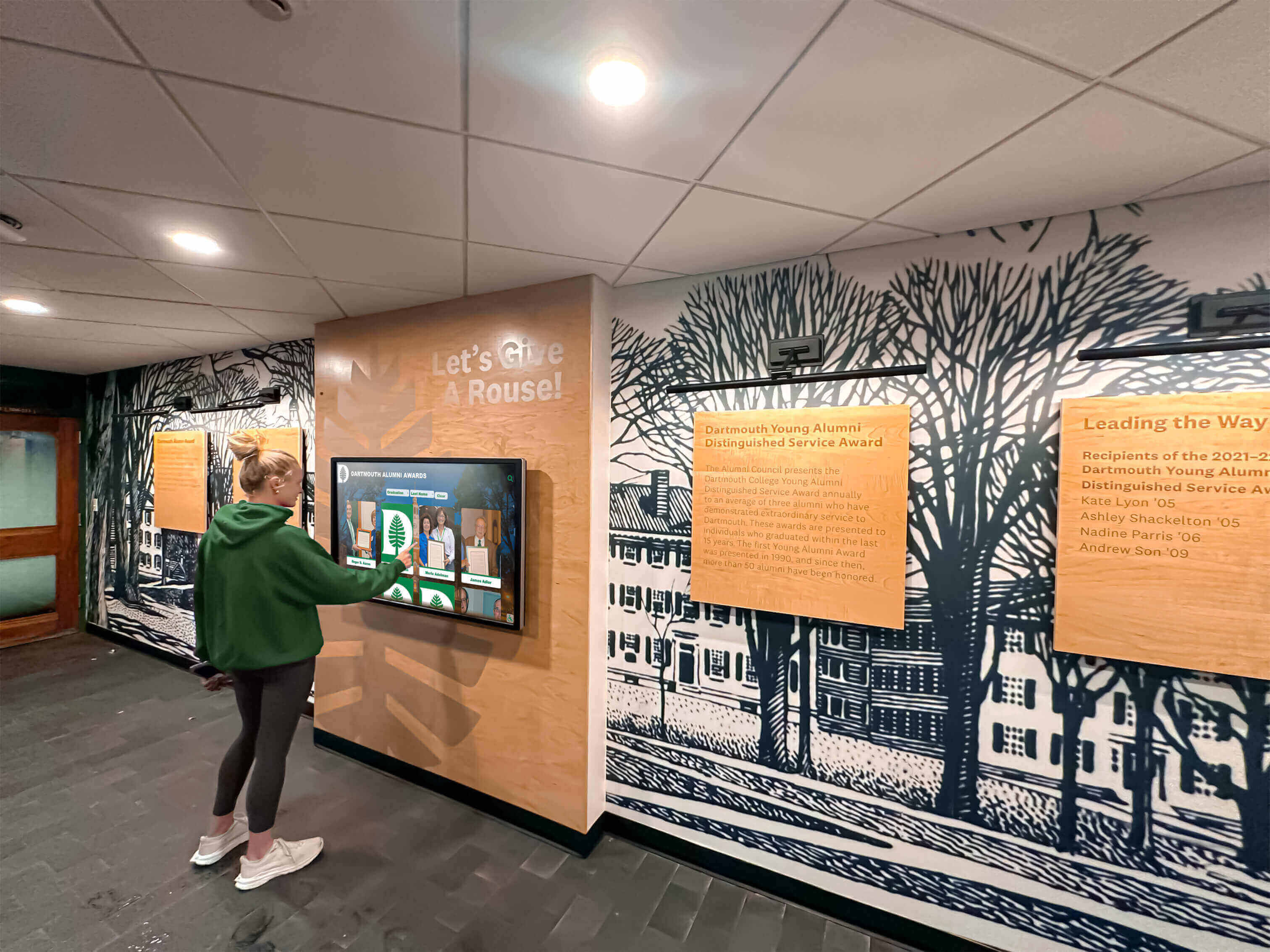
Students and alumni who navigate a digital hall of fame by keyboard or assistive technology depend on aria-orientation to know which arrow keys move between sport-category tabs, profile section tabs, and award-type selectors
Content Architecture: Tablist Types and aria-orientation Decision Table
The central output of a digital hall of fame ARIA-orientation audit is a pass, remediate, or not-applicable decision for every tablist on the recognition platform. The table below covers the tab component types most commonly found on school recognition platforms.
| Tab Component | Visual Layout | aria-orientation Required | Correct Value | Arrow Keys That Must Work | Common Finding |
|---|---|---|---|---|---|
| Sport-category tab strip (roster index) | Horizontal — tabs arranged left to right | Recommended (default applies, but explicit is auditable) | horizontal | Left Arrow / Right Arrow | Attribute absent; screen reader defaults to horizontal correctly but no explicit declaration; Left/Right keys work but Home/End not handled |
| Inductee profile section tabs (Career / Awards / Media) | Horizontal on desktop, vertical on narrow mobile viewport | Required — orientation changes with viewport | horizontal on desktop; aria-orientation must update to vertical on mobile | Left/Right on desktop; Up/Down on mobile | CSS changes layout but JavaScript handler not updated; horizontal keys still work on mobile while vertical layout is in use |
| Award-type filter tabs (Athletic / Academic / Arts) | Horizontal | Recommended | horizontal | Left Arrow / Right Arrow | aria-orientation="vertical" incorrectly applied to a horizontal tab strip; Up/Down arrows announced but Left/Right arrows are the working keys |
| Class-year selector tabs (2010 / 2015 / 2020 / 2025) | Horizontal | Recommended | horizontal | Left Arrow / Right Arrow | Tabs rendered as <div> elements with click handlers; no role="tablist", role="tab", or role="tabpanel"; aria-orientation cannot be evaluated because role structure is absent |
| Inductee profile vertical side-tab navigation (desktop sidebar) | Vertical — tabs stacked in a column on the left side of the profile page | Required | vertical | Up Arrow / Down Arrow | aria-orientation absent; assistive technology defaults to horizontal; visitor presses Right Arrow expecting to navigate down the tab column; nothing happens |
| Kiosk touchscreen sport-selector tabs | Horizontal (large-format kiosk display) | Recommended | horizontal | Left Arrow / Right Arrow (for switch-access or external keyboard users) | Tab strip implemented as touch-only component; no keyboard support at all; aria-orientation not present because key-handler is absent |
| Nested tabs inside inductee dialog (Career Stats sub-tabs) | Horizontal | Required — separate tablist for each level | horizontal on each inner tablist | Left/Right on each inner tablist independently | Outer tablist has correct orientation; inner tablist inherits outer key-handler rather than having its own; Up/Down Arrow from outer list captures events inside inner list |
| Accessible name on tablist | N/A — relates to aria-label or aria-labelledby | Required alongside orientation | N/A | N/A | Tablist has correct orientation but is not labeled; screen reader announces “tablist” with no context about what the tabs organize (sport categories, profile sections, or award types) |
The last row in the table highlights an important companion requirement: aria-orientation should always appear alongside an accessible name on the tablist element. A tablist labeled “Sport Categories” with aria-orientation="horizontal" communicates both what the tabs organize and how to navigate them. An unlabeled tablist with correct orientation leaves the screen-reader user knowing how to move between tabs but not what the tabs organize.
Auditing how a digital hall of fame handles aria-multiselectable in filter lists is a related accessibility check: filter lists that allow multiple sport selections use a different pattern than tab strips, and mixing tab semantics with listbox semantics is a common source of both aria-orientation and aria-multiselectable errors on recognition platforms.
Execution Timeline: Plan → Build → Launch → Refresh
Step 1 — Inventory All Tablist Elements
Open the recognition platform in Chrome or Firefox. In DevTools Elements panel, use Ctrl+F to search for role="tablist". For each tablist found, record: the element’s tag (<div>, <ul>, <nav>), the current aria-orientation value (if any), the accessible name (aria-label or aria-labelledby value), the count of child role="tab" elements, and the visual layout direction (horizontal or vertical). Open the computed Accessibility panel in DevTools for each tablist to confirm the browser’s computed accessible name and orientation property.
Also search for tablist implementations that do not use role="tablist" explicitly—some component libraries render tabs using <ul> and <li> elements without ARIA roles, or as <div> elements with click-only handlers. These implementations are failures on two levels: the role structure is absent, and aria-orientation cannot be evaluated because the tablist role is not declared.
Step 2 — Classify Each Tablist’s Visual Orientation
For each tablist in the inventory, determine its visual orientation. A tab strip is horizontal when the tab buttons are arranged side by side in a single row and a visitor naturally reads them left to right. It is vertical when the tab buttons are stacked in a column and a visitor reads them top to bottom.
Check for responsive layout behavior. Resize the browser window from a wide desktop viewport (1280px or wider) to a narrow mobile viewport (375px). Observe whether the tab strip changes orientation through CSS. If it does, record both orientations and note the breakpoint at which the change occurs. A tab strip that changes visual orientation must change its aria-orientation value at the same breakpoint.
Step 3 — Verify aria-orientation Value Against Visual Layout
For each tablist:
- If the tablist is visually horizontal and
aria-orientationis absent: the default applies and screen readers interpret it as horizontal. Record as Pass with a note to add explicit declaration for maintainability. - If the tablist is visually horizontal and
aria-orientation="horizontal"is present: record as Pass. - If the tablist is visually horizontal and
aria-orientation="vertical"is present: record as Remediate — incorrect orientation value (horizontal layout with vertical declaration). - If the tablist is visually vertical and
aria-orientationis absent: screen readers default to horizontal, which is incorrect. Record as Remediate — missing aria-orientation on vertical tablist. - If the tablist is visually vertical and
aria-orientation="vertical"is present: record as Pass. - If the tablist is visually vertical and
aria-orientation="horizontal"is present: record as Remediate — incorrect orientation value (vertical layout with horizontal declaration).
Step 4 — Test the JavaScript Arrow-Key Handler
For each tablist, test the arrow-key handler using a keyboard without a mouse:
Tab to the first tab in the tablist. Confirm that Tab key moves focus to the tab—not inside the tabpanel content. Once focus is on a tab:
- For a declared or expected horizontal tablist: press Right Arrow. Focus should move to the next tab and the next panel should become active. Press Left Arrow. Focus should return to the previous tab. Press Right Arrow repeatedly from the last tab: focus should wrap to the first tab (or stop at the last tab if wrapping is not implemented—record whether wrapping is present). Press Home: focus should move to the first tab. Press End: focus should move to the last tab.
- For a declared vertical tablist: press Down Arrow. Focus should move to the next tab. Press Up Arrow. Focus should return to the previous tab. Apply the same Home/End and wrap checks.
If the arrow keys that produce movement do not match the declared aria-orientation, record as Remediate — key-handler and orientation declaration mismatch.
Step 5 — Test Responsive Orientation Switching
If the audit identified a tab strip that changes visual orientation at a CSS breakpoint, repeat the arrow-key test at the mobile viewport width. Resize the browser to 375px width. Tab to the first tab. Press the arrow keys appropriate for the current visual layout (Up/Down if the strip is now vertical). If the handler still responds to Left/Right Arrow while the visual layout is vertical, record as Remediate — responsive orientation mismatch (orientation and key-handler not updated at breakpoint).
Inspect the aria-orientation attribute at the mobile viewport width in DevTools. Confirm the attribute value has changed to match the new visual orientation. If the attribute value has not changed, record as Remediate — aria-orientation not updated on viewport resize.
Step 6 — Verify Accessible Name on Each Tablist
For each tablist, confirm the presence of an accessible name using DevTools Accessibility panel. A well-named tablist will show a non-empty “Accessible Name” in the panel, derived from aria-label on the tablist element (for example, aria-label="Sport Categories") or from aria-labelledby referencing an adjacent visible heading.
An unlabeled tablist is not a WCAG failure at Level A, but the ARIA Authoring Practices Guide strongly recommends accessible names on tablists to help screen-reader users understand the tabs’ purpose. Record unlabeled tablists as a Recommendation alongside Pass or Remediate classification for orientation.
Step 7 — Screen Reader Navigation Test
Enable NVDA in Chrome on Windows. Tab to the first tab in a sport-category tab strip. NVDA should announce the tab’s name, its role (“tab”), its selected state (“selected” for the active tab), and its position (“1 of 5” or similar, using aria-posinset and aria-setsize if implemented). Press Right Arrow. NVDA should announce the next tab’s name, role, and selected state. Confirm that NVDA does not announce any directional guidance that contradicts the visual layout.
If the tablist is labeled, NVDA typically announces the tablist’s name when focus first enters the tab strip. Confirm this announcement matches the expected tablist label.
Enable VoiceOver on macOS. Navigate to the tablist. Use VO+Right Arrow to move through the interface and press Left/Right Arrow once focus is on a tab. Confirm VoiceOver announces tab navigation correctly and does not announce directional instructions that conflict with the arrow keys that actually work.
Auditing how a digital hall of fame communicates busy state during tab panel content loading is a complementary check: when a tab switch triggers a data load for the new panel, aria-busy="true" on the panel communicates that the content is still loading—preventing screen readers from reading an empty or incomplete panel before the inductee data has arrived.
Step 8 — Run axe DevTools for Structural Verification
With the inductee platform loaded in its default state (first tab active), run the axe DevTools browser extension. Review results for violations in the categories: ARIA Required Attributes (checks for tabs missing aria-selected, tablists missing required role structure), ARIA Valid Attribute Value (checks for invalid aria-orientation values), and Keyboard (flags interactive elements not reachable by Tab). Document violations alongside manual findings.
Switch to a different tab using the keyboard. Run axe again with the new tab active to confirm the aria-selected update is correctly reflected and no new violations appear.
Step 9 — Document and Assign Remediation
For each tablist that fails the audit, document: the element’s selector or aria-label, the page URL and viewport size at which the failure occurs, the specific failure (absent aria-orientation on vertical tablist, mismatched orientation and key-handler, responsive update missing, role structure absent), the WCAG criterion and ARIA specification reference, and the recommended fix. Pass documented findings to the platform vendor or IT team responsible for the tab component.
Common fixes:
- Add
aria-orientation="vertical"to the tablist element for any tab strip whose tabs are stacked in a column - Add
aria-orientation="horizontal"explicitly to all horizontal tablists to make the intent auditable - Update the JavaScript key-handler to listen for Up Arrow / Down Arrow in addition to or instead of Left Arrow / Right Arrow for vertical tablists
- Add a ResizeObserver or media-query JavaScript listener that updates both
aria-orientationand the key-handler binding when the viewport crosses the CSS breakpoint that changes the tab strip’s visual layout - Add
role="tablist",role="tab", androle="tabpanel"to any tab-like navigation that currently uses only click handlers on<div>or<li>elements
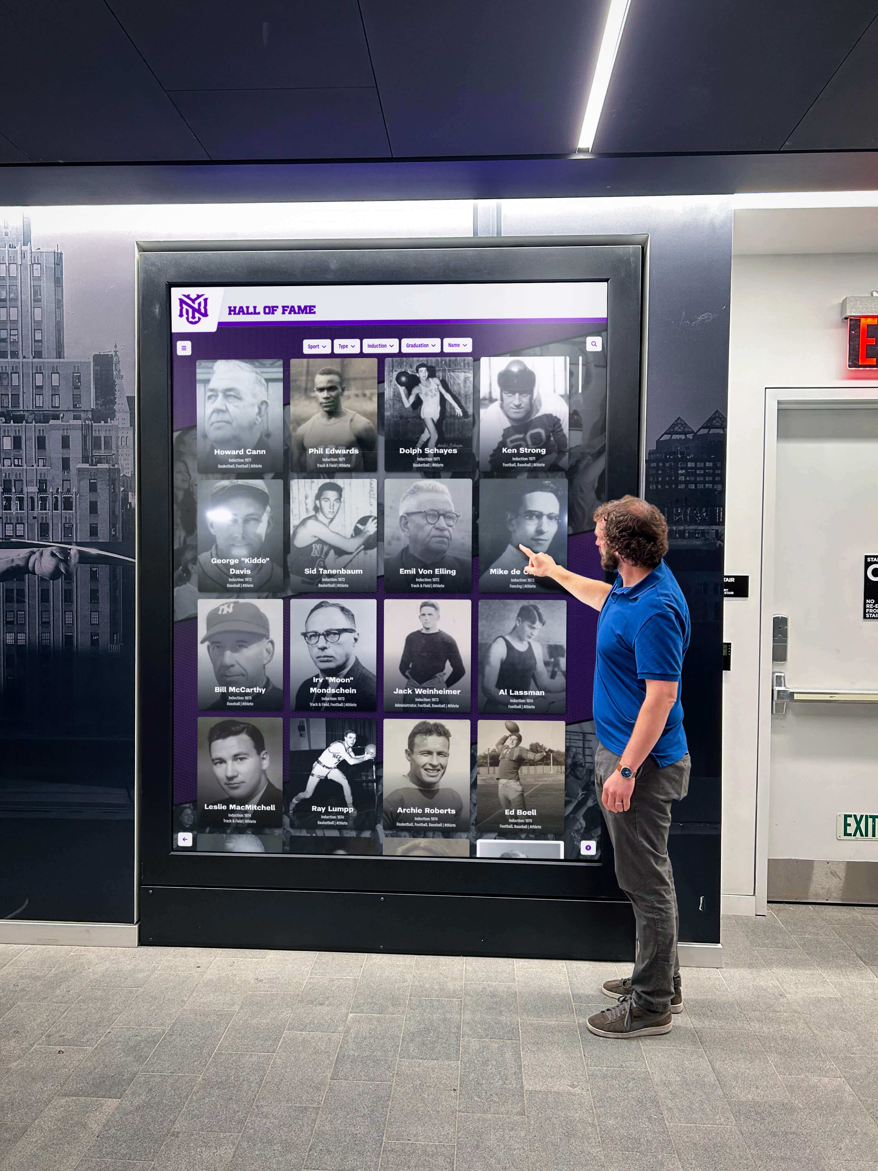
Community members exploring a school's inductee collection through tabbed navigation rely on the correct aria-orientation declaration and matching arrow-key behavior to move efficiently between sport categories, profile sections, and award types
Display Integration: Tab Orientation Across Web Directory and Kiosk Interfaces
A digital hall of fame platform that serves both a web directory and a physical kiosk typically shares a single tab component library. An aria-orientation implementation that passes the web directory audit propagates to the kiosk automatically when both environments use the same component. Schools should confirm with their platform vendor whether the kiosk interface uses the same shared tab component or a separate implementation optimized for touch.
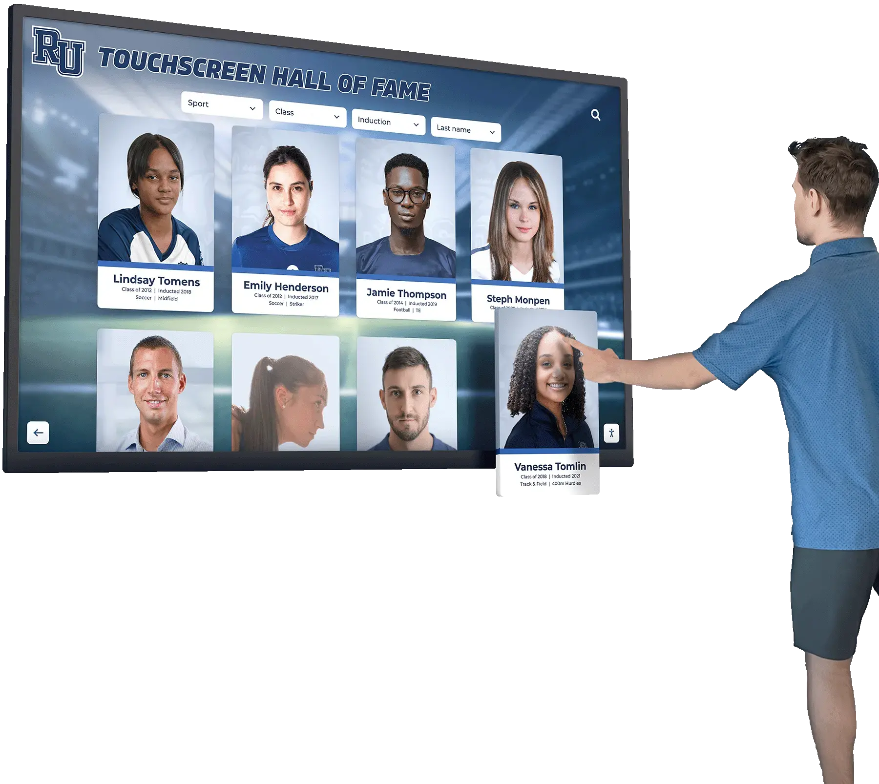
Kiosk tab strips are frequently simplified for large-screen touch interaction: fewer tabs, larger tap targets, and sometimes a scrolling horizontal tab strip rather than a fixed tab row. These simplified implementations are a common source of aria-orientation failures because the kiosk version of the component is developed separately from the web version and may not carry the ARIA role structure or orientation declaration that the web version includes. If the kiosk interface uses a dedicated touch-only tab component, the ARIA-orientation audit must be run independently for the kiosk.
Switch-access users—visitors who navigate using sip-and-puff devices, head-tracking inputs, or single-switch scanning systems connected to the kiosk via USB or Bluetooth—navigate using Tab and Enter, not touch. For these visitors, the kiosk’s tab strip must support keyboard navigation with correct arrow-key behavior, regardless of how typical touch visitors interact with the display. A kiosk tab strip that is touch-only is inaccessible to switch-access users even if the touch experience is excellent.
Reviewing the best hall of fame tools available for school recognition programs involves evaluating whether each tool’s tabbed navigation components are built with correct ARIA semantics—including orientation—or whether accessibility is a post-purchase customization. A platform that ships with correct aria-orientation declarations and matching key-handlers requires no accessibility rework after deployment; a platform that ships with click-only tab implementations requires remediation at the component layer, which is typically more complex than content-layer changes.
Rocket Alumni Solutions’ recognition platform delivers tab components with explicit aria-orientation declarations, correct role hierarchies (role="tablist" / role="tab" / role="tabpanel"), and JavaScript key-handlers that match the declared orientation. On responsive layouts where the sport-category tab strip transitions from horizontal to vertical at mobile breakpoints, the platform’s component library updates aria-orientation and the arrow-key binding at the same breakpoint threshold, so keyboard and screen-reader behavior is consistent with the visual layout at every viewport width.
See Accessible Tabbed Inductee Navigation in a Live Demo
Request a walkthrough of Rocket Alumni Solutions’ recognition platform to see how sport-category tabs, inductee profile section tabs, and award-type selectors implement aria-orientation, correct role structure, and keyboard arrow-key navigation — so every visitor can move through inductee content efficiently, regardless of how they interact with the display.
Reusable Audit Checklist: Digital Hall of Fame ARIA-Orientation Audit
Copy this checklist into your accessibility tracking system. Mark each item as Pass, Remediate, or N/A.
Inventory
- All
role="tablist"elements on the platform identified and listed in the audit inventory - Each tablist’s visual orientation (horizontal or vertical) recorded at desktop and mobile viewport widths
- Tab components lacking
role="tablist"identified and flagged for role structure remediation (noaria-orientationcheck is possible without the role)
Per Tablist — aria-orientation
- Visually horizontal tablist:
aria-orientation="horizontal"present or confirmed as default (explicit declaration recommended) - Visually vertical tablist:
aria-orientation="vertical"explicitly declared -
aria-orientationvalue matches the visual layout axis at every viewport width where the tablist appears - Responsive layout change:
aria-orientationupdated dynamically when CSS breakpoint changes the tab strip from horizontal to vertical or vice versa
Per Tablist — Role Structure
-
role="tablist"present on the container element -
role="tab"present on every tab button within the tablist -
role="tabpanel"present on every panel associated with a tab -
aria-selected="true"on the active tab;aria-selected="false"on all other tabs -
aria-controlson each tab references theidof its associated panel (oraria-labelledbyon each panel references theidof its controlling tab) - Accessible name present on the tablist element (
aria-labeloraria-labelledby)
Per Tablist — Keyboard Behavior
- Horizontal tablist: Right Arrow moves focus to next tab; Left Arrow moves focus to previous tab
- Horizontal tablist: Left Arrow at first tab wraps to last tab (or stops without error); Right Arrow at last tab wraps to first tab (or stops without error)
- Vertical tablist: Down Arrow moves focus to next tab; Up Arrow moves focus to previous tab
- Vertical tablist: Up Arrow at first tab wraps to last tab; Down Arrow at last tab wraps to first tab
- Home key moves focus to first tab in the tablist
- End key moves focus to last tab in the tablist
- Tab key moves focus from the tablist to the next focusable element (not to the next tab within the tablist)
- Shift+Tab moves focus from the active tab to the element before the tablist in the DOM order
Screen Reader Verification
- NVDA + Chrome: tab name, role, selected state, and position announced correctly on focus; Right/Left (or Up/Down) Arrow navigates between tabs with correct announcements; panel content announced after tab activation
- VoiceOver + Safari: tab name and role announced; arrow key navigation works; tablist accessible name announced on entry
- axe DevTools: no ARIA Required Attributes violations (missing
aria-selected, missing panel role); no ARIA Valid Attribute Value violations (invalid orientation value); no Keyboard violations
Regression Checks
- After any tab component or CSS layout update: re-verify
aria-orientationvalue and arrow-key behavior at all affected viewport widths - After any JavaScript framework or component library upgrade: re-verify that
aria-orientationis preserved in the rendered HTML and that key-handler bindings are reattached - After any new tab component type is introduced (e.g., a new inductee profile section): add to inventory and run full checklist for the new tablist
Assistive Technology Test Matrix
Verify each scenario for each tablist on the recognition platform before each recognition season.
| Scenario | Test Action | Expected Behavior | Pass? |
|---|---|---|---|
| Horizontal tablist — Right Arrow | Focus first tab; press Right Arrow | Focus moves to second tab; second panel becomes active; NVDA announces second tab name and “selected” | Confirm |
| Horizontal tablist — Left Arrow | Focus second tab; press Left Arrow | Focus returns to first tab; first panel becomes active | Confirm |
| Horizontal tablist — wrap at end | Focus last tab; press Right Arrow | Focus wraps to first tab (or stops at last tab without error — record which behavior) | Confirm |
| Vertical tablist — Down Arrow | Focus first tab in vertical strip; press Down Arrow | Focus moves to second tab; second panel becomes active | Confirm |
| Vertical tablist — Up Arrow | Focus second tab in vertical strip; press Up Arrow | Focus returns to first tab; first panel becomes active | Confirm |
| Responsive orientation — mobile | Resize to 375px; focus tab strip; press Down Arrow | If strip is now vertical: focus moves to next tab. If strip remains horizontal: Right Arrow is the correct key — record orientation mismatch if Down Arrow has no effect on a visually vertical strip | Confirm |
| Home key | Focus any tab; press Home | Focus moves to first tab in the tablist | Confirm |
| End key | Focus any tab; press End | Focus moves to last tab in the tablist | Confirm |
| Tab key exit | Focus any tab; press Tab | Focus moves to next element after the tablist — not to the next tab within the tablist | Confirm |
| aria-selected update | Activate second tab via keyboard | aria-selected="true" on second tab; aria-selected="false" on first tab in DOM | Confirm |
| NVDA tablist label | Enter NVDA browse mode; navigate to tablist | NVDA announces tablist accessible name (e.g., “Sport Categories”) before announcing first tab | Confirm |
| axe scan — default state | Run axe with first tab active | No ARIA Required Attributes or ARIA Valid Attribute Value violations on tablist or tab elements | Confirm |
| axe scan — second tab active | Switch to second tab; run axe | No new violations; aria-selected correctly reflects active tab | Confirm |
| Nested tablist orientation | Navigate to inner tablist inside inductee dialog | Inner tablist has its own aria-orientation independent of outer tablist; inner arrow keys navigate inner tabs only | Confirm |
Measurement: Indicators of aria-orientation Compliance Quality
| Signal | Target | How to Measure |
|---|---|---|
| Tablists with explicit aria-orientation declaration | 100% of tablists | Count tablists; count those with explicit aria-orientation; calculate ratio |
| aria-orientation accuracy — desktop viewport | 100% match between declared orientation and visual layout | Compare aria-orientation value to visual tab arrangement at 1280px; flag mismatches |
| aria-orientation accuracy — mobile viewport | 100% match between declared orientation and visual layout at 375px | Resize browser; re-inspect aria-orientation; flag values not updated at breakpoint |
| Key-handler and orientation consistency | Zero tablists with handler/declaration mismatch | Manual keyboard test per tablist; record keys that produce tab movement; compare to declared orientation |
| Tablists with accessible name | 100% of tablists | Count tablists with aria-label or valid aria-labelledby; flag unlabeled instances |
| axe violations — ARIA Required Attributes (tabs) | Zero violations | Run axe per tab component; record violation count |
| axe violations — ARIA Valid Attribute Value (orientation) | Zero violations | Run axe; flag invalid orientation values |
Athletic award data quality audits that reconcile names, titles, dates, and display records ensure that the inductee content behind each tab panel is accurate and consistent. The ARIA-orientation audit ensures that the tab navigation exposing that content is operable by every visitor. Both audits belong on the same pre-season schedule: accurate inductee records in inaccessible tab panels serve fewer visitors than accurate records in accessible panels that every visitor can reach by keyboard.
Frequently Asked Questions
What is the default value of aria-orientation for role=“tablist”?
The WAI-ARIA 1.2 specification defines the implicit value of aria-orientation for role="tablist" as horizontal. When aria-orientation is absent from a tablist element, supporting assistive technologies treat the widget as if aria-orientation="horizontal" were declared. For a tablist that is visually horizontal and uses Left/Right Arrow navigation, the default is correct and explicit declaration is optional—though recommended for maintainability. For a tablist that is visually vertical, the default is incorrect, and aria-orientation="vertical" must be explicitly declared so that screen readers communicate the correct directional navigation to users.
Does aria-orientation affect how the Tab key works inside the tablist?
No. The Tab key behavior in a tablist is independent of aria-orientation. Per the ARIA Authoring Practices Guide Tabs pattern, the Tab key should move focus from the active tab to the active tab’s associated panel—or to the next focusable element after the tablist in the DOM order, depending on the implementation choice. Arrow keys (Left/Right for horizontal, Up/Down for vertical) move focus between tabs within the tablist. aria-orientation controls only which arrow keys are expected to navigate between tabs; it has no effect on Tab, Shift+Tab, Home, or End behavior.
Can a tablist be both horizontal and vertical at the same time?
No. aria-orientation accepts only one value at a time. A tab strip that is visually horizontal should have aria-orientation="horizontal"; a strip that is visually vertical should have aria-orientation="vertical". A responsive layout that changes between the two orientations at a breakpoint must update aria-orientation dynamically at the same breakpoint. There is no value that declares both orientations simultaneously; the attribute reflects the orientation as rendered in the visitor’s current viewport.
Should each nested tablist have its own aria-orientation declaration?
Yes. A tablist nested inside a dialog or another tablist is a separate composite widget and must have its own aria-orientation declaration appropriate to its visual layout. The inner tablist’s key-handler must also be scoped so that arrow-key events inside the inner tablist do not bubble up to the outer tablist’s handler. A common failure in nested tab implementations is that the outer tablist’s key-handler captures Left/Right Arrow events from the inner tablist, causing both the inner and outer tab strips to advance simultaneously when the visitor presses an arrow key inside the inner tablist.
What if the platform uses a third-party component library that sets aria-orientation automatically?
Run the audit against the rendered HTML output, not the component library’s source. Inspect the tablist element in DevTools and confirm the aria-orientation value in the DOM matches the visual layout at each viewport width. If the component library’s automatic value is incorrect—for example, a library that always sets aria-orientation="horizontal" regardless of visual layout—document the finding with the rendered HTML evidence and pass it to the platform vendor. Overriding a component library’s aria-orientation at the template or wrapper level is a common interim fix while the vendor updates the component.
How does aria-orientation interact with aria-activedescendant in a tablist?
Some tablist implementations use aria-activedescendant on the tablist container to track the currently active tab, rather than moving DOM focus to individual tab elements. In this pattern, the tablist element receives keyboard events, and aria-activedescendant points to the id of the currently highlighted tab. The aria-orientation declaration governs which arrow keys advance the aria-activedescendant pointer in this pattern, just as it governs which arrow keys move DOM focus in the focus-moves pattern. Both implementations must update aria-activedescendant (or DOM focus) in response to the arrow keys specified by aria-orientation.
Does the audit need to run after every inductee content update?
No. Adding or removing inductee records changes the content behind tab panels—not the tab component’s role structure or aria-orientation declaration. The audit must run after any change to the tab component’s HTML, CSS layout, or JavaScript key-handler. Content additions through a cloud CMS that update only inductee data do not trigger an accessibility re-audit of the tab component. Schools should schedule the ARIA-orientation audit to run after each platform component update, CSS framework update, or viewport layout change—not after each content cycle.
Connecting Tab Orientation to the Recognition Program Experience
A digital hall of fame organized by sport categories gives every visitor a fast path to the inductees they care about most. A family at a basketball banquet wants to see the basketball inductees without scrolling through football, track and field, and soccer profiles first. A school administrator preparing for an athletic awards night wants to compare the school’s tennis inductee archive against a cross-sport search. Tab navigation is the mechanism that makes these direct paths available without a page reload—and aria-orientation is what makes that mechanism discoverable and operable for visitors who use keyboards or screen readers.
When a keyboard user tabs into the sport-category strip and discovers that Left Arrow and Right Arrow navigate between tabs exactly as expected, the interaction is immediate, efficient, and invisible in the best sense—the visitor is thinking about inductees, not about how the navigation works. When the orientation is wrong or the key-handler is mismatched, the navigation becomes a puzzle: which key works? Does anything move? Is the site broken? These questions interrupt the recognition experience and may cause the visitor to abandon the tab strip entirely and use a slower page-reload navigation path instead.
Evaluating recognition platforms for athletics, donors, and arts programs involves asking vendors whether their tab components are built with correct ARIA semantics from the start or whether accessibility is a customization layer. A platform that ships with correct aria-orientation, matching key-handlers, and explicit accessible names on every tablist delivers a tab navigation experience that is accessible to every visitor from day one—including keyboard-only users, switch-access users, and screen-reader users—without requiring post-deployment remediation at the component level.
The ARIA-orientation audit is a 20–40 minute investment that eliminates a common, silent class of keyboard navigation failures from recognition platforms that use tabbed interfaces. It requires no specialized accessibility tools beyond free browser extensions, built-in screen readers, and DevTools. It produces a documented checklist that can be retained for district-level accessibility compliance records, shared with platform vendors during contract reviews, and updated after each component or layout change.
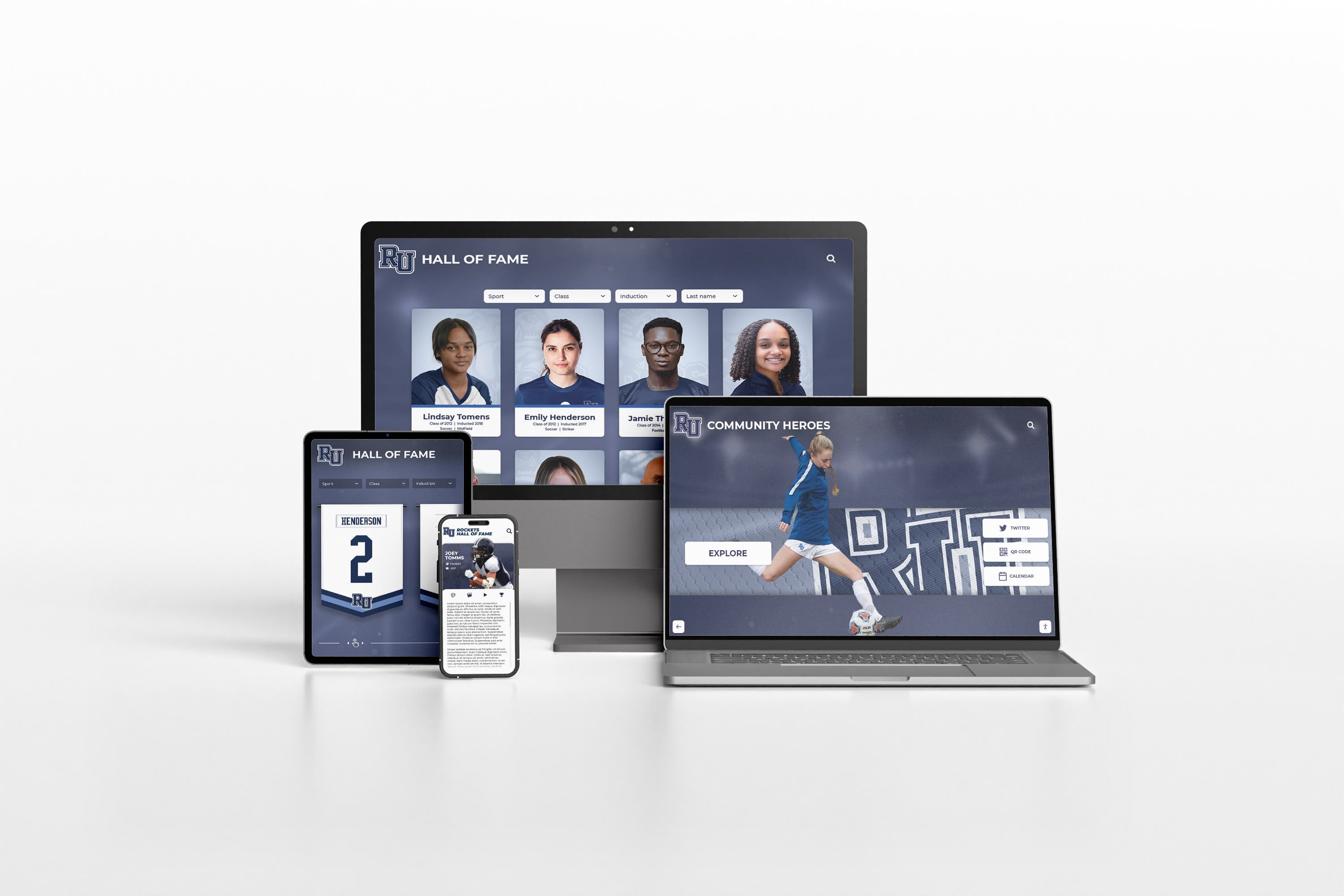
A digital hall of fame ARIA-orientation audit applies at every viewport width where tabbed inductee navigation appears — desktop tab strips, tablet layouts, and mobile vertical stacks must each carry the orientation declaration that matches their visual arrangement and arrow-key behavior
Rocket Alumni Solutions’ digital hall of fame platform delivers tabbed inductee navigation built to WCAG 2.1 AA standards, with every tablist element carrying explicit aria-orientation declarations, correct role hierarchies, matching JavaScript key-handlers, and accessible names that identify the tabs’ purpose for screen-reader users. On responsive layouts, the platform’s component library updates aria-orientation at the same CSS breakpoint that changes the tab strip’s visual axis, so keyboard and assistive-technology behavior is consistent with the visual layout at every viewport width. Schools that need to document WCAG 2.1 AA compliance for district or state accessibility reviews can request the platform’s tab component accessibility documentation and assistive-technology test results as part of the demo process.
Request a Demo of Accessible Tabbed Inductee Navigation
See how Rocket Alumni Solutions implements correctly oriented, keyboard-navigable sport-category tabs, inductee profile section tabs, and award-type selectors — with aria-orientation, role structure, and arrow-key behavior built into every tab component, on every device, at every viewport width.