

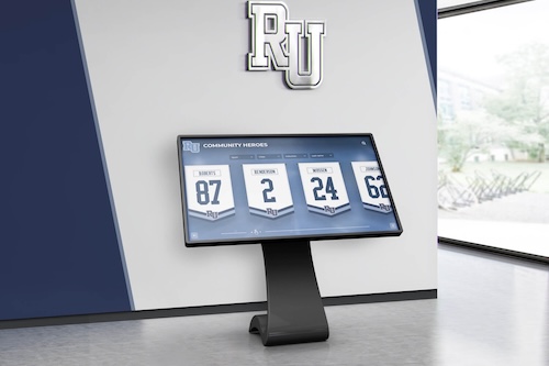
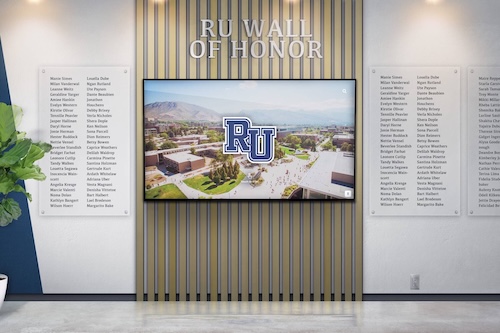
A digital hall of fame ARIA-modal audit is the process of examining every dialog element on your school’s recognition website and touchscreen kiosk—inductee biography overlays, fullscreen media viewers, award-detail panels, and records pop-ups—to verify that each dialog correctly declares aria-modal="true", exposes an accessible name through aria-labelledby, manages keyboard focus on open and close, and traps focus within the dialog boundary while it is visible. The aria-modal="true" attribute tells supporting screen readers (NVDA, JAWS, VoiceOver, TalkBack) to hide background page content from their virtual buffers while a dialog is open, so that a visitor who relies on assistive technology cannot accidentally read or navigate content outside the modal boundary. Without this attribute, a screen-reader user may browse past the inductee biography overlay and into the underlying roster, sponsor ribbon, or site navigation—experiencing the modal as a transparent layer rather than a confined interaction context. A digital hall of fame ARIA-modal audit maps every dialog on the recognition platform to a clear pass, remediate, or remove decision, so that blind alumni, parents with visual impairments, and community members who use assistive technology receive the same focused, unambiguous inductee experience as every other visitor.
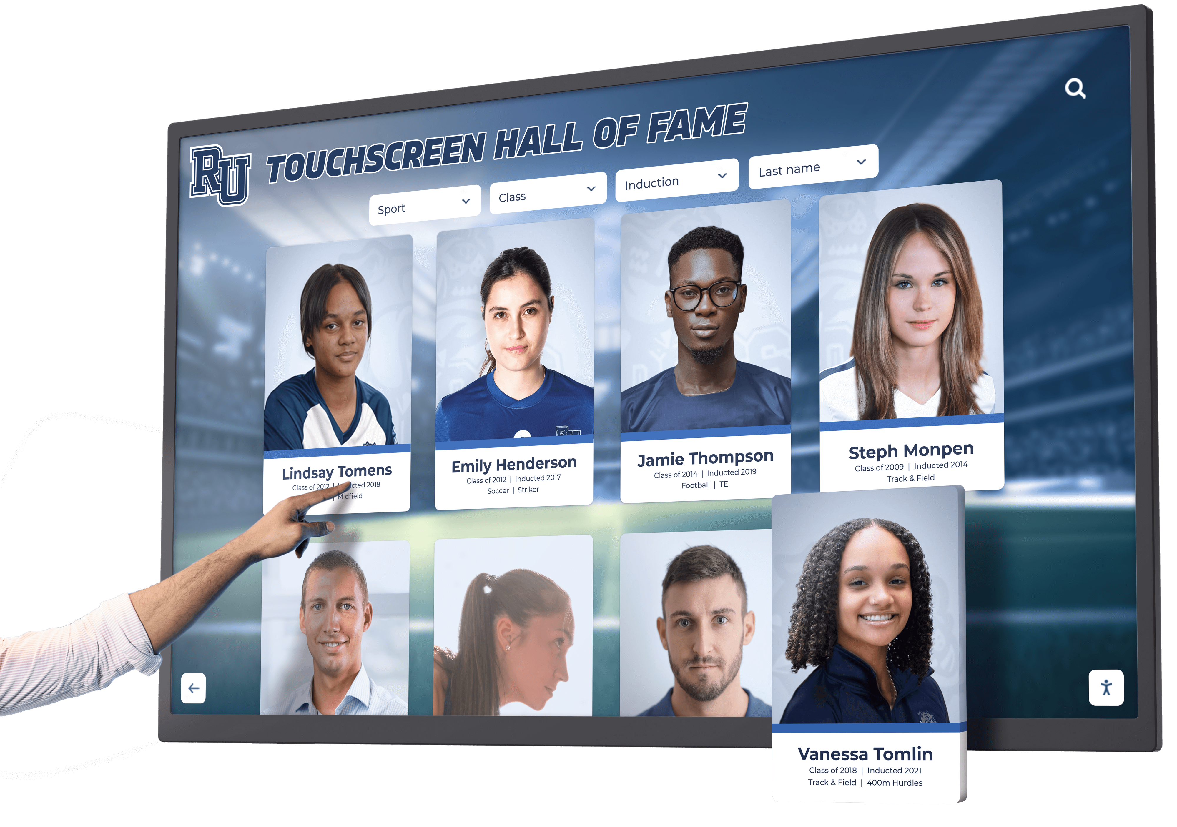
Inductee dialogs are among the most information-dense interactions on a digital hall of fame platform. When a visitor activates an inductee card, the resulting dialog may contain a portrait photo, career statistics, award history, a video highlight reel, a social sharing widget, and a link to the full inductee profile page—all rendered in an overlay while the roster continues to load in the background. For a sighted visitor, the visual context of the overlay is obvious. For a visitor using a screen reader, that context depends entirely on the ARIA dialog semantics, focus management, and aria-modal implementation the platform delivers.
A digital hall of fame ARIA-modal audit is the structured workflow that catches missing or incorrect dialog semantics before an inductee celebration or back-to-school recognition event—ensuring that every dialog on the platform works correctly for every visitor, regardless of how they access the site.

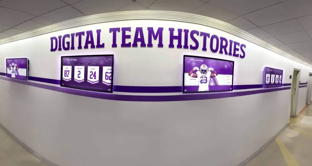
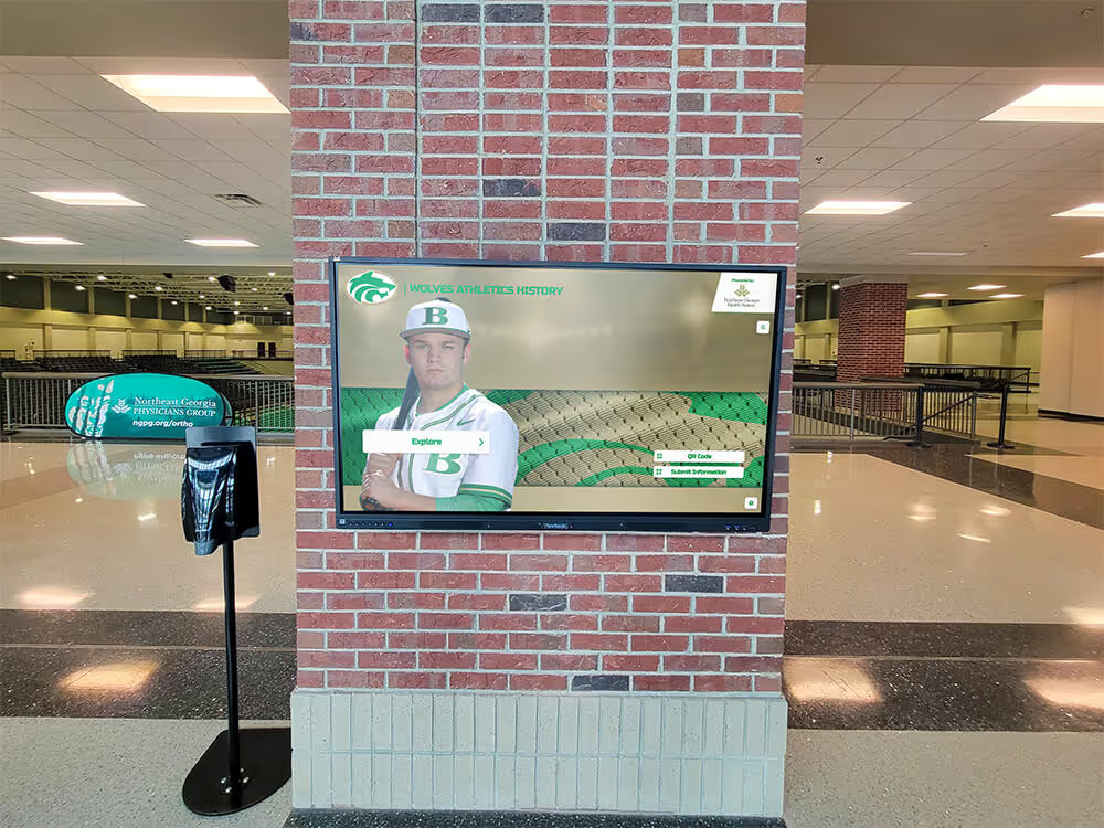
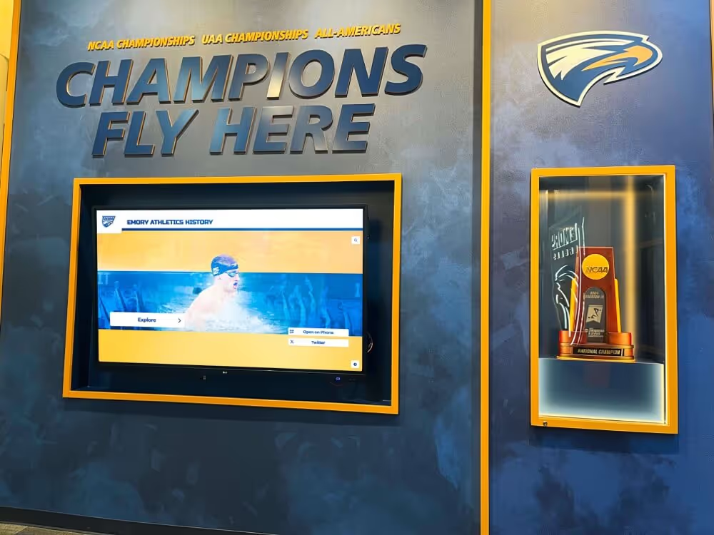
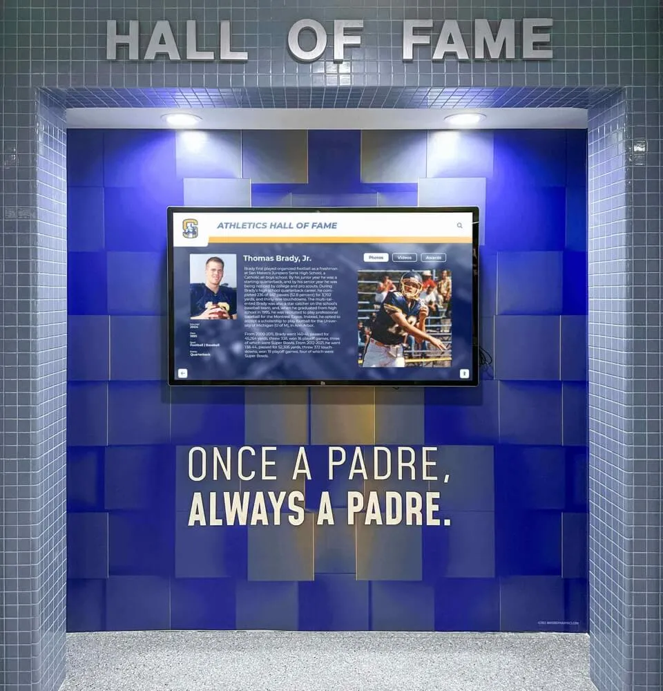
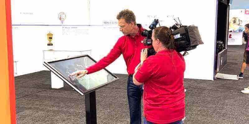
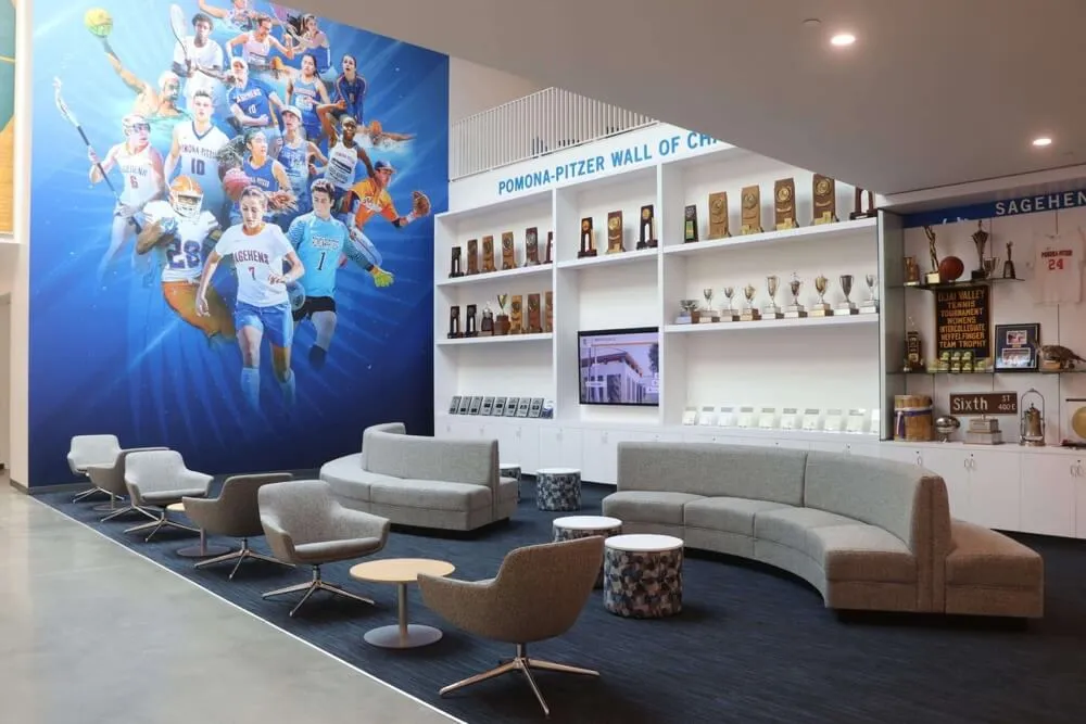
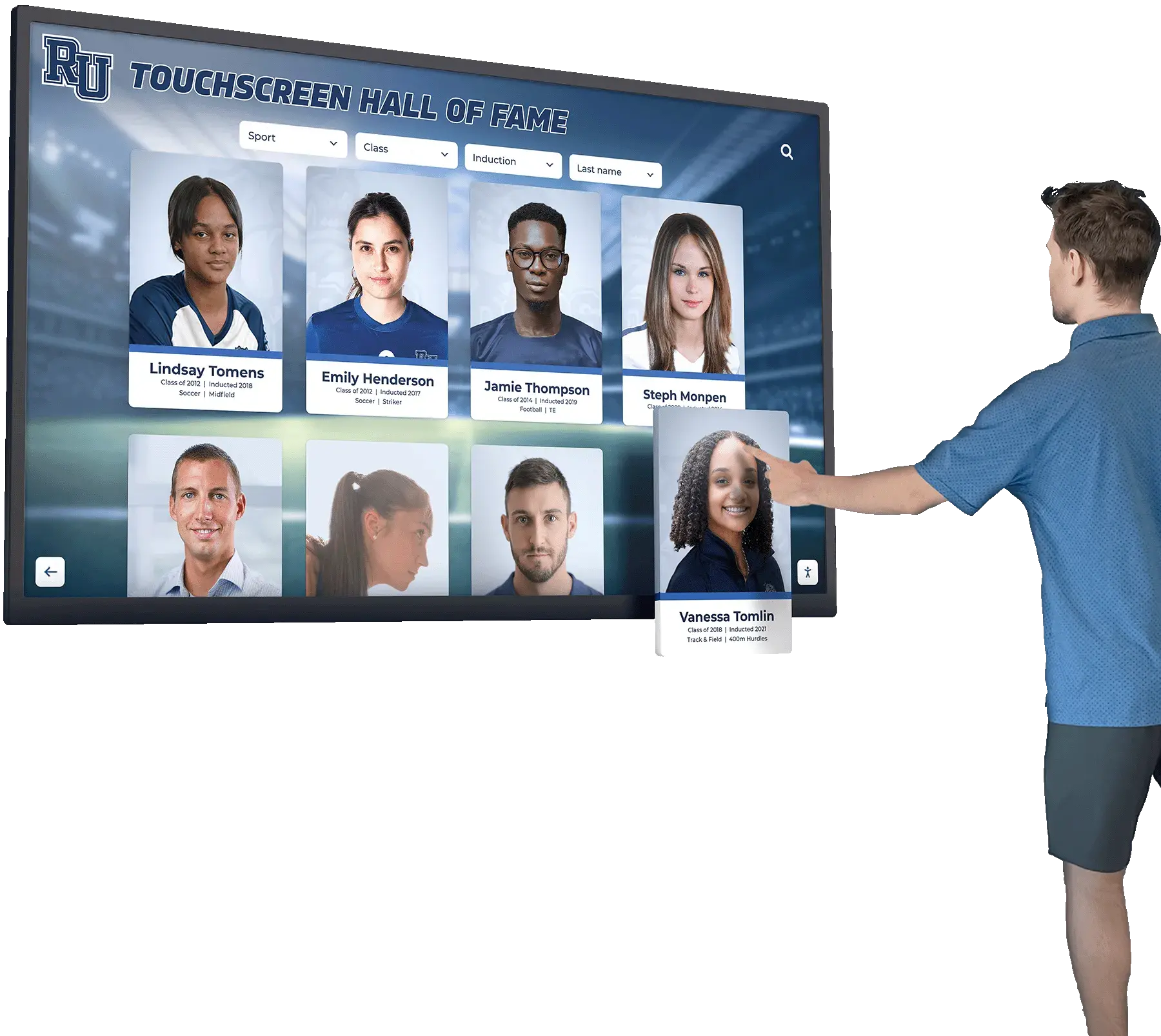
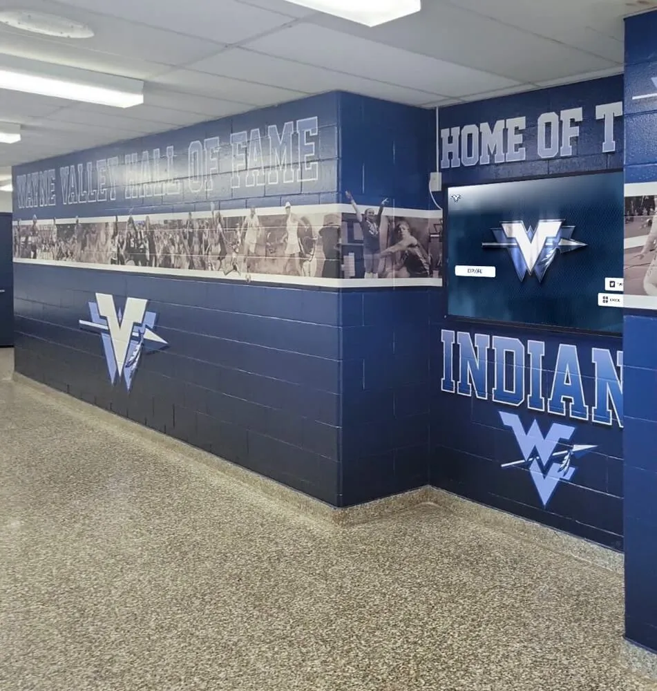
Activating an inductee card on a digital hall of fame touchscreen triggers a modal dialog that must correctly declare aria-modal, expose an accessible name, and manage keyboard focus—behaviors that an ARIA-modal audit verifies before each recognition season
Program Snapshot: ARIA-Modal Audit Scope for School Hall of Fame Platforms
Define the full audit scope before opening any tools. The table below covers schools at every stage of digital recognition implementation.
| Planning Element | Details |
|---|---|
| Primary Audience | Athletic directors, IT administrators, school web managers, accessibility compliance leads, recognition-program owners who maintain touchscreen or web-based inductee displays |
| What Is Being Audited | Every role="dialog" element on the recognition platform: inductee biography overlays, fullscreen media viewers, award-detail panels, records pop-ups, confirmation dialogs, and any composite overlay built from <div> elements with a dialog role |
| WCAG Criteria | 4.1.2 Name, Role, Value — Level A; 2.1.1 Keyboard — Level A; 2.1.2 No Keyboard Trap — Level A; 1.3.1 Info and Relationships — Level A; 2.4.3 Focus Order — Level A |
| Tools Required | Chrome or Firefox with DevTools Accessibility panel, NVDA (Windows, free) or VoiceOver (macOS, built-in), the axe DevTools browser extension, a keyboard without a mouse, and a screen reader speech log for transcription |
| Time Investment | 30–50 minutes for an initial audit of all dialogs; 10–20 minutes for a targeted re-check after any dialog component or CMS template change |
| Failure Consequence — aria-modal Missing | Screen-reader virtual buffer includes background content; visitor can browse the full page while the dialog is visually open, causing spatial confusion and increasing error risk |
| Failure Consequence — Focus Not Trapped | Keyboard users can Tab out of the dialog into background navigation or the inductee roster; the visitor may not be able to return to the dialog without refreshing the page |
| Failure Consequence — Focus Not Returned | After closing the dialog, focus drops to the top of the page rather than the inductee card that triggered the dialog; the visitor must re-navigate the entire roster to resume where they left off |
| Failure Consequence — No Accessible Name | Screen reader announces “dialog” with no label; visitor cannot determine what the dialog is about before exploring its contents |
| Pass Condition | Every dialog element carries role="dialog", aria-modal="true", and aria-labelledby pointing to a visible heading; focus moves into the dialog on open, is trapped while open, and returns to the triggering element on close; verified in at least two screen reader and browser combinations |
| ADA Relevance | Public school recognition websites and kiosk displays serving alumni, parents, and community members carry digital accessibility obligations; WCAG 4.1.2 Level A and 2.1.1 Level A together require that all dialog components expose correct role semantics and are fully operable by keyboard |
What Is aria-modal and Why Does It Matter for Inductee Dialogs?
aria-modal="true" is a WAI-ARIA property added to a role="dialog" element that signals to supporting screen readers that the dialog is a modal context—meaning that content outside the dialog should be treated as inert from the assistive technology’s perspective while the dialog is open. When a screen reader encounters an element with both role="dialog" and aria-modal="true", it instructs its virtual buffer to expose only the dialog’s content to the visitor, preventing the virtual cursor from wandering into the underlying page.
Without aria-modal="true", screen readers that use virtual browsing modes (NVDA’s Browse mode, JAWS’s Virtual Cursor) will continue to expose background page content even when a dialog is visually presented over it. A visitor using NVDA may press the Down Arrow key expecting to read through the inductee biography in the dialog and instead pass through the dialog boundary into the inductee roster or site footer beneath the overlay. The dialog may look like a modal to sighted visitors, but it functions like a transparent panel for screen-reader users.
Three properties work together to create a fully accessible inductee dialog. All three are required; none is sufficient on its own.
Property 1 — role=“dialog”: Declares the element’s ARIA role. Without this, the screen reader treats the element as a generic container (likely a <div> group) and does not apply dialog-specific keyboard conventions. NVDA and JAWS generate an “entered dialog” announcement when focus moves into a role="dialog" element; this announcement cues the visitor that they are now in a confined interaction context.
Property 2 — aria-modal=“true”: Activates modal semantics in the screen reader’s virtual buffer. This is the attribute that prevents background content from leaking into the assistive technology’s navigation. Note that aria-modal is a property on the dialog element itself, not a script flag—it must be present in the HTML (or programmatically set) before or when the dialog becomes visible.
Property 3 — aria-labelledby: Points to the ID of a visible heading element inside the dialog, giving the dialog an accessible name. When a screen reader enters a dialog, it reads the dialog’s accessible name immediately after announcing “dialog.” For an inductee biography dialog, the accessible name should be the inductee’s name: aria-labelledby="dialog-heading" where dialog-heading is the id of the <h2>Jordan Ramirez</h2> element inside the dialog. Without this, the announcement is simply “dialog”—leaving the visitor with no immediate context about whose biography they have opened.
Focus management is the behavioral counterpart to these ARIA properties. When an inductee dialog opens, keyboard focus must move into the dialog—either to the first focusable element or to the dialog container itself if no interactive element should receive initial focus. When the dialog closes (via the Close button, the Escape key, or a confirming action), focus must return to the element that triggered the dialog—in most cases, the inductee card or “View Profile” button the visitor activated. Failing to return focus leaves keyboard and screen-reader users stranded at the top of the page, requiring them to re-navigate the entire roster to resume where they left off.
Schools evaluating recognition platforms should confirm that dialog focus management is part of the platform’s component library behavior, not a site-by-site customization. Alumni management software features that schools compare typically include accessibility compliance as a core evaluation criterion; dialog focus management is one of the clearest indicators of whether a platform’s interactive components meet WCAG 2.1 AA in practice.
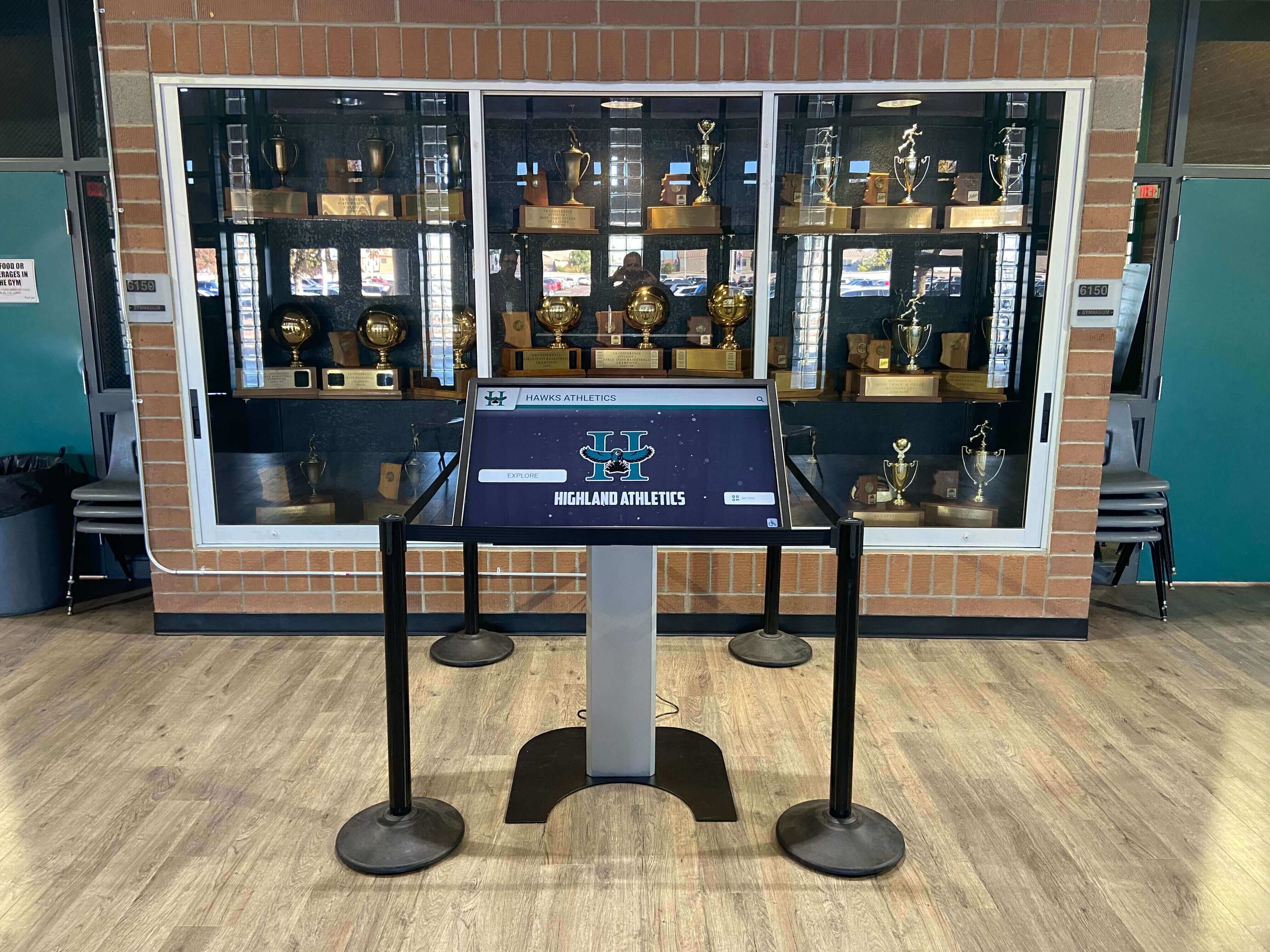
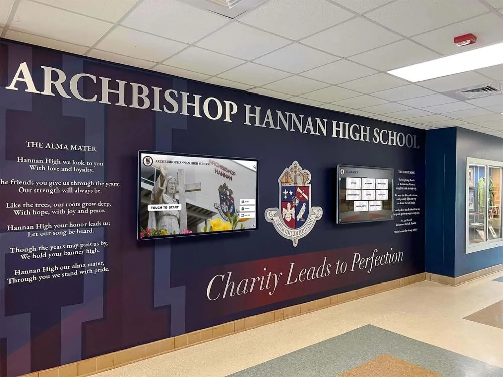
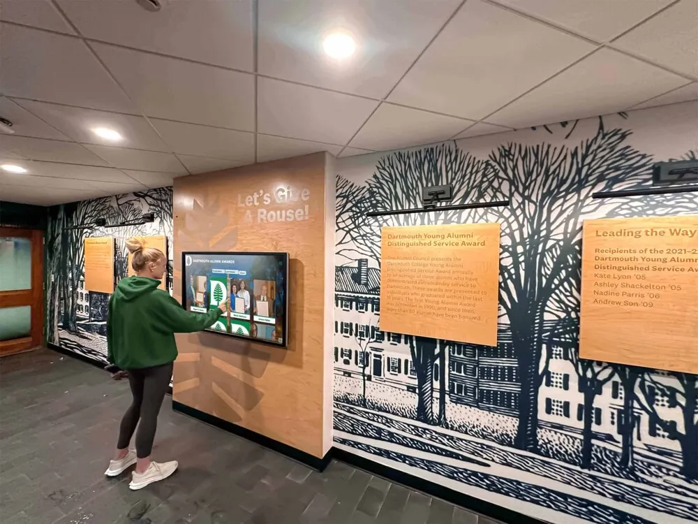
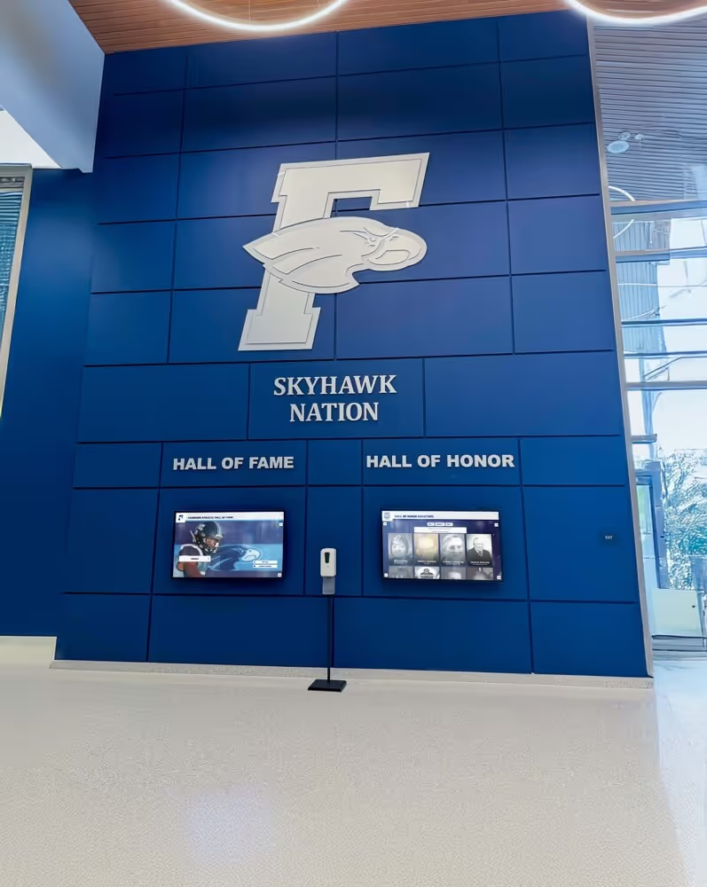
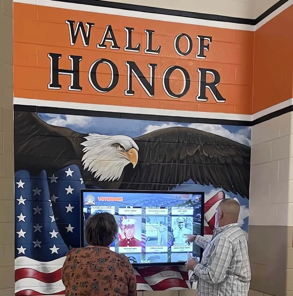
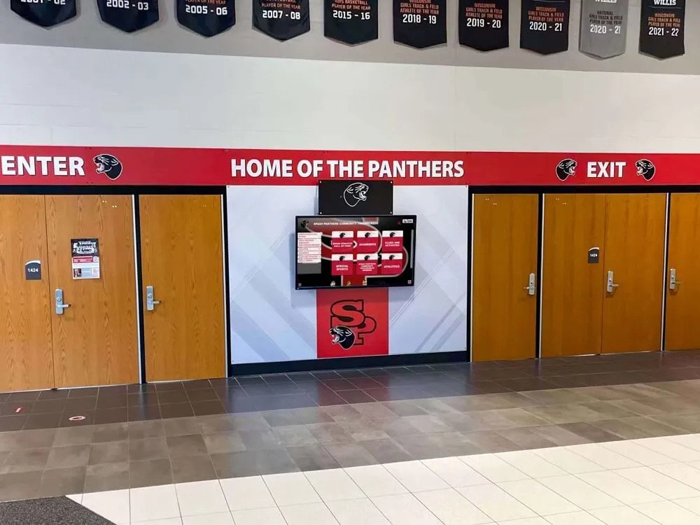
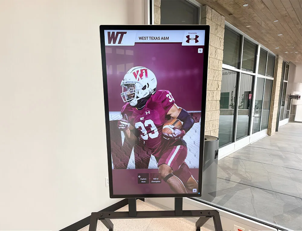
A school trophy case touchscreen kiosk triggers inductee biography dialogs when visitors activate profile cards—each dialog must carry aria-modal, an accessible name, and correct focus management to serve screen-reader users correctly
Content Architecture: Inductee Dialog Types and aria-modal Decision Table
The central output of a digital hall of fame ARIA-modal audit is a pass, remediate, or remove decision for every dialog on the recognition platform. The table below covers the dialog types most commonly found on school recognition platforms.
| Dialog Type | Expected Role | aria-modal Required? | aria-labelledby Target | Focus on Open | Focus on Close | Common Finding |
|---|---|---|---|---|---|---|
| Inductee biography overlay | role="dialog" | Yes | Inductee name heading (<h2>) inside dialog | First focusable element inside dialog (Close button or inductee name) | Inductee card that triggered the dialog | Missing aria-modal; focus sent to dialog container with no focusable child |
| Fullscreen media viewer (photo) | role="dialog" | Yes | Caption text or “Photo: [Inductee Name]” heading | Close button | Photo thumbnail or “View Media” trigger | No aria-labelledby; dialog announced as unlabeled |
| Fullscreen media viewer (video) | role="dialog" | Yes | Video title heading inside dialog | Close button or video play control | “Play video” trigger or inductee card | Focus sent to video element (not keyboard-operable without additional key-handler) |
| Award-detail panel | role="dialog" | Yes | Award name heading inside dialog | First focusable element | Award name or “Details” trigger | aria-modal present but focus not trapped; Tab key exits to background navigation |
| Records and statistics pop-up | role="dialog" | Yes | Statistics section heading or inductee name | First focusable element inside dialog | “View stats” trigger | Focus returned to page top rather than triggering element |
| Confirmation dialog (e.g., “Add to comparison”) | role="dialog" or role="alertdialog" | Yes | Confirmation question heading or prompt text | Confirm or Cancel button | Element that triggered the action | role="alertdialog" used when only confirmation is needed—appropriate; role="dialog" used when additional content is present—also appropriate |
| Induction ceremony date/time notice | role="dialog" or role="status" | Only if role="dialog" | Announcement heading | Close button if interactive; no focus if role="status" | Triggering element or no return if auto-dismissed | Auto-appearing notices using role="dialog" without user activation—should be role="status" or role="alert" instead |
| Sponsor acknowledgment overlay | role="dialog" | Yes | Sponsor name or “Sponsor” heading | Close button | Element beneath overlay or last interactive element | Overlay appears on page load without user activation; should use live region, not dialog |
| Share/social widget panel | role="dialog" | Yes | “Share [Inductee Name]’s Profile” heading | First share option or Close button | “Share” trigger | No aria-labelledby; aria-modal missing; focus loops to background |
Dialogs that appear automatically on page load—such as sponsor acknowledgment overlays or announcement notices—warrant special scrutiny. A role="dialog" element that appears without user activation violates the expectation that dialogs are triggered by deliberate user action. Auto-appearing overlays that cannot be dismissed by keyboard (Escape key) and do not return focus to a meaningful element after dismissal compound the accessibility failure. These overlays should be replaced with ARIA live regions (role="status" for polite announcements, role="alert" for urgent notices) or redesigned to require explicit user activation before the dialog opens.
Digital hall of fame filter chip interactions often appear on the same page as inductee dialogs—when a visitor applies a sport or year filter, the roster updates, and subsequent inductee card activations trigger dialogs against the filtered background. The dialog focus management audit must be run against filtered roster states, not only the default roster, to confirm that aria-modal and focus return work correctly when the background content set has changed.
Execution Timeline: Plan → Build → Launch → Refresh
Step 1 — Inventory All Dialog Elements
Open the recognition platform in Chrome or Firefox. Open DevTools and navigate to the Elements panel. Use the search function (Ctrl+F in Elements) to find all instances of role="dialog". For each dialog, record: the element tag (<div>, <section>, <aside>), the presence or absence of aria-modal, the presence or absence of aria-labelledby and the ID it references, and the dialog’s trigger mechanism (inductee card click, “View media” button, “More stats” link, or auto-appearance).
Create a dialog inventory spreadsheet with one row per dialog type. Columns should include: Dialog Type, Trigger Element, role attribute, aria-modal value, aria-labelledby value, aria-describedby value (if present), Focus Destination on Open, Focus Return on Close, Escape Key Behavior. This inventory is the audit baseline.
Step 2 — Verify aria-modal in DevTools Accessibility Panel
For each dialog in the inventory, activate the dialog trigger using keyboard navigation (Tab to the trigger, then Enter or Space). With the dialog open, inspect the dialog element in DevTools and switch to the Accessibility panel. Verify that the Accessibility panel shows aria-modal: true under computed properties. If the value is absent or false, record the dialog as Remediate.
For the aria-labelledby check, confirm that the referenced ID exists inside the dialog element (not outside it) and that the referenced element contains a visible, descriptive text string. A dialog whose aria-labelledby references a heading outside the dialog—perhaps a heading on the underlying page—will produce a misleading accessible name that does not reflect the dialog’s content.
Step 3 — Check Focus Destination with Keyboard Navigation
Tab to each dialog’s trigger element and activate it using Enter or Space. Without touching the mouse, observe where keyboard focus moves. Press Tab once. If focus leaves the dialog and moves to a background navigation link, a site header link, or a roster item outside the dialog, the dialog lacks focus trapping—record it as Remediate.
A correctly implemented dialog will cycle focus through only the elements inside the dialog when Tab is pressed repeatedly. If the dialog contains a Close button, inductee name (non-focusable heading), photo (non-focusable image), and a “Full Profile” link, then repeated Tab presses should cycle: Close button → Full Profile link → Close button → Full Profile link. No Tab press should deliver focus to the background page.
Step 4 — Test Escape Key Dismissal
With a dialog open and focus inside the dialog, press Escape. Verify two behaviors: the dialog closes visually, and keyboard focus returns to the element that triggered the dialog—the inductee card button, the “View Media” link, or the “More Stats” button, as applicable. If focus drops to the page top or disappears (focus lost), record the dialog as Remediate.
If the dialog does not close on Escape at all, record it as a Critical Remediate—this is a violation of WCAG 2.1.2 No Keyboard Trap, which requires that keyboard users always be able to navigate away from any component using standard keystrokes. A dialog that cannot be dismissed by Escape creates a keyboard trap, the most severe usability failure in a dialog implementation.
Step 5 — Test with NVDA + Chrome
Enable NVDA’s Browse mode (NVDA is in Browse mode by default in Chrome). Tab to the inductee card and activate it. Listen for NVDA’s announcement sequence: it should include the dialog’s accessible name followed by “dialog.” Example: “Jordan Ramirez, dialog.” While the dialog is open in Browse mode, press the Down Arrow key repeatedly. Confirm that Down Arrow navigation does not exit the dialog boundary and reach the background roster or site navigation. If it does, aria-modal is either absent or not recognized by NVDA in this browser version.
Press Escape to close the dialog. Confirm that NVDA announces focus returning to the inductee card: “Jordan Ramirez, button” or the equivalent accessible name and role of the triggering element.
Step 6 — Test with VoiceOver + Safari (macOS)
Enable VoiceOver (Command+F5). Navigate to the inductee card trigger and activate it using VO+Space. Listen for VoiceOver’s announcement: “Jordan Ramirez, web dialog.” Confirm that VO cursor navigation (VO+Right Arrow) does not exit the dialog while it is open. Press Escape to close. Confirm focus returns to the triggering element.
Note: VoiceOver’s handling of aria-modal on macOS differs from NVDA’s virtual cursor behavior. On iOS with VoiceOver, touch-based navigation is the primary mode; confirm that swiping right through the dialog content using a single finger does not escape the dialog boundary. Schools with kiosk installations serving visitors who use iOS assistive technology switches should include an iOS VoiceOver test in their audit.
Step 7 — Run axe DevTools for Structural Verification
With a dialog open, activate the axe DevTools browser extension. Run an accessibility scan on the current page state (dialog open). Review the results for violations in the categories: ARIA Required Attributes (checks for missing aria-labelledby on dialogs), Dialog Focus (checks that focus has moved inside the dialog), and ARIA Allowed Attributes. Record any axe-flagged violations alongside the manual findings from Steps 1–6.
axe DevTools catches structural issues reliably but does not simulate screen-reader announcement sequences or verify focus return after close. Manual testing in Steps 4–6 is required to confirm the complete dialog interaction cycle.
Kiosk display touch sensitivity testing is a complementary hardware audit that governs whether inductee card tap targets register reliably on the physical screen. The ARIA-modal audit governs what happens after the tap registers—whether the resulting dialog is correctly exposed to assistive technology. Both audits belong in the same pre-season verification checklist.
Step 8 — Document and Assign Remediation
For each Remediate-classified dialog, document: the dialog type, the specific failure (missing aria-modal, missing aria-labelledby, no focus trap, no focus return, Escape not handled), the WCAG criterion violated, and the recommended fix. Pass the documented findings to the platform vendor or IT team responsible for dialog component maintenance.
Common one-line fixes:
- Add
aria-modal="true"to the dialog element - Add
aria-labelledby="[heading-id]"to the dialog element and confirm the referenced heading is inside the dialog - Add
focus()call to the Close button or first focusable element immediately after the dialog becomes visible - Add a
keydownevent listener forEscapethat closes the dialog and callsfocus()on the triggering element reference - Add a focus trap utility that intercepts Tab and Shift+Tab within the dialog boundary
Display Integration: Dialogs Across Web Directory and Kiosk Interfaces
Most digital hall of fame platforms deliver both a web directory (accessible via any browser on any device) and a kiosk interface (deployed on a touchscreen in a school hallway, gymnasium lobby, or alumni center). The dialog component is typically shared between both interfaces through a single codebase.
An aria-modal implementation that passes the web directory audit will pass the kiosk audit automatically—provided the kiosk browser (usually a fullscreen Chrome or Chromium instance) renders the same HTML. Schools should confirm with their platform vendor whether the kiosk interface uses a separate template or a shared component library. If the kiosk uses a separate template with custom dialog markup, the ARIA-modal audit must be run independently for the kiosk interface.
Kiosk installations that serve visitors without a connected keyboard—relying entirely on touch—still benefit from correct dialog ARIA semantics for three reasons. First, visitors who use switch access devices (sip-and-puff switches, head-tracking inputs) connected to the kiosk’s USB or Bluetooth port navigate using Tab and Enter, not touch. Second, visitors who use iOS-based assistive technology on a personally carried device may use screen mirroring or web browser equivalents to access the kiosk content. Third, district-level accessibility audits typically evaluate kiosk interfaces using a keyboard and screen reader, regardless of how day-to-day visitors interact with the display.
Award display installations in sports banquet settings often share the same recognition platform as the hallway kiosk—with the same inductee dialog components rendering in both environments. Confirming aria-modal compliance on the web platform ensures that any shared components used in event display contexts also meet accessibility requirements.
Rocket Alumni Solutions’ cloud CMS allows IT staff and athletic directors to update inductee records, photos, and media without redeploying the site’s dialog components. When a new inductee bio is added through the CMS, the dialog content updates automatically while the ARIA semantics—role="dialog", aria-modal="true", aria-labelledby, and focus management—are handled by the platform’s component layer, not by the content editor. This separation ensures that accessibility-correct dialog behavior is maintained through every inductee update cycle without requiring the recognition-program manager to inspect dialog markup manually after each content change.
See Accessible Inductee Dialogs in a Live Hall of Fame Demo
Request a walkthrough of Rocket Alumni Solutions’ recognition platform to see how inductee biography dialogs, media viewers, and award panels implement aria-modal, accessible names, and keyboard focus management — ensuring every visitor can navigate inductee content with any assistive technology.
Reusable Audit Checklist: Digital Hall of Fame ARIA-Modal Audit
Copy this checklist into your accessibility tracking system. Mark each item as Pass, Remediate, or N/A.
Inventory
- All
role="dialog"elements on the platform identified and listed in the dialog inventory - Each dialog’s trigger mechanism documented (inductee card, media button, stats link, or auto-appearance)
- Auto-appearing dialogs flagged for review (should be live regions, not dialogs)
ARIA Properties — Per Dialog
-
role="dialog"present on the outermost dialog container -
aria-modal="true"present on the same dialog container -
aria-labelledbypresent and references a visible heading element inside the dialog - Referenced heading ID exists and contains a descriptive, inductee-specific text string
-
aria-describedbypresent if the dialog contains a supporting description (optional but recommended for bio dialogs)
Focus Management — Per Dialog
- Focus moves into the dialog automatically when it opens (to Close button or first focusable element)
- Focus is trapped inside the dialog while it is open (Tab and Shift+Tab cycle within dialog boundary only)
- Escape key closes the dialog
- Focus returns to the triggering element after the dialog closes
- No keyboard trap: the dialog can always be closed using standard keystrokes
Screen Reader Verification — Per Dialog
- NVDA + Chrome: dialog accessible name announced on open; background content not reachable by Down Arrow; focus returns to trigger on close
- VoiceOver + Safari: “web dialog” announced on open; VO cursor confined to dialog; focus returns to trigger on close
- axe DevTools: no violations in ARIA Required Attributes or Dialog Focus categories with dialog open
Regression Checks
- After any CMS template update affecting dialog layout: re-verify
aria-labelledbytarget exists inside dialog - After any component library upgrade: re-verify
aria-modalvalue and focus trap behavior for all dialog types - After any new inductee dialog type is introduced (e.g., new media type): add dialog type to inventory and run full audit for new type
Assistive Technology Test Cases
Verify these specific scenarios for each inductee dialog type before each recognition season.
| Dialog Type | Test Action | NVDA + Chrome Expected | VoiceOver + Safari Expected | Pass? |
|---|---|---|---|---|
| Inductee biography dialog | Tab to inductee card; press Enter; listen for dialog announcement | “[Inductee name], dialog” announced; Down Arrow stays inside dialog | “[Inductee name], web dialog” announced; VO cursor confined | Confirm both |
| Inductee biography dialog — close | Press Escape; listen for focus announcement | Focus returns to inductee card: “[Name], button” | Focus returns to inductee card; card announced | Confirm both |
| Media viewer dialog (photo) | Activate “View Photo” button; listen | “[Photo caption or inductee name], dialog” | “[Photo caption], web dialog” | Photo alt text inside dialog also verified |
| Media viewer dialog (video) | Activate “Play Video” trigger; listen | “[Video title or inductee name], dialog”; Close button is focus destination | “[Video title], web dialog”; Close button is focus destination | Video element not initial focus destination |
| Award-detail dialog | Activate “Details” button; Tab through dialog | Focus cycles through: Close → award links → Close only; background links not reachable | VO+Right Arrow stays inside dialog | Focus trap confirmed |
| Statistics pop-up dialog | Activate “View Stats” button; press Escape | Dialog closes; focus returns to “View Stats” button | Dialog closes; focus returns to trigger | Not returned to page top |
| Confirmation dialog | Activate a “Compare” or “Save” action | “Confirm [action]?, dialog” or “alertdialog” announced; Escape dismisses | Confirmation announced; Escape dismisses | role="alertdialog" used when only confirm/cancel present |
| Auto-appearing overlay | Load page; listen for announcement | Overlay announced as role="status" or role="alert", not dialog | Live region announcement, not “web dialog” | Should not be role="dialog" |
Measurement: Indicators of Dialog Accessibility Quality
| Signal | Target | How to Measure |
|---|---|---|
| Dialogs with aria-modal present | 100% of role="dialog" elements | Count dialog elements; count those with aria-modal="true"; calculate ratio |
| Dialogs with accessible name | 100% of role="dialog" elements | Count dialogs with valid aria-labelledby referencing an internal heading; flag unlabeled dialogs |
| Focus trap compliance rate | 100% | Manual keyboard test per dialog type; Tab-escape failures recorded as Remediate |
| Focus return compliance rate | 100% | Manual keyboard test per dialog type; post-close focus destination verified for each |
| Escape key handling | 100% of interactive dialogs | Manual keyboard test; NVDA + VoiceOver confirmation |
| axe DevTools violations (dialogs open) | Zero critical or serious violations | Run axe with each dialog type open; record finding count per dialog |
| Remediated dialogs per audit cycle | Trending toward zero as platform matures | Count Remediate-classified dialogs per audit; compare against prior cycle |
Athletic award data reconciliation is a content-level process that ensures the statistics and honors displayed inside inductee dialogs are accurate and current. The ARIA-modal audit is the accessibility-level process that ensures those dialogs are correctly exposed to assistive technology. Both processes should run on the same pre-season schedule so that inductee content and dialog semantics are both verified before each recognition event.
Frequently Asked Questions
What is the difference between aria-modal and a CSS-based backdrop?
A CSS backdrop (using ::backdrop or an overlay <div>) creates the visual appearance of a modal by dimming or obscuring background content. It has no effect on screen-reader virtual buffers. A visitor using NVDA’s Browse mode with a visually convincing backdrop overlay can still press Down Arrow and navigate through the roster, site footer, and navigation links beneath the overlay. aria-modal="true" on the dialog element is the mechanism that instructs the screen reader to treat background content as inert. Both CSS backdrop and aria-modal are needed: the CSS backdrop serves sighted visitors; aria-modal serves screen-reader users.
Does aria-modal work in all screen readers?
aria-modal="true" is well-supported in current versions of NVDA with Chrome, JAWS with Chrome and Firefox, and VoiceOver with Safari on macOS and iOS. Support in older screen reader versions—particularly NVDA before 2020 and JAWS before 2021—was inconsistent, with some versions ignoring the attribute and continuing to expose background content. As of 2025, the major screen reader releases all honor aria-modal in supported browsers. Schools using platforms delivered via a shared SaaS architecture should confirm the platform vendor’s AT compatibility matrix to understand which screen reader and browser combinations have been tested.
Can a dialog have aria-modal=“false”?
Yes. Setting aria-modal="false" explicitly informs screen readers that the element is a non-modal dialog—meaning background content should remain accessible from within the dialog. This pattern is appropriate for sidebars, side panels, or detail drawers that appear alongside the main content without obscuring it. On a digital hall of fame platform, a detail panel that slides in from the right edge of the screen while the roster remains visible and interactive in the left portion of the screen is correctly marked with aria-modal="false". An inductee biography overlay that covers the full screen or dims the background is a modal dialog and should use aria-modal="true".
What if the platform uses a third-party component library for dialogs?
Request the component library’s ARIA implementation documentation and run the audit against the rendered HTML, not the component source code. The audit does not require access to the component library’s source. If the rendered dialog element is missing aria-modal or aria-labelledby, document the finding with the rendered HTML evidence and pass it to the platform vendor. Third-party dialog components can be patched without replacing the component library—adding a wrapper element with aria-modal and aria-labelledby to an existing dialog container is a common interim fix while the vendor updates the component.
Should inductee dialogs use role=“dialog” or role=“alertdialog”?
role="alertdialog" is appropriate for dialogs that present an urgent message requiring user acknowledgment—such as a session timeout warning or an error notice. Screen readers announce role="alertdialog" with higher urgency than role="dialog", typically reading the dialog content immediately on open regardless of focus position. Inductee biography, media viewer, and statistics dialogs are informational and user-initiated; they should use role="dialog". Confirmation prompts (“Are you sure you want to add this inductee to your comparison list?”) that require an explicit choice between two options may use role="alertdialog" if the prompt is urgent, but role="dialog" is also acceptable for non-urgent confirmations.
How do we handle a dialog that contains tabs?
A dialog that contains a tab panel—such as an inductee biography dialog with tabs for Career Stats, Awards, and Media—requires correct tab semantics inside the dialog in addition to correct dialog semantics. The tab strip uses role="tablist", each tab uses role="tab", and each panel uses role="tabpanel". Focus management inside the dialog must account for the tab pattern: Arrow keys navigate between tabs within the tablist; Tab moves focus to the next component after the active tab panel. The ARIA-modal audit should verify both the dialog-level semantics and the tab-level semantics for any dialog that contains a tabbed interface. Schools evaluating tools and platforms for athletics, donor recognition, and arts halls of fame should confirm that any tabbed dialog components in the candidate platforms are built with correct nested ARIA semantics, not just correct outer dialog properties.
What is the correct focus destination when a dialog opens?
The WAI-ARIA Authoring Practices Guide recommends that focus move to the first focusable element inside the dialog, unless a specific element is more logical given the dialog’s purpose. For an inductee biography dialog that opens with a large portrait photo and a heading, focus should move to the Close button (the first interactive element) rather than a non-interactive heading or image. For a confirmation dialog with a “Confirm” and “Cancel” button, focus should move to the “Cancel” button—which is the safer default action—unless the dialog’s purpose makes “Confirm” the natural focus destination. The audit should verify the actual initial focus destination against this rationale for each dialog type.
Does the audit need to be rerun after every inductee addition?
No. Adding inductee records through a cloud CMS updates dialog content—the inductee’s name, photo, statistics, and media—but does not change the dialog’s ARIA markup or JavaScript focus management. The audit must be rerun after any change to the dialog component, template, or layout—not after content-only updates. Schools using a platform with a CMS-driven content model benefit from this separation: content editors can add hundreds of inductees without triggering an accessibility re-audit, because the ARIA semantics are part of the component layer, not the content layer.
Connecting Dialog Accessibility to the Recognition Program Experience
A digital hall of fame induction ceremony is a public recognition event—alumni, parents, coaches, community members, and media attend in person while families who cannot travel may access the platform remotely. For a family member with a visual impairment attending remotely, the inductee biography dialog is the primary vehicle through which they access the recognition content their family member has earned. An inductee dialog that does not correctly implement aria-modal, that drops keyboard focus after opening, or that cannot be closed by pressing Escape is not a minor accessibility inconvenience—it is a barrier to participation in a recognition milestone.
Basketball hall of fame programs and multi-sport recognition archives are among the most content-rich hall of fame implementations, often featuring hundreds of inductee profiles with career statistics tables, photo galleries, and video reels accessible through the same dialog framework. An ARIA-modal audit run at the framework level—verifying the dialog component once rather than per-inductee—scales correctly to archives of any size. The same component that renders a basketball inductee’s biography dialog renders a track-and-field inductee’s media viewer, a fine arts inductee’s award-detail panel, and a donor recognition honoree’s profile overlay. Correct aria-modal implementation benefits every inductee and every visitor simultaneously.
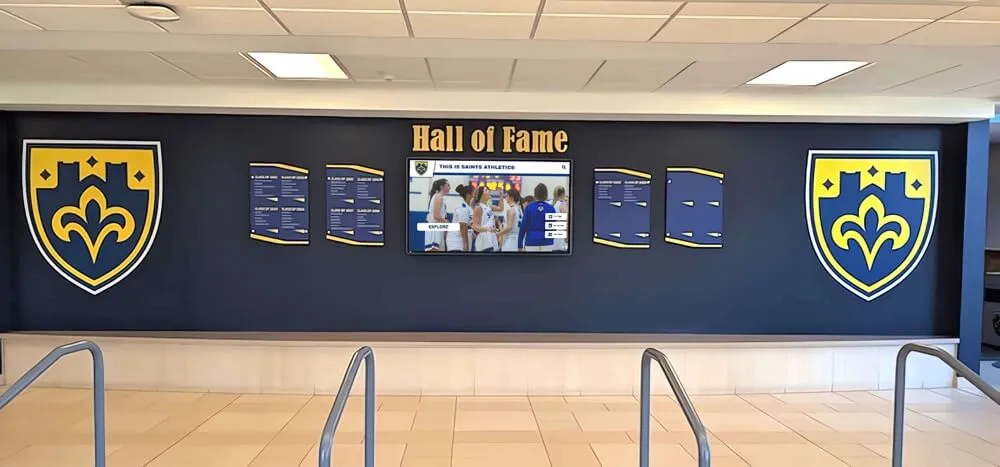
Schools that develop robust recognition programs connect digital recognition back to physical environments—inductee plaques, championship banners, and trophy cases in hallways and gymnasiums. Back-to-school events that build community often incorporate recognition touchscreens as orientation and pride-building tools, with new students and families exploring the hall of fame interactive displays for the first time. For these visitors—who may include families with accessibility needs who are new to the school—first-contact dialog experiences set the tone for how inclusive the recognition program feels.
The ARIA-modal audit is a 30–50 minute investment, run once per platform and once per major component update, that eliminates an entire class of assistive technology failures from a school’s recognition platform. It requires no specialized accessibility tools beyond free browser extensions and built-in screen readers. It produces a documented checklist that can be retained for compliance records, shared with district technology coordinators, and updated after every platform update cycle.
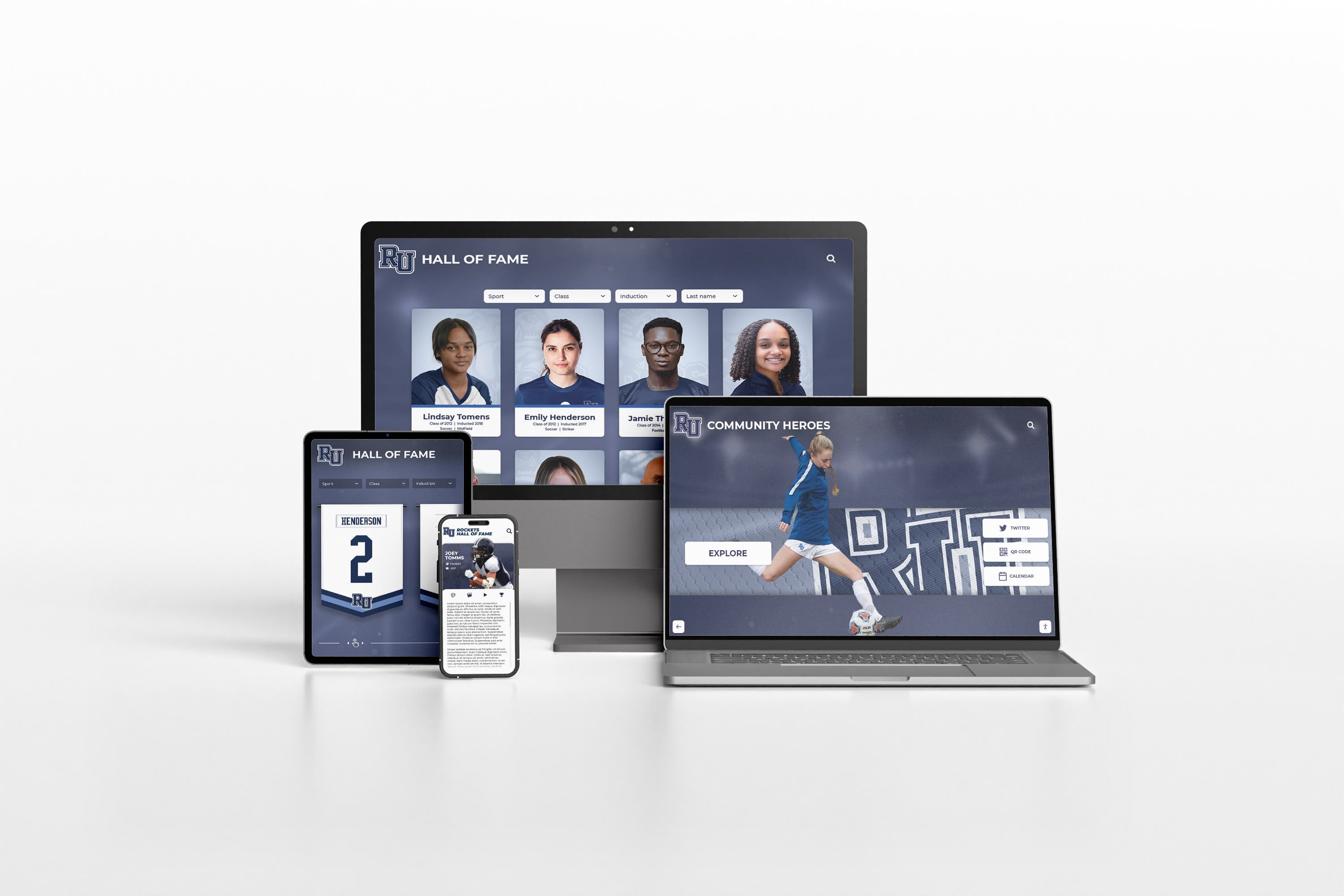
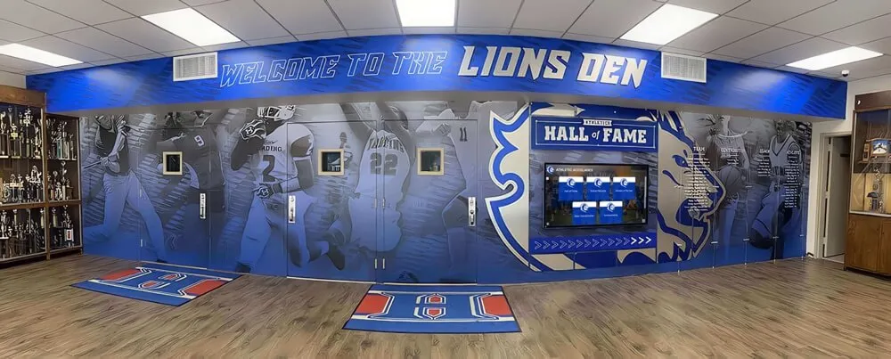
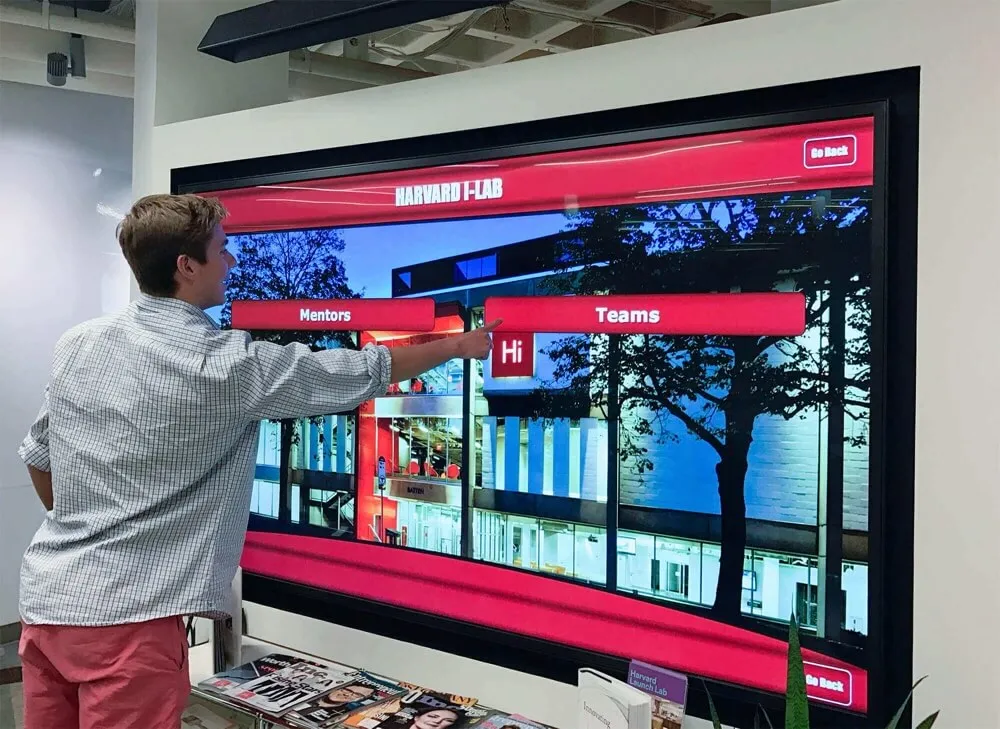
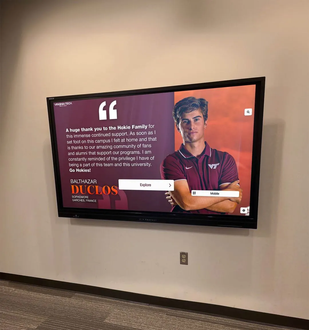
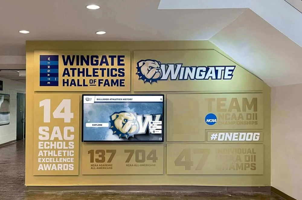
A digital hall of fame ARIA-modal audit applies across every device where inductee dialogs appear—desktop web directories, tablets, smartphones, and hallway kiosks—because the same dialog component and its ARIA semantics serve all form factors
Rocket Alumni Solutions’ digital hall of fame platform is built to WCAG 2.1 AA standards, with inductee biography dialogs, media viewers, and award-detail panels implemented using role="dialog", aria-modal="true", and aria-labelledby that references each inductee’s name heading. The platform’s JavaScript dialog manager moves focus into dialogs on open, traps focus within the dialog boundary, returns focus to triggering elements on close, and handles Escape key dismissal as native behavior—not as an optional configuration. Cloud CMS content updates do not touch dialog component markup, ensuring that aria-modal compliance is maintained through every inductee addition, media upload, and roster update. Schools that need to document WCAG 2.1 AA compliance for district or state accessibility reviews can request the platform’s ARIA implementation documentation as part of the demo process.
Request a Demonstration of Accessible Inductee Dialogs
See how Rocket Alumni Solutions implements ARIA-modal compliant biography overlays, media viewers, and award panels on a live recognition platform—with focus management, keyboard dismissal, and screen-reader compatibility built into every dialog component.