


A digital hall of fame ARIA-disabled audit for unavailable filters is the process of examining every filter control on your school’s recognition website and touchscreen kiosk—sport-category filters, class-year selectors, award-type pickers, and any inductee-roster refinement widget—to verify that filter options which are temporarily unavailable (because no inductees match the current selection context) are marked with aria-disabled="true" rather than removed from the DOM, hidden with CSS, or left without any state declaration at all. The aria-disabled attribute, defined in the WAI-ARIA 1.2 specification published by the W3C Web Accessibility Initiative, tells supporting screen readers (NVDA, JAWS, VoiceOver, TalkBack) that a specific interactive element exists and is currently inactive—without removing that element from the accessibility tree or from keyboard focus order the way the native HTML disabled attribute does on form controls. When a sport filter option such as “Swimming” is removed from the DOM because no swimming inductees exist for the selected class year, a screen-reader user navigating the filter list receives no signal that a swimming filter category ever existed. When the same option carries aria-disabled="true", the screen reader announces it as “dimmed” or “unavailable,” preserving the user’s understanding of the full filter set and communicating that the option is inactive for this context—not absent from the platform. A digital hall of fame ARIA-disabled audit maps every filter widget on the recognition platform to a clear pass, remediate, or not-applicable decision, ensuring that blind alumni, parents with visual impairments, and keyboard-only visitors receive an accurate, complete picture of available filtering choices regardless of the current inductee data context.
Inductee roster filters on digital hall of fame platforms are dynamic. A sport filter panel that displays twelve sport categories when the full inductee archive is in view may narrow to four active categories when a visitor selects a specific graduation decade. A class-year selector that spans sixty years of school history may reduce to a handful of available years when an award-type filter is applied first. In these narrowed contexts, the filter options that have no matching inductees are unavailable—but they are not permanently absent, and their temporary unavailability is meaningful information for any visitor trying to understand the recognition archive’s structure.
For sighted visitors, a grayed-out sport filter communicates its state visually: the contrast is reduced, the cursor becomes a not-allowed icon, and the surrounding active filters retain their full color. For screen-reader users, the visual graying communicates nothing—the accessible state must be declared explicitly through aria-disabled="true" on the element carrying the filter role. When that declaration is missing, the screen-reader user navigates the filter list encountering only active options, with no way to know whether “Swimming” or “Wrestling” are absent because the platform does not support those sports or because no inductees match the current context.

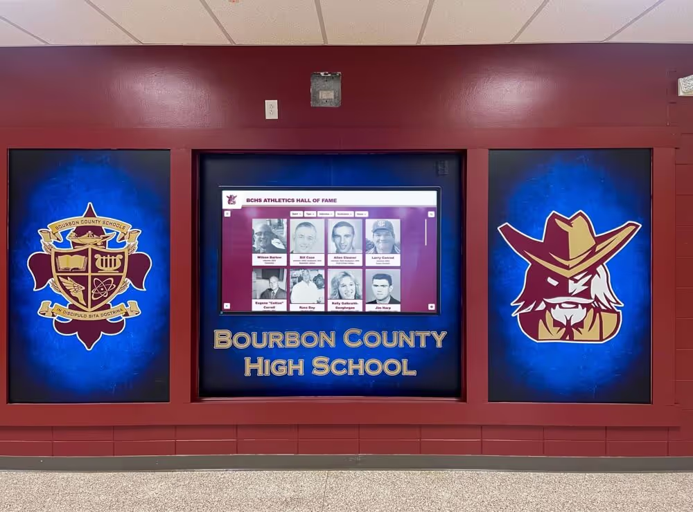
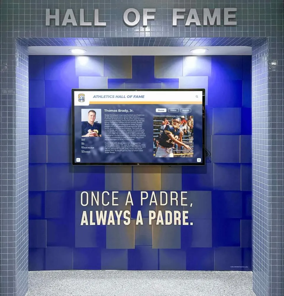
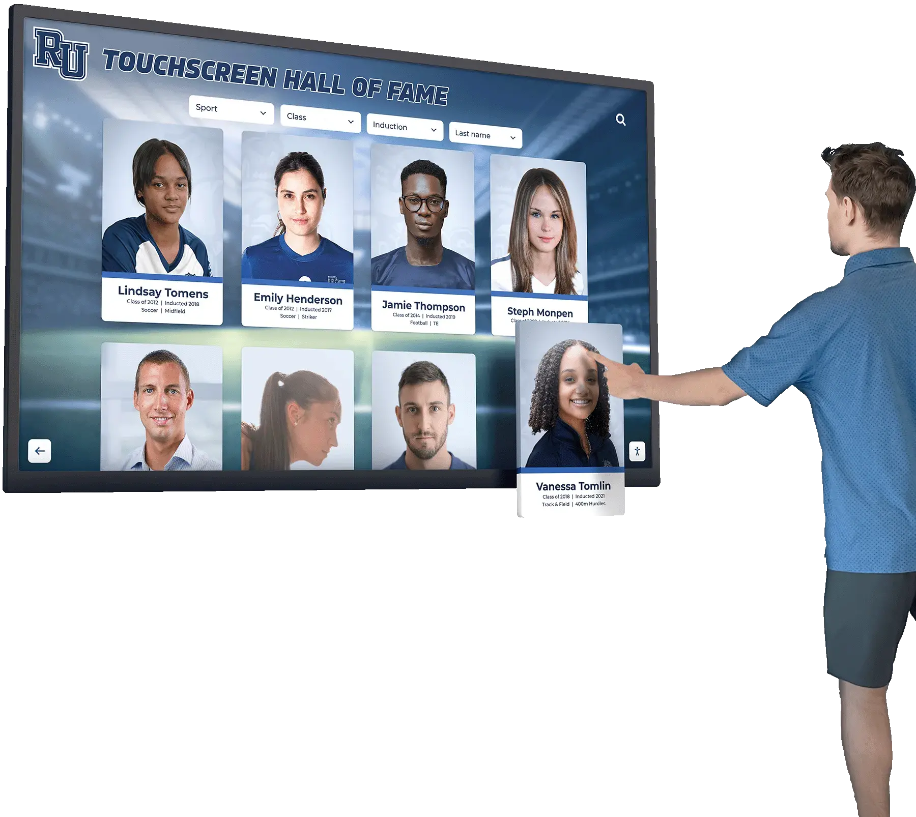
Filter interactions on a digital hall of fame touchscreen determine which inductee cards are visible — aria-disabled is the attribute that tells screen-reader users when a filter option exists but is currently inactive for the selected context
Program Snapshot: ARIA-Disabled Audit Scope for School Hall of Fame Filter Widgets
Define the full audit scope before opening any tools. The table below covers schools at every stage of digital recognition implementation.
| Planning Element | Details |
|---|---|
| Primary Audience | Athletic directors, IT administrators, school web managers, accessibility compliance leads, and recognition-program owners who maintain web-based or touchscreen inductee displays with sport, year, award-type, or multi-dimensional filter controls |
| What Is Being Audited | Every filter control on the recognition platform whose options can become temporarily unavailable based on selection context: sport-category filter lists, class-year range selectors, award-type pickers, gender-category toggles, and any multi-faceted filter widget that narrows the inductee roster based on user selections |
| WCAG Criteria | 4.1.2 Name, Role, Value — Level A; 2.1.1 Keyboard — Level A; 1.3.1 Info and Relationships — Level A |
| Tools Required | Chrome or Firefox with DevTools Accessibility panel, NVDA (Windows, free) or VoiceOver (macOS, built-in), the axe DevTools browser extension, a keyboard without a mouse for interaction testing |
| Time Investment | 25–45 minutes for an initial audit of all filter widgets; 10–15 minutes for a targeted re-check after any filter component, data-binding logic, or inductee dataset update |
| Failure Consequence — Unavailable Options Removed from DOM | Screen-reader users see only active filter options; they cannot distinguish between a sport the platform does not support and a sport with no inductees in the current context; the filter panel’s apparent structure changes silently with each selection |
| Failure Consequence — Unavailable Options Hidden via CSS | Options with display: none or visibility: hidden are removed from the accessibility tree; same outcome as DOM removal — the screen-reader user cannot discover that the option category exists |
| Failure Consequence — Unavailable Options Left Without State Declaration | Options that remain in the DOM but carry no aria-disabled declaration appear interactive to screen readers; a user may attempt to activate a visually grayed filter option and receive no response, with no announcement explaining why the action had no effect |
| Pass Condition | Every filter option that is temporarily unavailable carries aria-disabled="true"; the option remains in the accessibility tree, is announced as “dimmed” or “unavailable” by screen readers, does not execute any filtering action when activated by keyboard or switch-access device, and is visually grayed to match the accessible state |
| ADA Relevance | Public school recognition websites and kiosk displays serving alumni, parents, and community members carry digital accessibility obligations under the ADA and Section 504; WCAG 4.1.2 Level A requires that all UI components expose accurate name, role, and value through the accessibility API, which includes the disabled state for temporarily inactive filter options |
What Is aria-disabled and Why Does It Matter for Inductee Filters?
aria-disabled is a WAI-ARIA state property defined in the WAI-ARIA 1.2 specification (W3C, 2023) that communicates to assistive technologies that an interactive element exists but is not currently operable. The property accepts a boolean string value: aria-disabled="true" marks the element as inactive; aria-disabled="false" or the absence of the attribute marks it as active.
The critical distinction between aria-disabled="true" and the native HTML disabled attribute is how each affects keyboard focus and the accessibility tree:
Native HTML disabled attribute — When applied to a native form control (<button>, <input>, <select>, <option>), the disabled attribute removes the element from the Tab-key focus order and, in most browsers, removes it from the accessibility tree entirely. A disabled <option> inside a <select> is unavailable and typically inaccessible to screen readers as an independent announcement. This behavior is appropriate for permanently unavailable form controls but is unsuitable for filter options in a dynamic recognition archive where the same option may become available again when the visitor adjusts another filter.
aria-disabled="true" on a custom widget element — When applied to an element with a custom ARIA role (role="option", role="menuitem", role="checkbox", role="button", role="listitem"), aria-disabled="true" marks the element as inactive without removing it from the Tab-key focus order or the accessibility tree. The element remains present, focusable, and announced by screen readers—typically with an “unavailable” or “dimmed” suffix—while carrying an explicit state that tells the visitor the option cannot be activated in the current context. JavaScript attached to the widget must intercept keyboard events (Enter, Space) and mouse/touch clicks on aria-disabled="true" elements and prevent the default filtering action from executing; the ARIA attribute communicates the state to assistive technology but does not automatically block interaction the way the HTML disabled attribute does on native controls.
For a digital hall of fame filter list built with custom ARIA roles—a role="listbox" containing role="option" elements, or a role="group" of role="checkbox" filter chips—aria-disabled="true" is the correct tool for marking unavailable filter options. Removing those options from the DOM, hiding them with display: none, or applying the native disabled attribute (which has no semantic effect on non-native-control elements) each fail to communicate the option’s existence and temporary inactive state to screen-reader users.
Auditing how a digital hall of fame announces filter selection state through aria-checked is a companion check to the ARIA-disabled audit: aria-checked communicates whether a filter is currently selected and active, while aria-disabled communicates whether a filter is currently selectable. Both state properties must be correctly implemented on every filter option for a screen-reader user to understand the full interactive state of the filter panel.
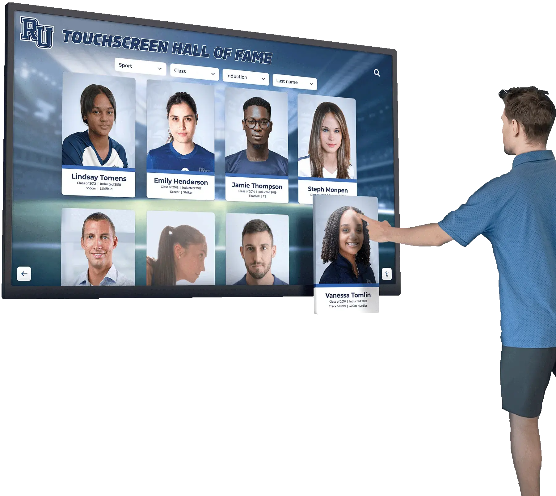
When a visitor narrows the inductee roster by sport or class year, previously active filter options in adjacent categories may become temporarily unavailable — aria-disabled keeps those options visible in the accessibility tree so screen-reader users understand the complete filter set
Content Architecture: Filter Types and aria-disabled Decision Table
The central output of a digital hall of fame ARIA-disabled audit is a pass, remediate, or not-applicable decision for every filter option type on the recognition platform. The table below covers the filter widget types most commonly found on school recognition platforms.
| Filter Widget Type | Role Structure | When an Option Becomes Unavailable | Correct aria-disabled Approach | Common Finding |
|---|---|---|---|---|
| Sport-category filter list | role="listbox" containing role="option" elements | A sport has no inductees for the selected class year or award type | aria-disabled="true" on each unavailable role="option"; JavaScript intercepts Enter/Space and prevents filtering; option remains visible and announced | Option removed from DOM when sport has no inductees; screen reader sees filtered list with no indication of missing categories |
| Class-year range selector | role="listbox" or group of role="option" year buttons | A year has no inductees matching the current sport or award-type filter | aria-disabled="true" on years with no matching inductees; year remains focusable and announced as “unavailable” | Years hidden with display: none; screen reader sees a shorter list with no indication that additional years exist |
| Award-type filter chips | Group of role="checkbox" or role="button" chips | An award type has no inductees in the current sport-and-year context | aria-disabled="true" on the chip element; chip remains in Tab order; chip’s label includes or is supplemented by context about why it is unavailable | Chip visually grayed but aria-disabled absent; screen reader announces the chip as interactive; visitor attempts activation and receives no response |
| Gender-category toggle | role="group" containing role="radio" or custom toggle buttons | One gender category has no inductees for the selected sport or year | aria-disabled="true" on the unavailable toggle; toggle remains focusable and announced as inactive | Toggle removed from DOM or native disabled applied to a non-native element; screen reader cannot discover the category’s existence |
| Multi-select sport checkboxes | role="group" containing role="checkbox" elements | A sport has no inductees matching other active filters | aria-disabled="true" on the role="checkbox" element; aria-checked state remains (typically "false" or omitted) alongside aria-disabled="true" | Native HTML disabled attribute applied to <div role="checkbox">; attribute has no semantic effect on the non-native element; screen reader announces the element as interactive |
| Inductee status filter (Active/Posthumous/Honorary) | role="radiogroup" containing role="radio" elements | A status category has no inductees for the selected sport | aria-disabled="true" on the role="radio" element; element remains focusable and announced as unavailable | Status option hidden with visibility: hidden; element removed from accessibility tree; screen reader cannot discover the category |
Native <select> with <option> elements | Native HTML form control | An option has no matching inductees | Native disabled attribute on <option> is appropriate here; the option remains visible in the <select> but is announced as unavailable by most screen readers | aria-disabled incorrectly applied to a native <option> element (use native disabled attribute for native controls instead) |
| Decade-range slider or stepper | role="slider" | All inductees fall outside a reachable range end | If the entire slider is temporarily meaningless, aria-disabled="true" on the role="slider" element; if only parts of the range are empty, that requires content metadata rather than disabled state on the control | Slider remains interactive with no state change; visitor navigates to years with no results and receives no indication that the range endpoint is unreachable |
The table highlights an important boundary: aria-disabled is the correct tool for custom ARIA role elements; the native HTML disabled attribute is the correct tool for native form controls (<button>, <input>, <select>, <option>). Mixing these—applying native disabled to a <div role="checkbox"> or applying aria-disabled to a native <button>—produces inconsistent behavior across browsers and screen readers. The audit must confirm the element type before classifying the state declaration as correct or incorrect.
Auditing how a digital hall of fame filter panel uses aria-controls to link filter triggers to search result panels is a related check: aria-controls identifies which content region a filter widget updates, while aria-disabled identifies which filter options are currently operable. Both attributes belong on a fully accessible filter panel.
Execution Timeline: Plan → Build → Launch → Refresh
Step 1 — Inventory All Filter Widgets and Their Option Sets
Open the recognition platform in Chrome or Firefox. Navigate to the inductee roster page. Identify every filter widget: sport-category filters, class-year selectors, award-type pickers, gender-category toggles, and any multi-dimensional faceted filter panel. For each widget, record: the containing element’s tag and role, each option element’s tag and role, the total count of options when the full archive is displayed (no filter applied), and the count of options rendered when a narrowing filter is applied.
Apply at least one filter that you know will cause other filter options to become unavailable—for example, selecting a specific class year to narrow the sport filter, or selecting a sport with limited inductees to narrow the award-type filter. Observe what happens to the newly unavailable options: Are they removed from the DOM? Hidden with CSS? Grayed out visually? Grayed out and still present in the DOM? For each scenario, record the exact implementation behavior.
Step 2 — Inspect the DOM State of Unavailable Options
With a narrowing filter applied (from Step 1), open DevTools Elements panel. Expand the filter widget container. For each option that is visually grayed out or was present in the unfiltered state but is now missing:
- If the element is not present in the DOM: record as DOM Removal — Remediate. The option must remain in the DOM with
aria-disabled="true"applied. - If the element is present in the DOM but carries
display: noneorvisibility: hiddenin its computed styles: record as CSS Hidden — Remediate. The option must be visually distinguishable (reduced opacity, grayed text) rather than completely hidden; screen readers skipdisplay: noneandvisibility: hiddenelements. - If the element is present with full or partial opacity and carries
aria-disabled="true": record as Pass — verify state announcement in Step 5. - If the element is present but carries no
aria-disabledattribute and no nativedisabledattribute: record as State Missing — Remediate. The option appears interactive but produces no result when activated. - If the element is a native form control (
<button>,<option>) with the nativedisabledattribute applied: evaluate whether the native attribute exposes the inactive state correctly in the accessibility tree (see Step 3).
Step 3 — Verify the Accessibility Tree for Each Unavailable Option
For each unavailable filter option identified in Step 2, open DevTools Accessibility panel (Chrome: Elements panel → Accessibility tab). Confirm the element’s computed accessibility properties. A correctly implemented aria-disabled="true" option should show:
- Role: matches the element’s
roleattribute (e.g., “option”, “checkbox”, “menuitem”) - Name: the filter option’s accessible label (e.g., “Swimming”, “Class of 2018”, “Academic Achievement Award”)
- Disabled state:
true(shown asaria-disabled: truein the computed properties panel)
If the element is not present in the DevTools Accessibility tree at all—because it was hidden via display: none, visibility: hidden, or DOM removal—record it as absent and classify as Remediate.
If the element is present in the accessibility tree but the disabled state is false or not shown, aria-disabled="true" is either missing or incorrectly formatted. Record as State Missing — Remediate.
Step 4 — Confirm JavaScript Blocks Interaction on aria-disabled Options
aria-disabled="true" is a semantic declaration; it does not automatically prevent the element from executing its action when activated. For each element marked aria-disabled="true", test the following:
- Tab to the unavailable filter option using the keyboard.
- Press Enter or Space (whichever activates the filter normally).
- Confirm that the inductee roster does not change in response — the unavailable filter option must be inert even when focused and activated.
- Press the mouse button or simulate a touch tap on the element (or use browser DevTools to simulate a click event).
- Confirm again that no filtering action executes.
If the element executes a filtering action when activated while carrying aria-disabled="true", record as JavaScript Intercept Missing — Remediate. The event handler must check for aria-disabled="true" on the target element and call event.preventDefault() before applying any filter logic.
Step 5 — Test Screen Reader Announcement of Unavailable Options
Enable NVDA in Chrome on Windows. Apply a narrowing filter to make at least one sport or year option unavailable. Tab into the filter widget. Navigate through the options using Arrow keys (for role="listbox") or Tab (for role="checkbox" chips or role="button" filters). For each unavailable option, NVDA should announce: the option’s name, its role, and a state indicator — typically “dimmed” or “unavailable.”
Common NVDA announcements for aria-disabled="true" elements by role:
role="option"witharia-disabled="true": NVDA announces the option name followed by “dimmed”role="checkbox"witharia-disabled="true": NVDA announces the label followed by “checkbox, unavailable” or “dimmed”role="button"witharia-disabled="true": NVDA announces the label followed by “button, dimmed”
If NVDA does not reach the unavailable option at all — because it was removed from the DOM or hidden with CSS — record as AT Invisible — Remediate.
Enable VoiceOver on macOS. Navigate to the filter widget using VO+Right Arrow. VoiceOver should announce each unavailable option with a “dimmed” state indicator. Confirm that VoiceOver does not skip the unavailable options and does not announce them as interactive without any state qualifier.
Auditing how a digital hall of fame handles aria-busy during filter-triggered data loads is a complementary test: when a visitor activates an available filter and the inductee roster begins loading new results, aria-busy="true" on the results region communicates to screen readers that the content is being updated — preventing premature reading of incomplete results. aria-disabled on unavailable options and aria-busy on the results region together cover the filter interaction’s full accessibility surface.
Step 6 — Test Keyboard Focus Behavior on Unavailable Options
Confirm that unavailable filter options marked with aria-disabled="true" remain reachable by keyboard. Per the WAI-ARIA Authoring Practices Guide, elements with aria-disabled="true" should typically remain in the Tab order (unlike native disabled controls, which are removed from the Tab order). This allows keyboard users to discover unavailable options and read their labels, gaining the same information that sighted visitors receive from the visual grayed state.
- Tab through the filter widget from the first focusable element to the last.
- Confirm that unavailable options receive focus when Tab reaches them.
- Confirm that the browser’s focus indicator is visible on the unavailable option (reduced opacity does not exempt the element from focus-visibility requirements under WCAG 2.4.11 Level AA).
- Confirm that pressing Tab again from the unavailable option moves focus to the next element in the Tab order without triggering any filter action.
If unavailable options are removed from the Tab order by tabindex="-1" without a corresponding mechanism to inform keyboard users that additional (unavailable) options exist in this filter category, record as Focus Order — Review Required. In some implementations, removing unavailable options from Tab order is a deliberate design choice paired with an accessible count announcement (“3 of 7 sport filters available”); document the full pattern before classifying as a failure.
Step 7 — Verify Visual and Accessible State Consistency
Confirm that every option marked aria-disabled="true" is also visually grayed or otherwise visually distinct from active options. The W3C’s Understanding Success Criterion 1.4.3 Contrast (WCAG 2.1) notes that inactive user interface components are exempted from contrast minimums — but this exemption applies only when the inactive state is clear from context. A filter option that is grayed to 2:1 contrast against the panel background is visually distinct; a filter option grayed to 4.5:1 (same as an active option) may not be visually distinguishable as inactive. Confirm that the visual graying is sufficient to distinguish unavailable options from active ones for low-vision visitors who do not use screen readers.
For each unavailable option, the alignment check is:
- DOM present: Yes
- CSS visible (not
display: none, notvisibility: hidden): Yes - Opacity or color reduced (visually grayed): Yes
aria-disabled="true"present: Yes- JavaScript intercept blocks activation: Yes
- Screen reader announces as “dimmed” or “unavailable”: Yes
Any row that breaks this alignment is a finding.
Step 8 — Run axe DevTools Structural Verification
With a narrowing filter applied (unavailable options visible and grayed), run the axe DevTools browser extension. Review results in the categories: ARIA Valid Attribute Value (checks for aria-disabled with non-boolean values), Keyboard (flags interactive elements not reachable by Tab if they are expected to be focusable), and Element Has Visible Focus. Document axe violations alongside manual findings from Steps 4–7.
Apply a second filter to further narrow the available options and run axe again. Dynamic filter applications that remove or add aria-disabled states on the fly must maintain valid ARIA markup after each state transition — axe verification should be run in multiple filter states, not only in the default unfiltered view.
Step 9 — Document and Assign Remediation
For each filter option that fails the audit, document: the filter widget type, the page URL, the element’s selector or accessible name, the filter context that triggers the unavailability, the specific failure pattern (DOM removal, CSS hide, state missing, JavaScript intercept missing), the WCAG criterion, and the recommended fix.
Common fixes:
- Replace DOM removal with in-place
aria-disabled="true"addition and CSS opacity reduction when a filter option becomes temporarily unavailable - Replace
display: noneorvisibility: hiddenwithopacity: 0.4plusaria-disabled="true"to keep options in the accessibility tree while graying them visually - Add
aria-disabledto custom widget elements (role="option",role="checkbox",role="button") that currently have no state declaration when unavailable - Add a JavaScript event-handler guard that checks
element.getAttribute('aria-disabled') === 'true'before executing any filter logic, and callsevent.preventDefault()when the guard condition is met - For native
<select>/<option>elements: replacearia-disabled(which has no effect on native controls) with the nativedisabledattribute on individual<option>elements
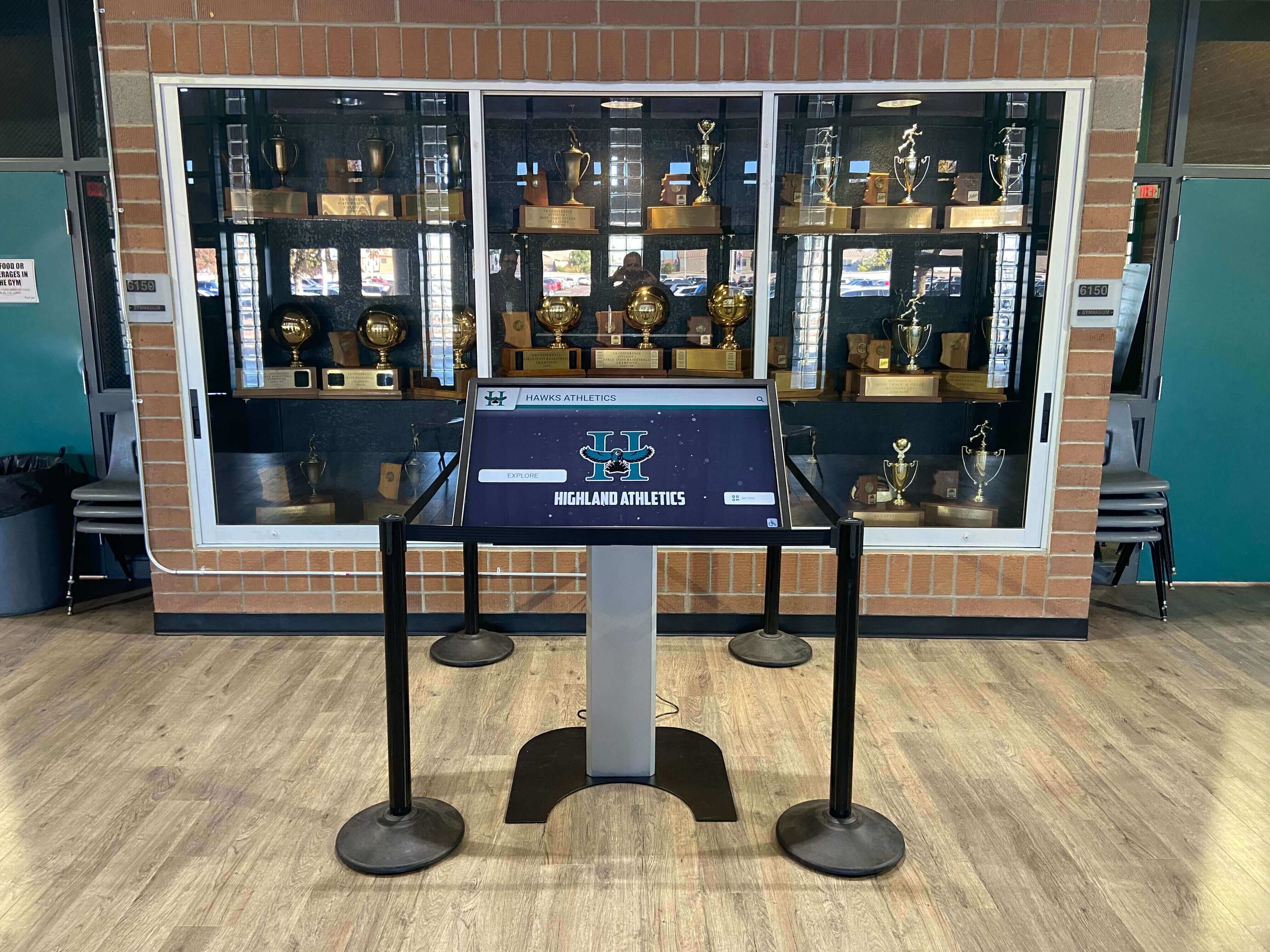
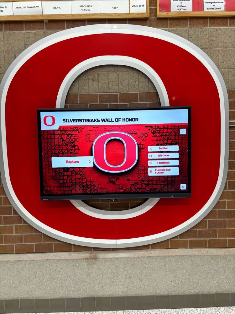
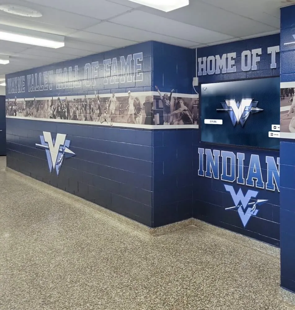
Hall of fame touchscreen kiosks in school trophy cases present filter panels where some sport or class-year options may be temporarily inactive — aria-disabled preserves those options in the accessibility tree so every visitor understands the complete filter set
Display Integration: Filter Unavailability Across Web Directory and Kiosk Interfaces
A digital hall of fame platform that serves both a web directory and a physical kiosk typically shares a single filter component library. An aria-disabled implementation that passes the web directory audit propagates to the kiosk automatically when both environments use the same component. Schools should confirm with their platform vendor whether the kiosk interface uses the same shared filter component or a purpose-built touch-only filter implementation.
Kiosk filter panels are frequently simplified compared to the web directory: a kiosk in a school lobby may offer only a sport-category filter and a class-decade filter, while the web directory supports sport, year, award type, gender category, and status filters simultaneously. A simplified kiosk filter panel that has fewer options has fewer unavailability scenarios to audit — but each scenario still requires aria-disabled on unavailable options if the kiosk interface supports assistive technology input (switch-access devices, external keyboards, or screen readers on the underlying browser).
Schools with a printed championship banner display alongside the digital kiosk can cross-reference the physical display to verify that the filter categories match the banner categories. If the printed recognition banner lists twelve sport categories and the kiosk filter panel offers only six, that discrepancy may reflect correctly archived data (only six sports have inductees) or missing data (six sports’ inductees were never entered). Resolving data completeness before auditing filter state ensures the aria-disabled audit reflects real unavailability rather than data gaps that should be filled. Championship banner variable-data printing for school athletic programs involves coordinating exactly this kind of sport-category alignment between physical and digital recognition assets — join the waitlist to be notified when new planning resources are available.
Reviewing the best hall of fame tools available for school recognition programs involves evaluating whether each tool’s filter components are built with correct ARIA semantics — including aria-disabled state management for unavailable options — or whether accessibility is a post-purchase customization. A platform that manages filter state through aria-disabled natively requires no accessibility rework after deployment; a platform that removes unavailable options from the DOM requires remediation at the component layer.
Auditing how a digital hall of fame uses aria-pressed for toggle-style filter controls is a related check for filter panels that use toggle buttons rather than listbox options: aria-pressed communicates the on/off state of a toggle filter, while aria-disabled communicates when the toggle is not currently operable. Both state properties may appear on the same filter panel when some toggles are active and others are unavailable for the current context.
Rocket Alumni Solutions’ recognition platform manages inductee filter state through a component layer that applies aria-disabled="true" to unavailable sport, year, and award-type options as inductee data changes — keeping the full filter set visible in the accessibility tree in every filtered state. Schools that need to document WCAG 2.1 AA compliance for district or state accessibility reviews can request the platform’s filter component accessibility documentation and assistive-technology test results as part of the demo process.
See Accessible Inductee Filter Controls in a Live Demo
Request a walkthrough of Rocket Alumni Solutions’ recognition platform to see how sport-category, class-year, and award-type filter options implement aria-disabled state management — keeping unavailable options visible and correctly announced for every visitor, regardless of which filters are active.
Reusable Audit Checklist: Digital Hall of Fame ARIA-Disabled Audit for Unavailable Filters
Copy this checklist into your accessibility tracking system. Mark each item as Pass, Remediate, or N/A.
Inventory
- All filter widgets on the recognition platform identified: sport category, class year, award type, gender category, inductee status, and any multi-dimensional faceted filters
- A test scenario identified for each filter widget that causes at least one option to become temporarily unavailable (e.g., selecting a specific decade that has no swimming inductees)
- The DOM behavior of each unavailable option confirmed: DOM removal, CSS hide, state missing, or
aria-disabled="true"correctly applied
Per Filter Option — Unavailable State Declaration
- Unavailable
role="option"element:aria-disabled="true"present; element remains in DOM; element is CSS-visible (notdisplay: noneorvisibility: hidden) - Unavailable
role="checkbox"element:aria-disabled="true"present; element remains in DOM and Tab order - Unavailable
role="button"filter element:aria-disabled="true"present; element remains focusable - Unavailable native
<option>inside<select>: nativedisabledattribute present (notaria-disabled) - Visual graying or reduced opacity applied to all unavailable options to match the accessible state
Per Filter Widget — JavaScript Interaction Guard
- JavaScript event handler checks
aria-disabled="true"before executing filter logic - Pressing Enter or Space on an
aria-disabledoption does not update the inductee roster - Mouse click or touch tap on an
aria-disabledoption does not update the inductee roster - Focus indicator visible on unavailable option when keyboard focus reaches it
Per Filter Widget — Accessibility Tree Verification
- Chrome DevTools Accessibility panel shows
aria-disabled: truein computed properties for each unavailable option - Unavailable options are present as nodes in the accessibility tree (not absent due to DOM removal or CSS hide)
- axe DevTools: no ARIA Valid Attribute Value violations on filter option elements; no Keyboard violations for expected-focusable elements
Screen Reader Verification
- NVDA + Chrome: unavailable filter options announced with “dimmed” or “unavailable” state indicator; no response when Enter/Space pressed on unavailable option; focus proceeds to next option when Tab pressed
- VoiceOver + Safari: unavailable options announced with “dimmed” indicator; VoiceOver does not skip unavailable options during navigation
- Available filter options remain fully interactive and continue to update the inductee roster correctly after remediation
Regression Checks
- After any filter component update or JavaScript data-binding change: re-verify
aria-disabledis applied correctly in all unavailability scenarios - After any CMS inductee data update that changes which sport/year combinations have inductees: confirm filter options transition correctly between available and unavailable states
- After any CSS framework or component library upgrade: confirm
aria-disableddeclaration is preserved in the rendered HTML and visual graying remains visually distinct
Assistive Technology Verification Table
Run these scenarios for each filter widget type before each recognition season.
| Scenario | Test Action | Expected Behavior | Pass? |
|---|---|---|---|
| Unavailable sport option — NVDA announcement | Apply year filter that eliminates swimming inductees; Tab to the Swimming filter option | NVDA announces “Swimming, option, dimmed” (or equivalent “unavailable” phrasing) | Confirm |
| Unavailable sport option — Enter key | Focus the unavailable Swimming option; press Enter | No change to inductee roster; no error; focus remains on the option | Confirm |
| Unavailable sport option — Space key | Focus the unavailable Swimming option; press Space | No change to inductee roster | Confirm |
| Unavailable year option — VoiceOver | Apply sport filter that eliminates Class of 2004 inductees; navigate to 2004 in year selector | VoiceOver announces “2004, option, dimmed” | Confirm |
| Unavailable option — Tab key behavior | Focus unavailable option; press Tab | Focus advances to next option in Tab order; no filtering executed | Confirm |
| Unavailable option — focus indicator | Tab to unavailable option | Browser focus ring visible on option despite reduced opacity | Confirm |
| Unavailable option — accessibility tree presence | Apply narrowing filter; inspect accessibility tree in DevTools | Unavailable option appears as a node in the accessibility tree with aria-disabled: true in computed properties | Confirm |
| Unavailable option — axe scan | Apply narrowing filter; run axe DevTools | No ARIA Valid Attribute Value violations; no Keyboard violations on filter panel | Confirm |
| Available option after disabled option — NVDA | Navigate past unavailable options using Arrow keys | NVDA announces available options without “dimmed” state; Arrow key navigation continues smoothly | Confirm |
| Filter reset — options become available | Clear all applied filters; navigate filter panel | Previously unavailable options are now announced without “dimmed” state; aria-disabled="true" has been removed by JavaScript | Confirm |
| Kiosk filter panel — unavailable option | On kiosk interface (or simulated kiosk viewport), apply narrowing filter; Tab to unavailable option | Same aria-disabled="true" behavior as web directory; option announced as unavailable | Confirm |
Native <select> with disabled <option> | Open native select filter; navigate options with Arrow keys | Disabled <option> announced by screen reader as unavailable or skipped based on native browser behavior; verify in target browser/AT combination | Confirm |
Measurement: Indicators of aria-disabled Filter Compliance Quality
| Signal | Target | How to Measure |
|---|---|---|
| Filter options that become unavailable in at least one context | 100% identified in inventory | Count total filter options across all widgets; apply narrowing filters to discover unavailability scenarios; confirm all scenarios are documented |
| Unavailable options with correct aria-disabled declaration | 100% of unavailable custom-role options | Apply each narrowing filter; count unavailable options; count those with aria-disabled="true" and DOM-visible presence |
| Unavailable options absent from accessibility tree | Zero options missing from accessibility tree due to DOM removal or CSS hide | Inspect accessibility tree for each narrowing-filter scenario; count absent options |
| JavaScript interaction guards present | 100% of unavailable options block filtering action on activation | Keyboard and mouse test per unavailable option per widget type; record any that execute filtering action |
| Visual graying consistency | 100% of unavailable options visually distinct from active options | Visual inspection per filter widget in all unavailability scenarios |
| axe violations — ARIA Valid Attribute Value (filter options) | Zero violations | Run axe in multiple filter states; count ARIA attribute value violations on filter elements |
| Screen-reader navigation success — unavailable options discoverable | 100% of unavailable option types discoverable in NVDA + VoiceOver | Manual test per filter widget type; record options that are invisible to AT |
Frequently Asked Questions
What is the difference between aria-disabled and removing an unavailable filter option from the DOM?
Removing an unavailable option from the DOM makes it invisible to screen readers and keyboard users — they cannot discover that the option category exists. Using aria-disabled="true" on the option preserves it in the accessibility tree and announces it as temporarily inactive, giving screen-reader users the same understanding as sighted visitors who see a grayed option. The WAI-ARIA 1.2 specification’s definition of aria-disabled explicitly supports this use: indicating that an element is perceivable but not operable, without removing it from the interaction model.
Does aria-disabled=“true” automatically prevent the element from responding to keyboard events?
No. aria-disabled="true" is a semantic declaration that communicates state to assistive technologies — it does not modify event handling in the browser. JavaScript must separately intercept keyboard and mouse events on elements with aria-disabled="true" and prevent the default action from executing. The common implementation pattern is to check event.target.getAttribute('aria-disabled') === 'true' at the top of the event handler and return early without executing filter logic when the check is true.
Can I use the native HTML disabled attribute instead of aria-disabled on custom filter widgets?
The native disabled attribute affects the behavior and accessibility tree of native form controls only: <button>, <input>, <select>, <textarea>, <option>, <optgroup>, and <fieldset>. Placing the disabled attribute on a <div>, <span>, or <li> element with a custom ARIA role (such as role="option" or role="checkbox") has no semantic effect — the attribute is not recognized as meaningful by browsers or accessibility APIs for non-native elements. Custom widget elements require aria-disabled="true" to communicate an inactive state. Only for native controls should you use the native disabled attribute.
Should unavailable filter options remain in the Tab order?
The WAI-ARIA Authoring Practices Guide recommends that elements with aria-disabled="true" remain focusable, including in the Tab order, so that keyboard users can discover and read them. This is different from native disabled controls, which are removed from the Tab order entirely. Keeping unavailable options in Tab order allows keyboard users to understand the full filter set — not just the currently active subset — matching the experience of sighted visitors who see grayed options alongside active ones. If your implementation removes unavailable options from the Tab order for design reasons, provide an equivalent mechanism (such as an announcement of the total option count including unavailable options) so keyboard users are not missing information.
What should a screen reader announce when focus reaches an aria-disabled filter option?
Announcement behavior varies by screen reader and browser combination. NVDA with Chrome typically announces the element’s name, its role, and “dimmed” for aria-disabled="true" elements (e.g., “Swimming, option, dimmed”). VoiceOver on macOS with Safari typically announces “dimmed” as a state qualifier on the element’s name. JAWS with Chrome may announce “unavailable” or suppress the element from Tab navigation depending on configuration. The audit’s screen-reader test in Step 5 should verify the actual announcement in the target combinations used by your school community, rather than relying on expected behavior from the specification alone.
How does aria-disabled interact with aria-checked on filter checkboxes?
Both aria-disabled and aria-checked can appear on the same role="checkbox" element. When a filter checkbox is both checked and disabled — because the visitor selected it earlier and then applied another filter that made it unavailable — the element should carry aria-disabled="true" and retain its current aria-checked state. Screen readers typically announce both states: “Swimming, checkbox, checked, dimmed.” This combination is uncommon on recognition filters (most designs deselect a filter automatically when it becomes unavailable) but the ARIA specification permits it, and the implementation should handle it gracefully if the platform’s filter logic supports it.
How often should the aria-disabled audit be repeated?
The audit should run once at initial platform launch and then after any change that modifies filter component logic, filter option rendering, or inductee data in ways that affect which sport-year-award combinations produce empty results. Adding inductee records through the cloud CMS does not require a re-audit of the aria-disabled implementation — only changes to the component layer or data-binding logic that controls how unavailability is signaled to the DOM. Schools should schedule the audit alongside other ARIA state audits (aria-checked, aria-pressed, aria-expanded) on a pre-season accessibility review schedule.
Connecting Filter Accessibility to the Recognition Program Experience
A digital hall of fame serves the broadest possible community: alumni who graduated before the digital platform existed, parents who attended induction ceremonies and want to revisit their student’s recognition, students who use the archive for school history projects, and community members who visit the lobby kiosk during an open house. Each of these visitors arrives with a different set of assumptions about which sports, years, and award types the school has recognized. When the filter panel presents only active options — silently omitting unavailable ones — a screen-reader user cannot distinguish between a sport the school does not recognize and a sport with no inductees for the selected decade. That ambiguity is not a minor inconvenience; it is a gap in the recognition program’s communication of its own scope and history.
aria-disabled="true" closes that gap with a single attribute. The unavailable filter option remains in the accessibility tree, announced as temporarily inactive, allowing the visitor to understand: this sport is recognized, it simply has no inductees in this decade. The mental model of the archive’s full scope is preserved, the visit can continue without confusion, and the recognition program has served that visitor completely.
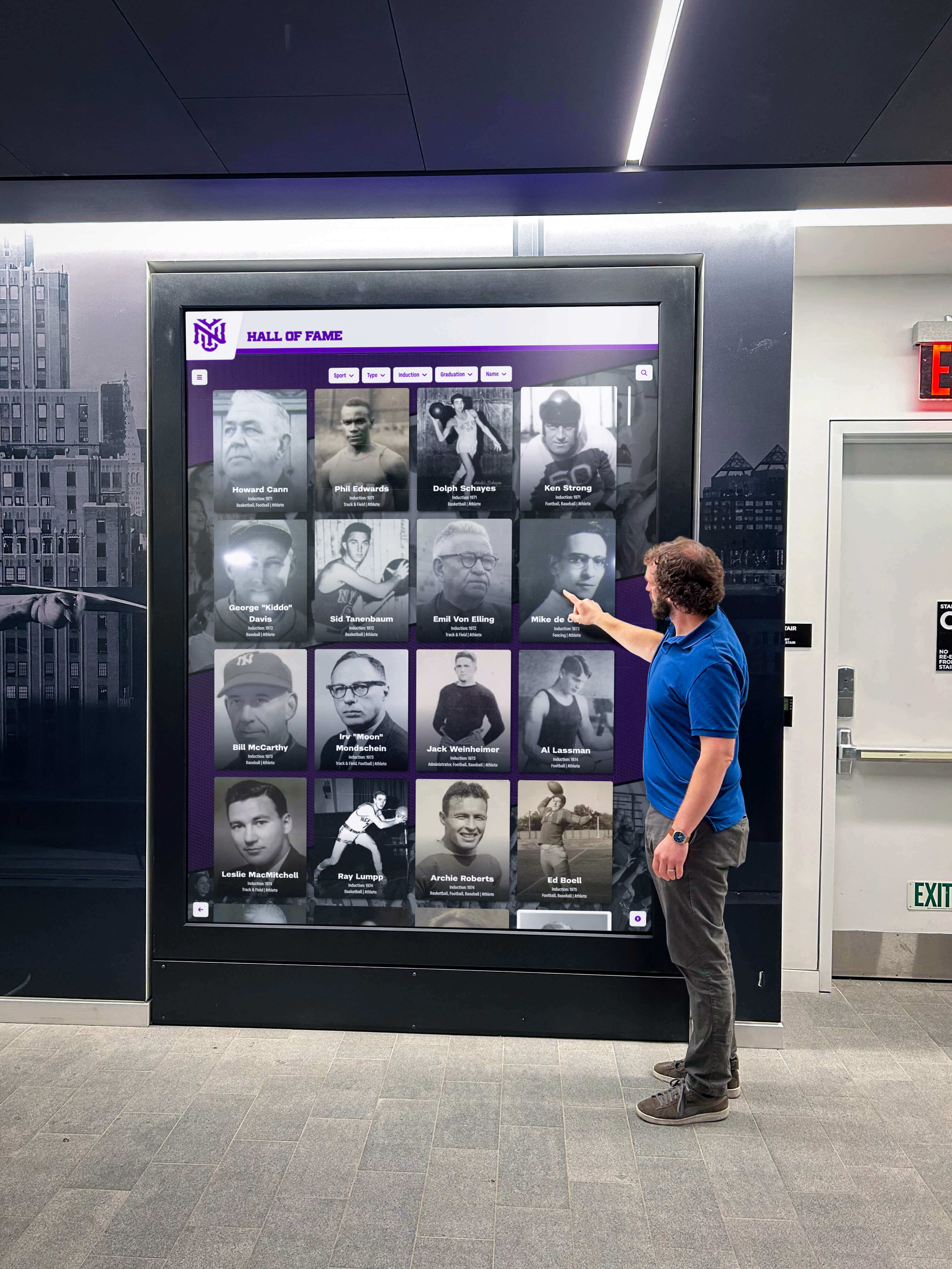
Community members exploring a school's recognition history through filter controls deserve accurate announcements about which filter options are active and which are temporarily unavailable — aria-disabled delivers that information to every screen-reader user
Athletic directors and recognition staff who manage the inductee archive are accustomed to thinking about filter availability in data terms: which sports have inductees, which class years have nominations, which award types have been conferred. The aria-disabled audit translates that data-level thinking into an accessibility check: for every filter state the data creates, does the platform correctly announce the state to assistive technology? The answer determines whether the recognition program’s digital presence serves its full community or only its sighted majority.
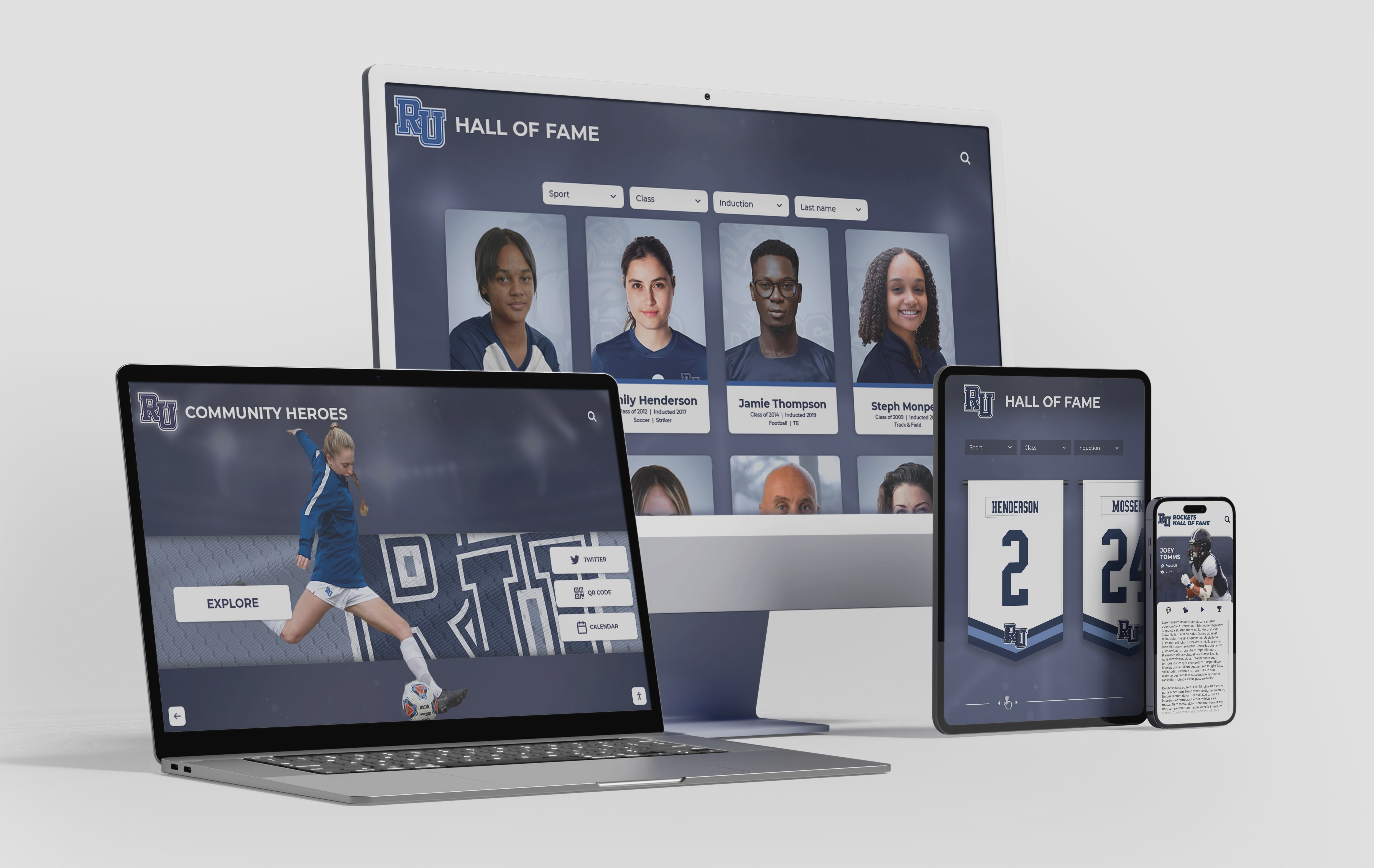
A digital hall of fame ARIA-disabled audit for unavailable filters applies across every device and browser where the inductee roster filter panel appears — desktop web, tablet, mobile, and kiosk — confirming that unavailable options are correctly announced in every context
The ARIA-disabled audit for unavailable filters is a 25–45 minute investment run once per platform, repeated after component changes, and maintained through data updates without re-testing. It requires no specialized accessibility tools beyond free browser extensions, built-in screen readers, and DevTools. It produces a documented checklist that can be retained for district-level accessibility compliance records, shared with platform vendors during contract reviews, and updated after each component or data-binding change.
Rocket Alumni Solutions’ digital hall of fame platform is built to WCAG 2.1 AA standards, with filter components that apply aria-disabled="true" to unavailable sport, year, and award-type options as inductee data and visitor selections change — keeping the full filter set visible and correctly announced in the accessibility tree in every filtered state. JavaScript interaction guards prevent unavailable options from executing filter actions regardless of how they are activated. Schools that need to document WCAG 2.1 AA compliance for district or state accessibility reviews can request the platform’s filter component accessibility documentation and assistive-technology test results as part of the demo process.
See How Rocket Alumni Solutions Handles Unavailable Filters Accessibly
Request a demo of the Rocket Alumni Solutions recognition platform to see how sport-category, class-year, and award-type filter options use aria-disabled state management — so unavailable filters are visible and correctly announced to every screen-reader user, on every device, in every filter context.