


A digital hall of fame accessible name audit is the process of verifying that every interactive element on your school’s recognition website—icon-only buttons, search input fields, sport and year filter controls, and media playback actions—exposes a meaningful text label to screen-reading software. An accessible name is the text a screen reader announces the moment keyboard focus lands on a control. When a control has no accessible name, a visitor using NVDA, JAWS, VoiceOver, or TalkBack hears only the element type—“button,” “edit,” or “combobox”—without any indication of what that control does or why it matters. On a digital hall of fame platform, the controls most likely to fail this check are icon-only share and play buttons attached to inductee profiles, a search field that relies on placeholder text instead of a visible or programmatic label, and sport-category or decade filter buttons that display logos or checkmarks with no accompanying text. This guide gives school administrators, athletic directors, IT staff, and recognition-program managers a complete audit workflow they can run using free tools in under 45 minutes.
When a visually impaired parent visits your school’s athletic hall of fame to find their child’s induction record, every button they encounter must announce itself clearly. A play button that says only “button” tells the visitor nothing. A filter chip displaying a football icon with no label leaves them guessing whether activating it will show football inductees or clear all filters. A search field whose only label is placeholder text—text that disappears the moment the visitor begins typing—leaves them without any indication of what the input accepts.
The accessible name is the foundational layer of interactive accessibility. Before focus order, before color contrast, before ARIA live regions, every control must have a name that describes its purpose. A digital hall of fame platform with dozens of icon buttons, a multi-faceted filter system, and a prominent search bar presents a concentrated accessible-name audit surface. This guide addresses each element type in sequence.

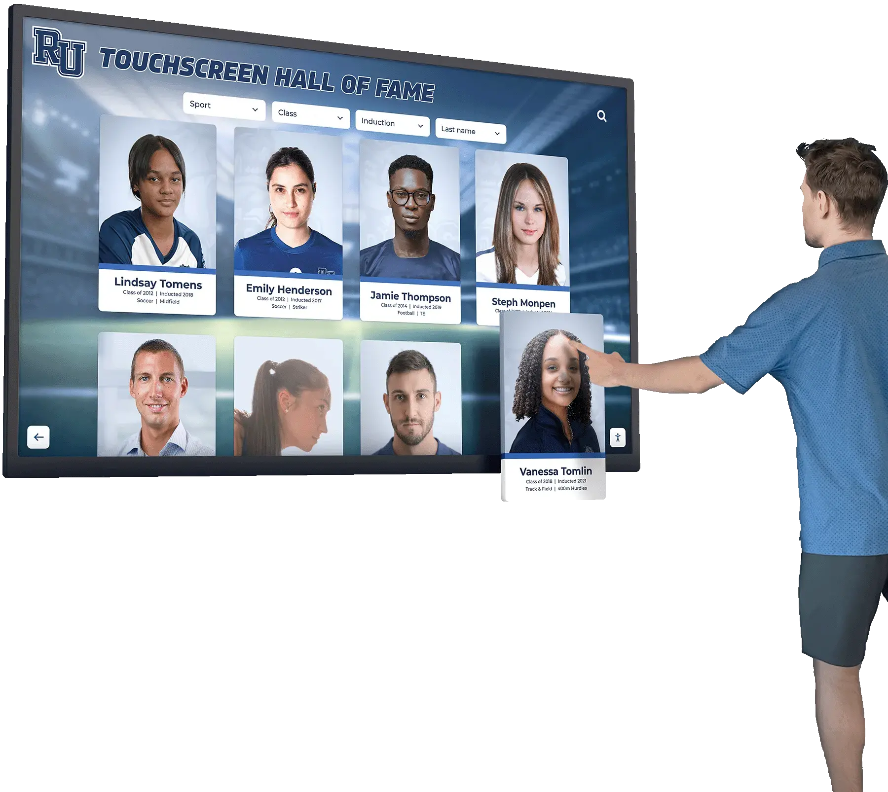

Every icon button, search field, and filter control on a digital hall of fame touchscreen and web directory must expose a clear accessible name so screen-reader users know what each control does before activating it
Program Snapshot: Accessible Name Audit Scope for School Hall of Fame Sites
Establish the audit scope before opening a browser or developer tool. The table below defines key parameters for schools at any stage of digital recognition.
| Planning Element | Details |
|---|---|
| Primary Audience | Athletic directors, IT administrators, school web managers, accessibility compliance leads, facilities coordinators |
| What Is Being Audited | Accessible names on icon-only buttons, search input fields, filter controls, media playback actions, and social share elements in the digital hall of fame web directory and touchscreen kiosk interface |
| Tools Required | Chrome DevTools Accessibility panel (free, built-in), axe DevTools browser extension (free tier), and at least one screen reader: NVDA (Windows, free) or VoiceOver (macOS, built-in) |
| WCAG Criteria | 4.1.2 Name, Role, Value — Level A; 2.5.3 Label in Name — Level AA; 1.3.1 Info and Relationships — Level A |
| Time Investment | 30–45 minutes for an initial audit of all control types; 10–15 minutes for a targeted re-check after any button, search, or filter code change |
| Failure Consequence | Screen-reader users encounter unlabeled controls and cannot determine whether they are activating a play button, a share button, a filter toggle, or a search submit; they must guess or abandon the interaction |
| Pass Condition | Every interactive control exposes an accessible name that describes its function clearly, either through visible text, aria-label, aria-labelledby, or a combination that meets the Label in Name requirement |
| ADA Relevance | Public school recognition sites served to the community are subject to digital accessibility requirements; WCAG 4.1.2 Name, Role, Value at Level A is the floor criterion for all interactive elements |
What Is an Accessible Name, and How Is It Computed?
An accessible name is the text value that browsers compute for each interactive element and expose through the accessibility API to screen-reading software. It is the first thing a screen reader announces when keyboard focus arrives at a control. Without it, the screen reader can identify the element type—button, text field, checkbox—but cannot tell the user what that element does.
The browser computes an accessible name by checking a defined priority order of sources, specified in the ARIA Accessible Name and Description Computation (accName) algorithm:
1. aria-labelledby (highest priority): The browser reads the text content of one or more other elements on the page and uses it as the accessible name. This approach works well when a visible heading or label is already present in the DOM and can be associated with the control.
2. aria-label: A string attribute placed directly on the interactive element. The browser uses this string as the accessible name, overriding any visible text the element might contain. This is the standard approach for icon-only buttons that have no visible text child.
3. Native label association (<label for=""> or wrapping <label>): For input fields, the HTML <label> element creates an explicit association. The label text becomes the input’s accessible name.
4. title attribute: A fallback source that also produces a tooltip on hover. Using title alone for accessible names is not recommended because it is inconsistent across screen readers and not perceivable by keyboard-only users who rely on focus rather than hover.
5. Placeholder attribute: A placeholder value is not a valid source of accessible name for an input field. The WCAG technique explicitly disqualifies placeholder as a substitute for a label because placeholder text disappears when the visitor begins typing, leaving the input without a programmatically determinable name mid-interaction.
6. Element text content (for buttons and links): For <button> elements and <a> elements, the browser uses the visible text children as the accessible name. When a button contains only an SVG icon or <img> with no alt text, no text content is available and the button has no accessible name.
On a digital hall of fame site, these computation paths matter because different control types fail for different reasons. Icon buttons fail because they have no text content and no aria-label. Search fields fail because they use placeholder text instead of a <label>. Filter dropdowns fail because their <select> element lacks an associated label. Each failure type requires a different fix, and an accessible name audit must check each type separately.
Content Architecture: Control Types and Their Accessible Name Requirements
A digital hall of fame web directory and touchscreen interface typically contains four categories of interactive controls, each with distinct accessible name patterns.
| Control Category | Common Examples | Most Frequent Failure | Correct Implementation |
|---|---|---|---|
| Icon-only action buttons | Play video, pause video, share profile, print page, download photo, mute audio, expand fullscreen | No aria-label; screen reader announces only “button” | Add aria-label="Play [Inductee Name] tribute video" or aria-label="Share [Inductee Name] profile" |
| Search input fields | Name search, keyword search, combined name-and-sport search | placeholder text used instead of <label>; placeholder disappears on input | Add a visible <label for="search-id">Search inductees by name</label> or aria-label="Search inductees by name" on the <input> |
| Filter controls | Sport-category buttons, decade selector, award-type checkboxes, “All” reset button, year-range slider | Icon-only sport buttons (football logo with no text); unlabeled <select> dropdowns; sliders with no aria-label | Add visible text or aria-label to each filter button; associate <label> with every <select> and <input type="range"> |
| Media actions | Inductee highlight reel controls, acceptance speech player, photo gallery navigation (previous/next arrow buttons), carousel dot controls | Arrow buttons labeled only “button”; carousel dots labeled “1,” “2,” “3” without context | Add aria-label="Next inductee photo" / aria-label="Previous inductee photo"; label carousel dots aria-label="Inductee photo 1 of 5" |
Icon Button Naming Depth
For hall of fame platforms, icon buttons are the highest-risk control category because recognition profiles typically aggregate several actions: play a video tribute, share a profile URL on social media, print the profile page, download a headshot, and sometimes add the inductee to a personal watchlist or favorites collection. When all five of these actions appear as icon-only buttons in a compact action bar, an unlabeled control row leaves a screen-reader user with five consecutive “button” announcements and no way to distinguish among them.
The accessible name for action buttons on a recognition profile should include the inductee’s name when the button is contextually tied to a specific person. A generic label like aria-label="Play video" is technically a name, but it is ambiguous when multiple inductee cards appear on a search results page. A name like aria-label="Play tribute video for Marcus Taylor, Class of 1998" is unambiguous regardless of where keyboard focus arrives on the page.
For media player controls embedded within an inductee profile page (where the inductee context is already established by the page heading), shorter labels—aria-label="Play tribute video", aria-label="Pause video", aria-label="Mute audio", aria-label="Enter fullscreen"—are appropriate because the surrounding heading structure provides the missing context through aria-labelledby.
Schools planning recognition programs that include video tribute features alongside historical records—the kind of multi-media inductee profiles common in comprehensive athletic archive programs that protect digital school records—should include an icon-button accessible name check in the platform acceptance criteria before any inductee content is published.
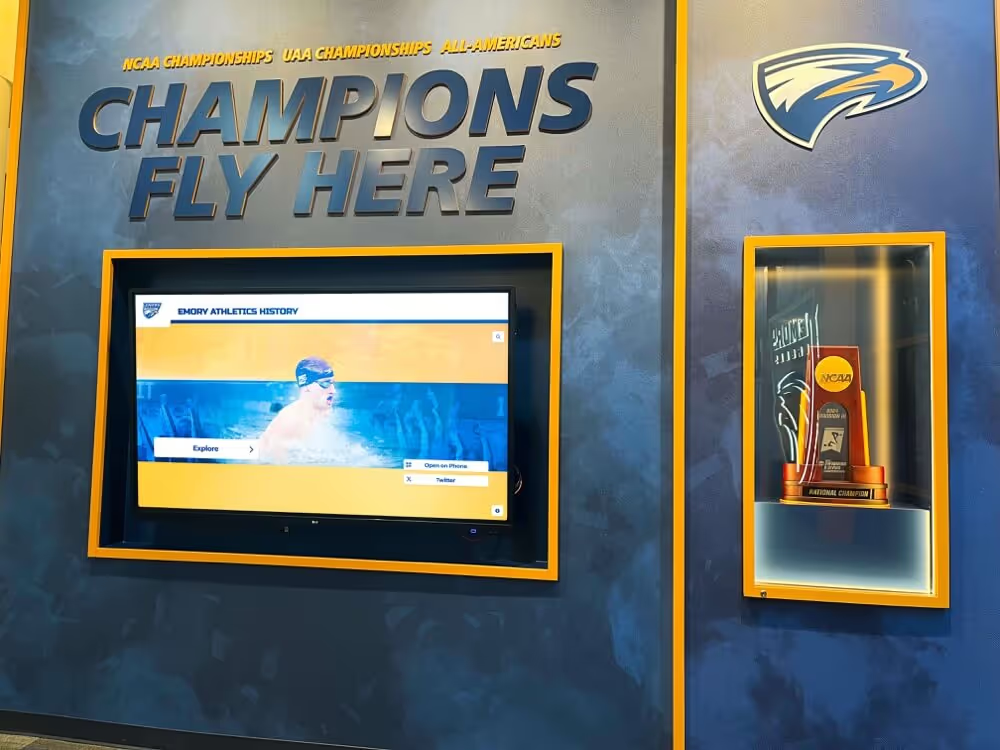
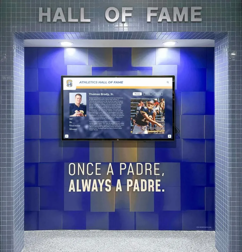
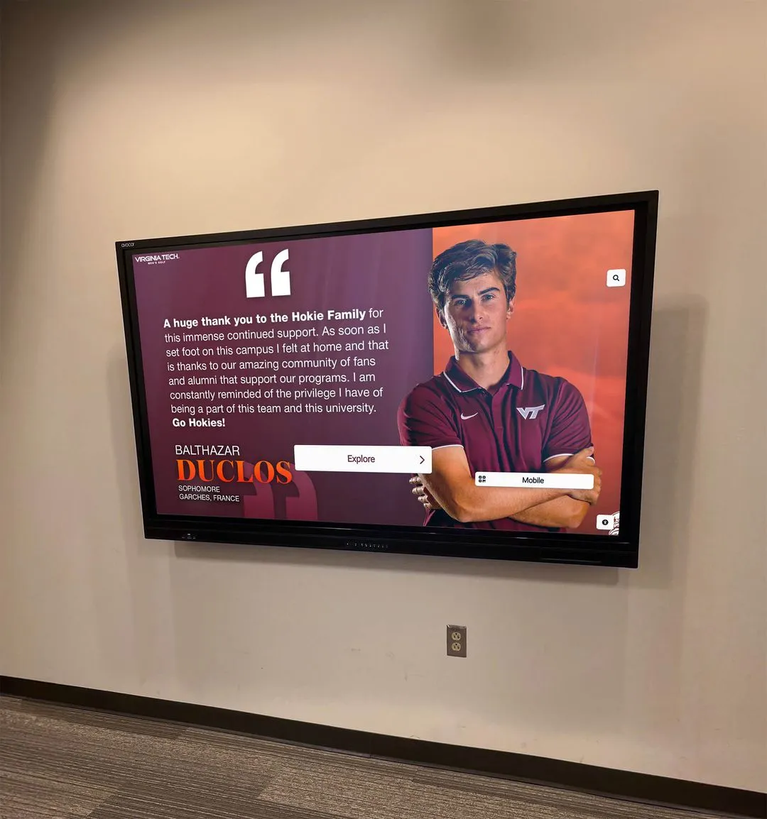
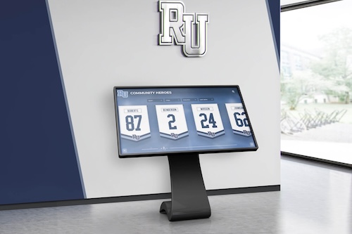
Navigation menus and icon button rows on digital hall of fame touchscreens must expose accessible names through aria-label or visible text so screen-reader users know what each control does before activating it
Step-by-Step Digital Hall of Fame Accessible Name Audit Workflow
Step 1: Run an Automated Scan with axe DevTools
Install the axe DevTools browser extension (free tier) in Chrome, Firefox, or Edge. Navigate to the public-facing hall of fame web directory—the search and filter landing page, not the CMS backend. Open DevTools (F12), select the axe DevTools panel, and run a full-page scan.
axe reports accessible name failures under two rule IDs:
button-name: fired when a<button>element has no accessible nameinput-button-name: fired for<input type="button">or<input type="submit">with no value oraria-labellabel: fired when a form input has no associated labelselect-name: fired when a<select>element has no associated label
Export the axe results to a spreadsheet. Record the element selector, the rule ID, and the page section (search bar, filter panel, inductee card action bar, media player). This list becomes the primary audit work item backlog.
Automated tools do not catch every accessible name failure—particularly cases where an aria-label is present but does not match the visible text (a Label in Name violation) or where a label exists but points to the wrong element via an incorrect for/id pairing. Step 2 addresses these cases.
Step 2: Inspect Individual Controls in DevTools Accessibility Panel
In Chrome, open DevTools and select the Accessibility panel in the sidebar (Elements > Accessibility). Click on any icon button on the page. The Accessibility panel displays the computed accessible name, the role, and the source of the name.
For each icon-only button in the inductee card action bar, verify that:
- The Computed Name field is populated with a meaningful string (not empty, not “button,” not a CSS class name)
- The Name From source is
aria-labeloraria-labelledby(nottitle, notcontentswith an empty string)
For search fields, click the search <input> element and verify:
- The Computed Name matches the visible label text (or a meaningful invisible label if no visible label exists)
- The Name From source is
label(meaning a proper<label>element is associated) rather thanplaceholderortitle
For filter controls, check each <select>, <input type="checkbox">, and <input type="range"> element. A decade slider with aria-label="Decade" passes the name check; a slider with no aria-label and no associated <label> fails.
Step 3: Keyboard-Tab Through the Interface and Listen with a Screen Reader
Enable NVDA (Windows) or VoiceOver (macOS). Navigate to the hall of fame search and filter page. Press Tab to move focus through every interactive element in document order—this mirrors the experience of a visitor who navigates by keyboard and screen reader.
For each element, listen to what the screen reader announces. Document any element where the announcement is:
- Only the element role with no name: “button” or “edit”
- A name that does not match the visible label: a filter button labeled “Football” visually but announced as “btn-football” due to a CSS class leaking into the accessible name
- A placeholder value: a search field announced as “Search inductees…” with the ellipsis, indicating the screen reader fell back to placeholder text
- Duplicated names: multiple buttons on the same page all announced as “Play video” without inductee context
Tab through the complete flow: search field, search submit button, each sport filter button, the decade or year-range filter, any award-type filter, the search results grid, each inductee card action bar, and the media player controls. Record each fail.
Step 4: Test Label in Name (WCAG 2.5.3) for Visible-Text Controls
Some controls display visible text but have an aria-label that does not contain that text—a Level AA violation of WCAG 2.5.3 Label in Name. This issue commonly appears when a developer adds an aria-label to supplement a short visible button label without preserving the visible text in the label string.
For example: a sport filter button displays the text “Football” but carries aria-label="Filter by sport: gridiron". A voice control user who says “click Football” cannot activate the button because the accessible name does not contain the word “Football.” The fix is to align the aria-label with or include the visible label text: aria-label="Filter by sport: Football".
To test for this: for every button or input that has both visible text and an aria-label, confirm that the aria-label string contains the visible text as a substring. The DevTools Accessibility panel shows both the computed name and the source, making this comparison straightforward.
Step 5: Test Icon Buttons on Inductee Profile Cards
Navigate to an individual inductee profile page. This page typically presents the highest concentration of icon-only buttons: video play, social share, print, download, and sometimes a QR code reveal. Run the same keyboard-tab and screen-reader listening workflow on these controls specifically.
A pass condition for the profile page action bar: every button in the action bar announces a name that includes the inductee’s name or is unambiguous from page context established by a heading that is associated via aria-labelledby.
A fail condition: five sequential “button” announcements with no differentiation. A screen-reader user in this situation cannot distinguish the play button from the share button from the print button.
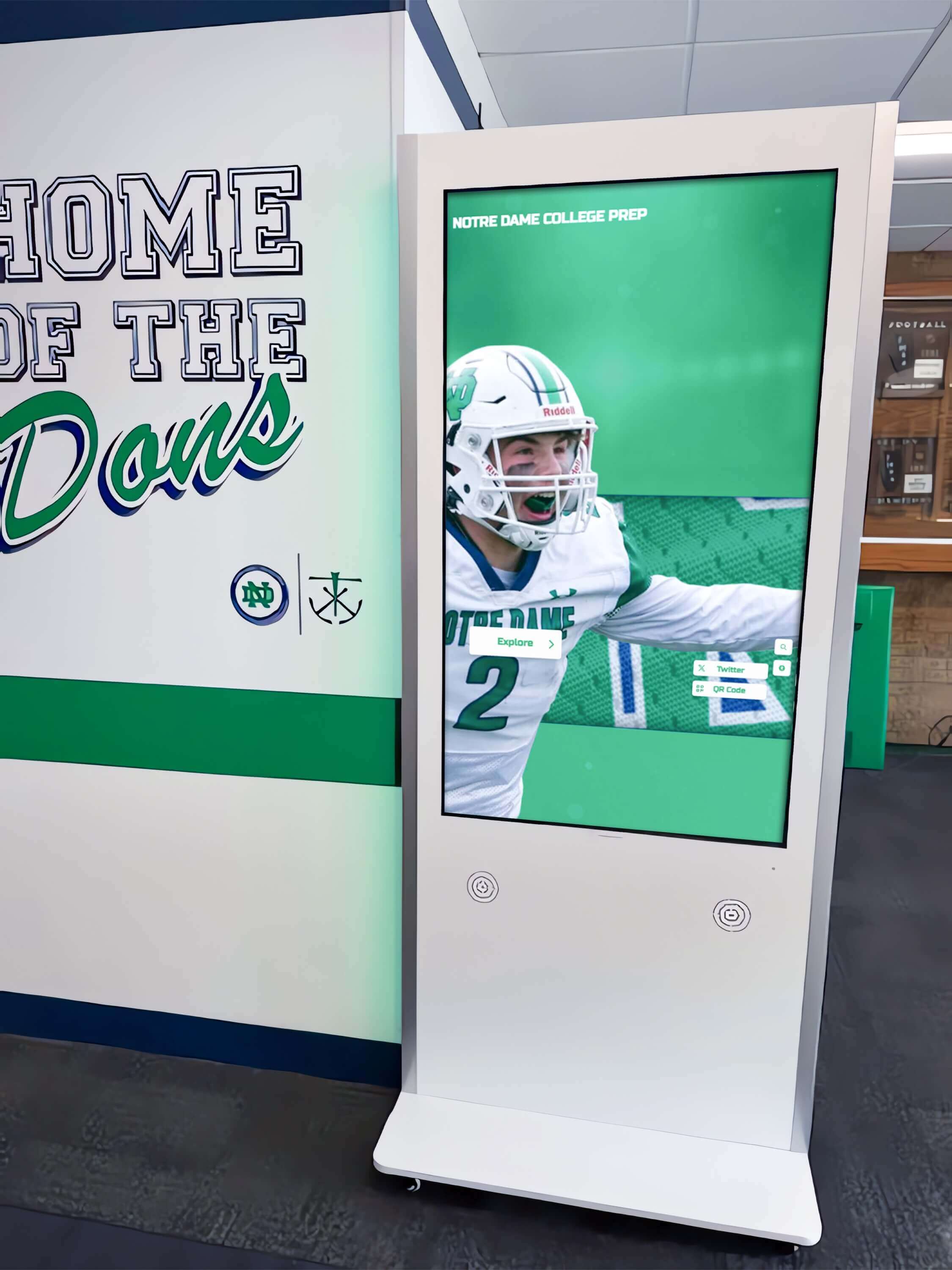
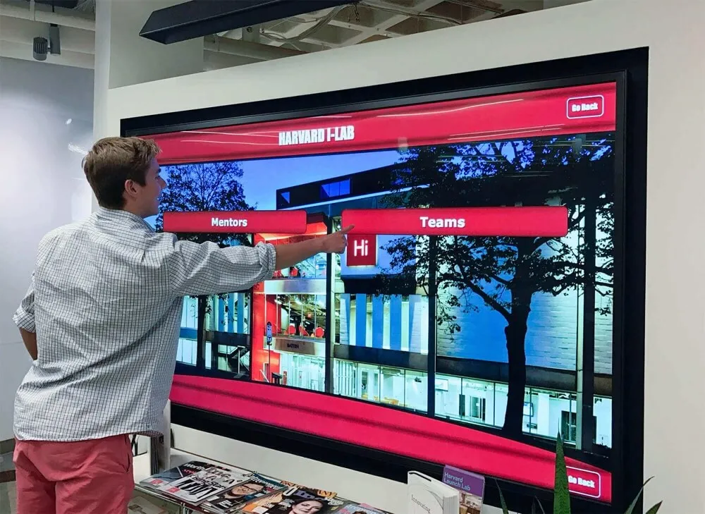
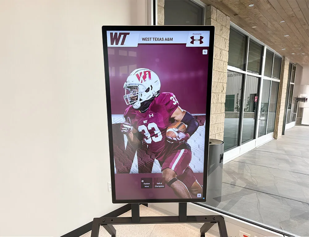
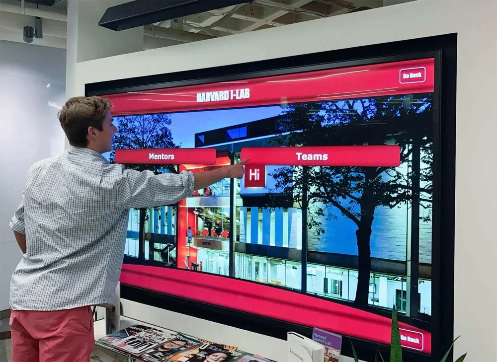
Sport-category filter buttons on hall of fame kiosks and web directories must carry accessible names—not just icons or logos—so screen-reader users can navigate by sport without guessing what each control activates
Common Fixes for Each Control Type
Fix: Icon-Only Action Buttons
Add aria-label to every icon-only <button> element. If the button appears in a repeated context (inductee card grid), include the inductee name in the label:
<!-- Before: no accessible name -->
<button class="btn-play">
  <svg aria-hidden="true" focusable="false">...</svg>
</button>

<!-- After: accessible name via aria-label -->
<button class="btn-play" aria-label="Play tribute video for Marcus Taylor, Class of 1998">
  <svg aria-hidden="true" focusable="false">...</svg>
</button>
Note the aria-hidden="true" and focusable="false" on the SVG. Without these, some screen readers read the SVG’s internal title element separately, creating a duplicate announcement. The button’s aria-label provides the name; the SVG is decorative and should be invisible to the accessibility tree.
For a media player embedded within a profile page, a shorter label is acceptable because the page heading establishes context:
<button aria-label="Play tribute video">...</button>
<button aria-label="Pause tribute video">...</button>
<button aria-label="Mute audio">...</button>
<button aria-label="Enter fullscreen">...</button>
Fix: Search Input Fields
Replace placeholder-only labels with proper <label> elements. If the design calls for a visually hidden label to preserve the search field’s minimal appearance, use a CSS visually-hidden class—not display: none or visibility: hidden, which remove the element from the accessibility tree:
<!-- Before: placeholder only, no accessible name -->
<input type="search" placeholder="Search inductees…">

<!-- After: visible label associated by for/id -->
<label for="hof-search">Search inductees by name or sport</label>
<input type="search" id="hof-search" placeholder="Enter a name or sport">

<!-- Alternative: visually hidden label for design-constrained layouts -->
<label for="hof-search" class="sr-only">Search inductees by name or sport</label>
<input type="search" id="hof-search" placeholder="Enter a name or sport">
The search submit button, if it displays only a magnifying glass icon, also needs an aria-label:
<button type="submit" aria-label="Submit inductee search">
  <svg aria-hidden="true" focusable="false">...</svg>
</button>
Fix: Filter Controls
Associate a <label> with every <select> element. For custom filter buttons that display sport names (text visible), confirm the button text is the accessible name source and that no overriding aria-label mismatches the visible text. For icon-only sport filter buttons (logo-only), add aria-label:
<!-- Sport filter button with visible text: no change needed if text is clear -->
<button class="filter-btn">Football</button>

<!-- Sport filter button with logo only: add aria-label -->
<button class="filter-btn" aria-label="Filter by Football">
  <img src="football-icon.png" alt="">
</button>

<!-- Year range slider: associate label -->
<label for="decade-filter">Filter by decade</label>
<input type="range" id="decade-filter" min="1980" max="2020" step="10"
       aria-valuemin="1980" aria-valuemax="2020" aria-valuenow="1980"
       aria-valuetext="1980s">
For checkbox-group filters (award type), associate the group with a <fieldset> and <legend>:
<fieldset>
  <legend>Filter by award type</legend>
  <label><input type="checkbox" name="award" value="mvp"> MVP</label>
  <label><input type="checkbox" name="award" value="all-state"> All-State</label>
  <label><input type="checkbox" name="award" value="academic"> Academic Honor</label>
</fieldset>
Fix: Gallery Navigation Buttons
Photo gallery previous/next arrow buttons and carousel dot navigation controls are common accessible name failures on inductee profile pages. Fix them with aria-label on each control:
<button aria-label="Previous inductee photo">
  <svg aria-hidden="true" focusable="false">...</svg>
</button>
<button aria-label="Next inductee photo">
  <svg aria-hidden="true" focusable="false">...</svg>
</button>

<!-- Carousel dot buttons -->
<button aria-label="Photo 1 of 5" aria-current="true">•</button>
<button aria-label="Photo 2 of 5">•</button>
<button aria-label="Photo 3 of 5">•</button>
Execution Timeline: Plan, Audit, Fix, Verify
| Phase | Activities | Responsible Party | Cadence |
|---|---|---|---|
| Plan | Inventory all page templates in the hall of fame web directory; identify every template that contains icon buttons, search fields, filter controls, or media players; create a test matrix listing templates by control type | Athletic director + IT lead | Once at launch; once per induction cycle or any time a new template is added |
| Audit | Run axe scan on each template; complete keyboard-tab and screen-reader walkthrough; export results to a work item spreadsheet categorized by control type and severity | IT staff or web administrator | Quarterly; immediately after any JavaScript, theme, or CMS update that touches interactive controls |
| Fix | Add aria-label to icon-only buttons; associate <label> elements with all inputs; fix Label in Name mismatches; suppress SVG title elements with aria-hidden; retest after each fix batch | Developer or platform vendor | Within 30 days of identified failures; immediately before a major community event, induction ceremony, or new class launch |
| Verify | Repeat axe scan and screen-reader tab test after fixes are deployed; confirm all previously failed controls now pass; test across NVDA + Chrome and VoiceOver + Safari | IT staff | Immediately after fix deployment |
| Document | Record test date, axe version, browser and screen-reader versions, controls audited, pass/fail counts by type, and any fixes applied; retain for compliance records | Administrative lead | Each audit cycle |
Schools preparing to expand their recognition program to a touchscreen kiosk alongside the web directory—including the kind of display installations described in guides to digital trophy case designs for schools replacing glass cabinets—should complete an accessible name audit of the web interface before migrating content to the kiosk layer. Accessible name fixes applied in the shared web layer propagate to the kiosk interface automatically when both use the same underlying web technology.
Display Integration: Web Directories, Kiosk Interfaces, and QR Entry Points
Accessible name requirements apply across all surfaces of a digital hall of fame installation, but their enforcement differs by surface type.
Web directory: The full WCAG 4.1.2 and 2.5.3 requirements apply. Any visitor accessing the web directory from a personal device—including alumni, parents, and community members using screen readers, voice control software, or switch access—depends on accessible names to understand every control they encounter. This is the highest-priority surface for accessible name testing because the audience and device variability is highest.
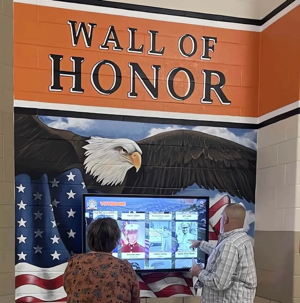
Touchscreen kiosk: If the kiosk interface runs inside a web browser (a common architecture for recognition platforms), the same HTML-based accessible name requirements apply. Kiosks connected to a keyboard or alternative input device expose the full interactive interface to keyboard navigation, and accessible names are required for every control. Even kiosks without a connected keyboard benefit from accessible names if the kiosk OS supports VoiceOver or TalkBack integration for visitors who bring their own assistive technology.
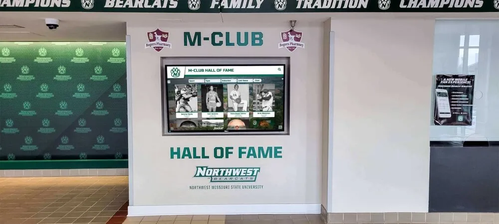
QR code entry points: Recognition installations frequently include QR codes on physical award cases, trophy displays, and school hallway murals that link directly to filtered inductee views—a football roster page, a decade-specific gallery, or a specific inductee’s profile. When a visitor arrives at these deep-linked pages via QR scan, they may encounter a media player and action button row as the first interactive content on the page. If those controls lack accessible names, the first interactive experience is a failure. Include QR-linked target pages in the accessible name audit even if the main search-and-filter landing page has already been audited.
Schools building recognition programs that extend from physical trophy cases to digital archives—including schools that draw on strategies from memorabilia display cases and school history showcases—should treat each QR code destination as an independent audit target, because each deep-linked page carries its own set of controls that may not have been tested as part of the main directory audit.
Platform CMS updates: Platforms that use cloud CMS workflows for updating inductee records, scheduling seasonal displays, and pushing new induction classes can inadvertently break accessible names when a theme update modifies the button template, when a CMS upgrade changes the HTML structure of the action bar, or when a plugin update replaces a labeled native <select> with an unlabeled custom dropdown widget. Schedule a targeted accessible name spot-check after any platform update, even if only content (not code) was changed—content updates sometimes trigger automatic JavaScript rehydration that replaces labeled controls with unlabeled replacements.
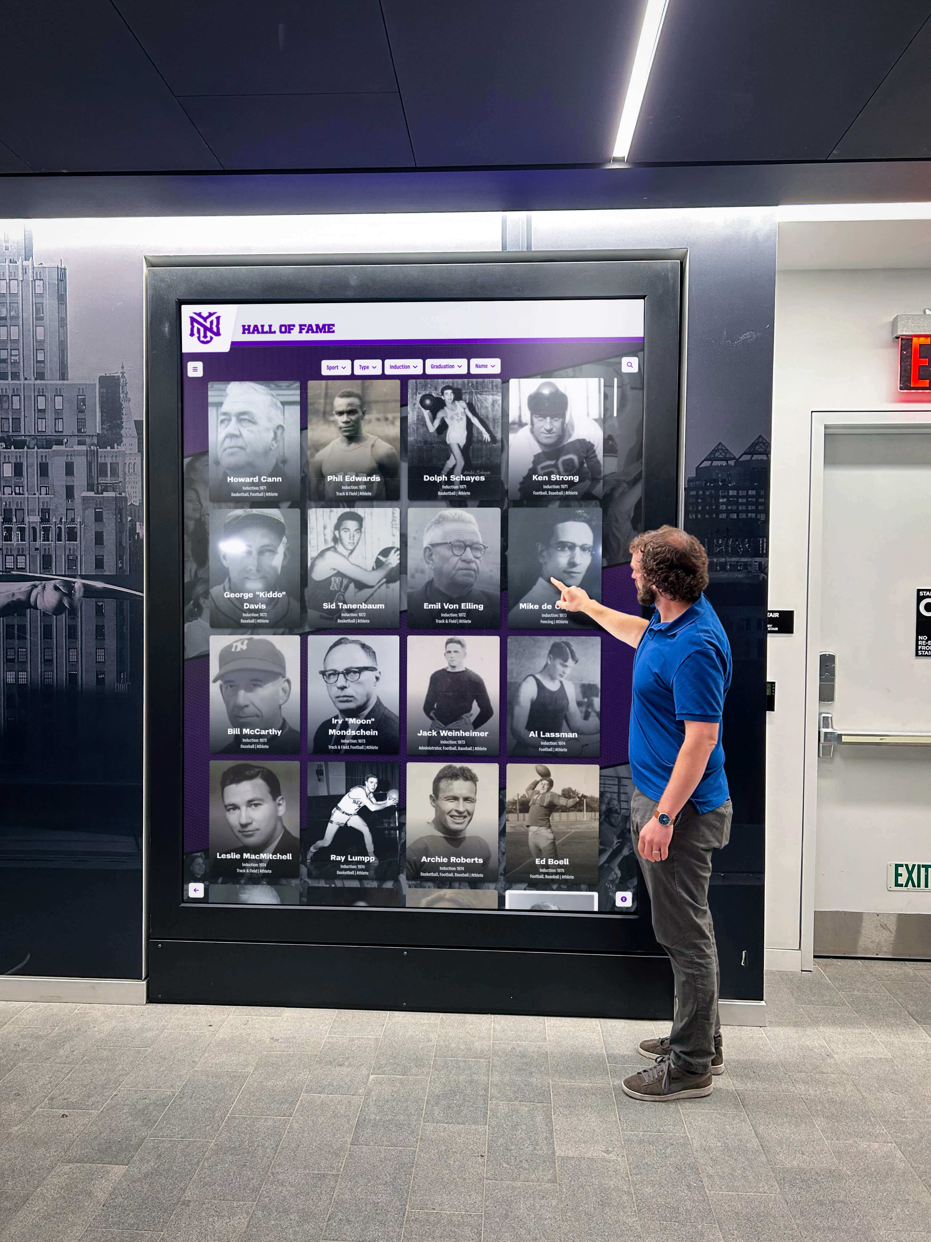
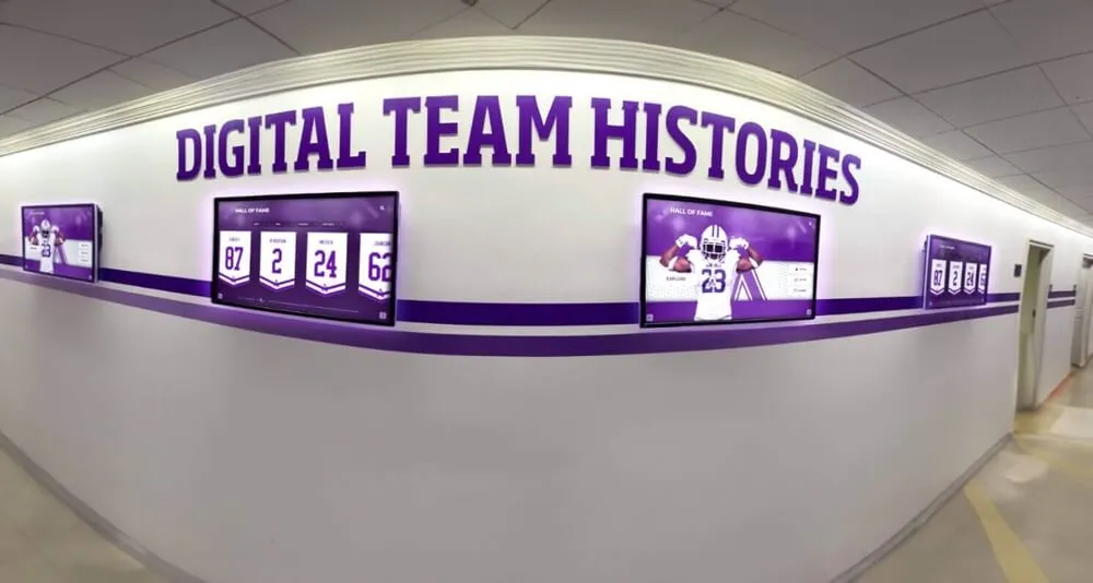
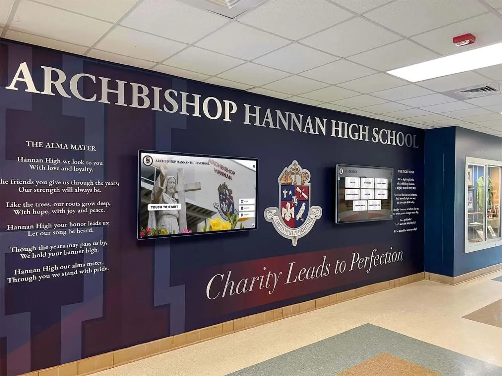
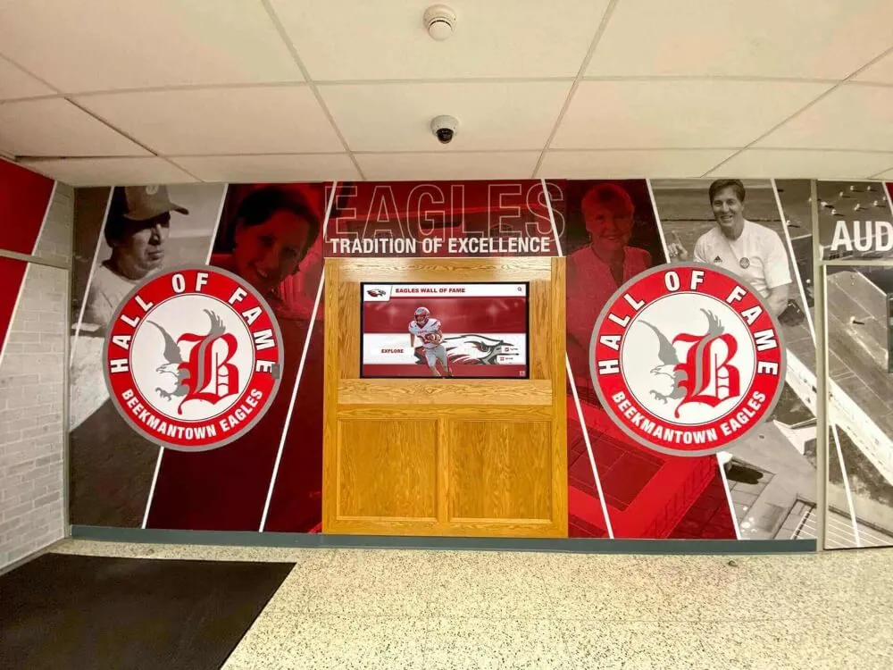
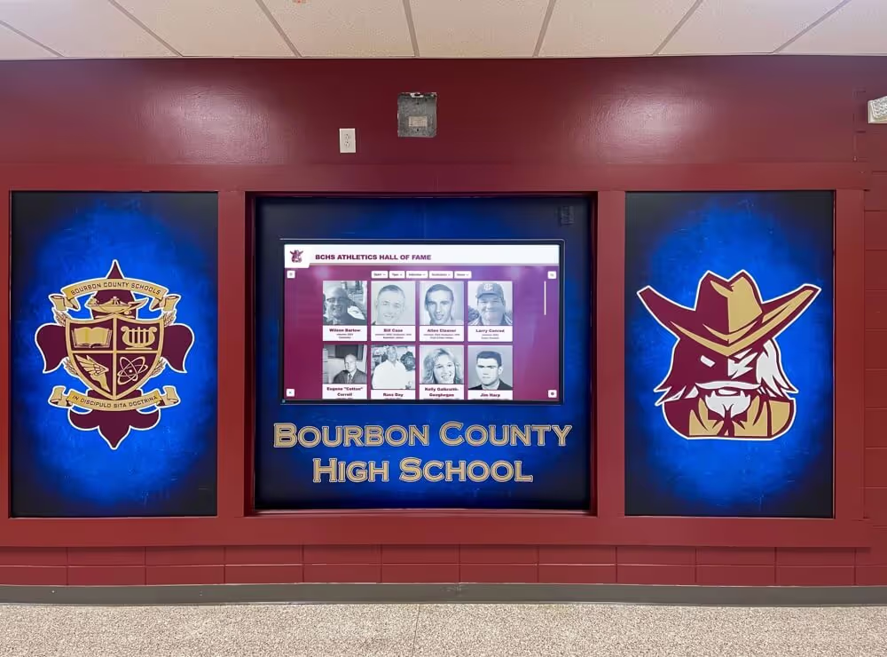
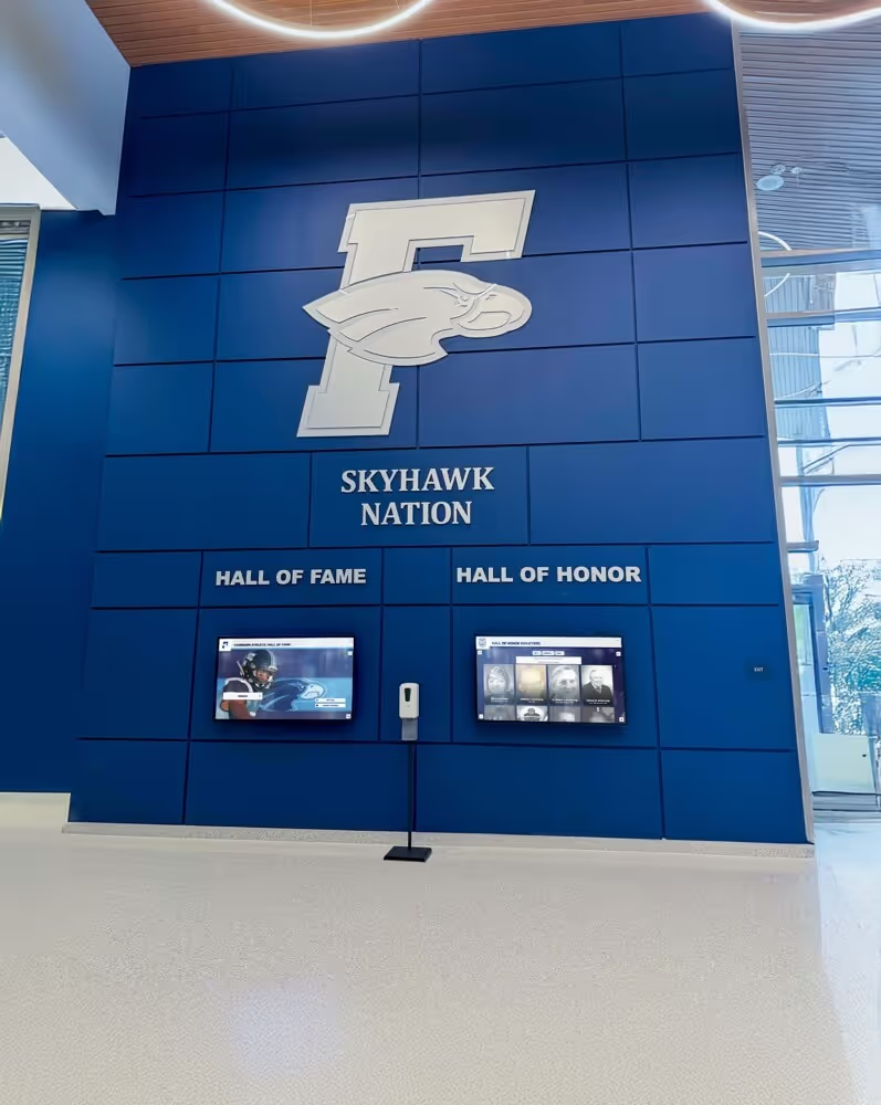
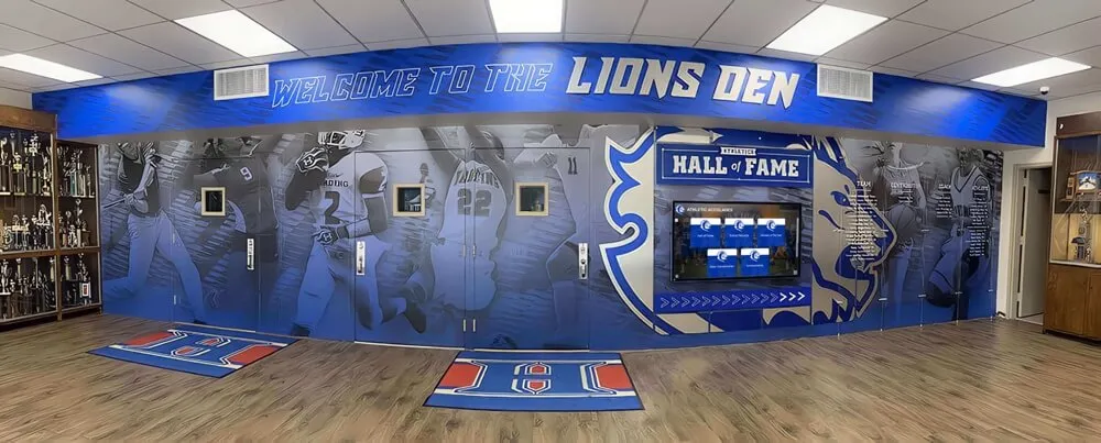
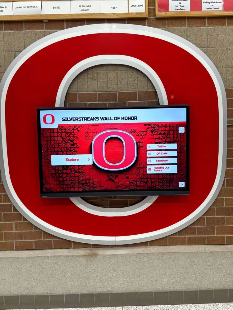
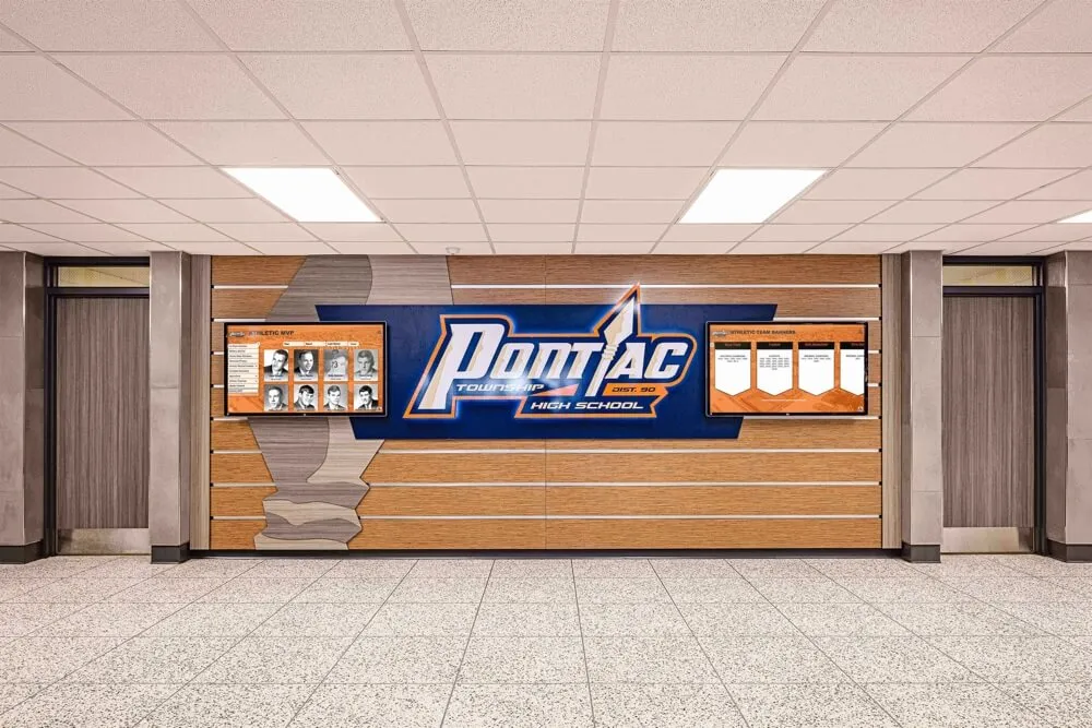
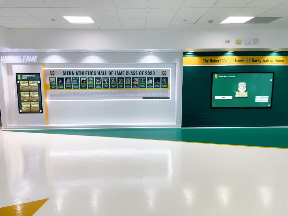
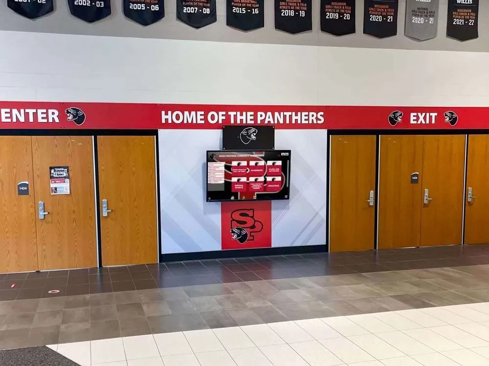
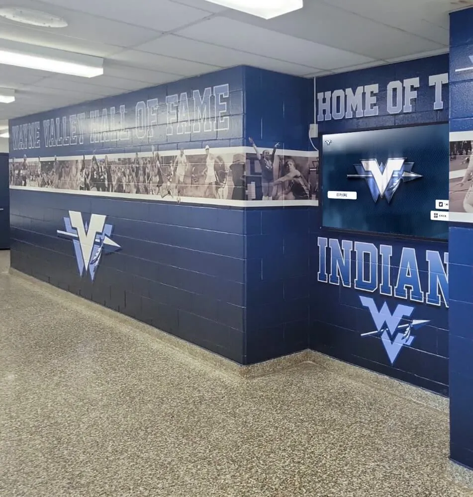
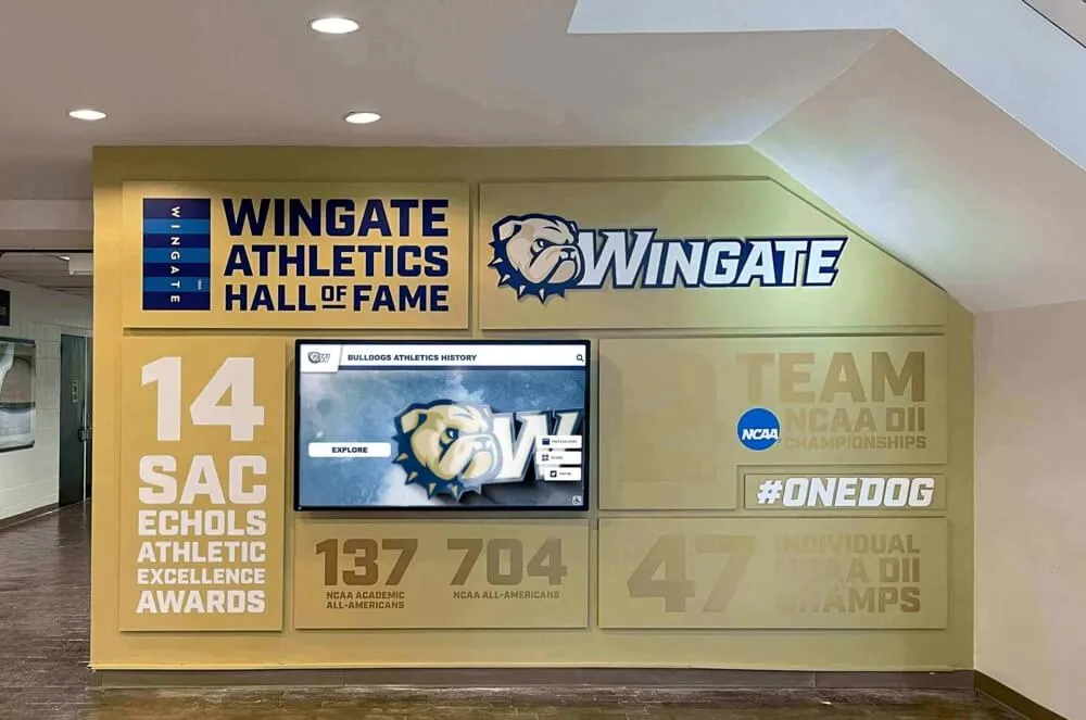
Lobby and hallway digital hall of fame installations bring interactive controls to the broadest possible community audience—accessible name audits confirm that every button, search field, and filter is usable by visitors who rely on screen readers or voice control
Accessible Name Audit Checklist
Use this checklist during each audit cycle. Copy it to a shared spreadsheet and record results by control type and template.
Icon-Only Buttons
- Every icon-only
<button>on inductee card grids carriesaria-labeldescribing its function and, where contextually ambiguous, the inductee’s name - Every icon-only
<button>in media players (play, pause, mute, fullscreen, captions) carries a descriptivearia-label - Icon SVGs inside buttons carry
aria-hidden="true"andfocusable="false"to prevent duplicate announcements - Social share buttons (share to Twitter/X, Facebook, copy link) carry
aria-labelvalues that include the share destination - Print and download buttons carry
aria-labelvalues that describe the output format or target - All five or more action buttons on an inductee profile page produce distinct, differentiated announcements when tabbed through in sequence
Search Input Fields
- Every search
<input>field has an associated<label>element linked byfor/idpairing or wrapped as a parent - No search field relies solely on
placeholdertext as its accessible name - The accessible name is visible to sighted users as a persistent label (or hidden via
sr-onlyCSS, notdisplay: none) - The search submit button carries a descriptive
aria-labelor visible text that does not rely solely on a magnifying glass icon - The accessible name of the search field matches the visible label text (Label in Name requirement)
Filter Controls
- Every
<select>dropdown used as a year, sport, or award filter has an associated<label>element - Sport-category filter buttons that display logos or icons only carry
aria-labelvalues naming the sport - Sport-category filter buttons that display visible sport names pass the Label in Name check (accessible name contains visible text)
- Year-range sliders carry
aria-label,aria-valuemin,aria-valuemax,aria-valuenow, andaria-valuetextattributes - Checkbox filter groups are wrapped in
<fieldset>with a<legend>describing the filter category - An “All” or “Reset filters” button carries an accessible name that makes its function clear:
aria-label="Reset all filters"rather than just “All” - When a filter is active, the button’s state is communicated:
aria-pressed="true"for toggle buttons oraria-selected="true"for tab-style controls
Gallery and Carousel Navigation
- Previous and next arrow buttons in inductee photo galleries carry
aria-labelvalues naming the direction and context: “Previous inductee photo,” “Next inductee photo” - Carousel dot navigation buttons carry
aria-labelvalues indicating position and total: “Photo 1 of 5,” “Photo 2 of 5” - The currently active dot or carousel position carries
aria-current="true"in addition to its position label
Automated Scan Results
- axe DevTools reports zero
button-nameviolations on all audited templates - axe DevTools reports zero
labelandselect-nameviolations on all audited templates - No WCAG 2.5.3 Label in Name violations are present (verified manually or with an extended axe ruleset)
Measurement: Indicators of a Passing Accessible Name Implementation
| Signal | What to Measure | How to Measure |
|---|---|---|
| axe violation count | Number of button-name, label, and select-name rule violations per template | Run axe scan on each template; track count over time |
| Screen-reader tab announcement completeness | Whether every interactive element in a tab sequence produces a meaningful announcement | Manual screen-reader test; document failures by element selector |
| Label in Name conformance | Whether visible text on buttons and inputs is contained in the accessible name | Manual comparison of visible text vs. computed accessible name in DevTools |
| Vendor VPAT coverage | Whether the platform’s Voluntary Product Accessibility Template (VPAT) documents 4.1.2 and 2.5.3 conformance status | Request VPAT from platform vendor; review criterion rows |
| Post-update regression rate | How often a platform update introduces new accessible name failures | Track axe violation count before and after each platform update |
Accessible name failures are among the most detectable accessibility issues—both automated scanners and a single keyboard-tab test reveal them quickly. They are also among the most straightforward to fix: an aria-label attribute added to a button in the platform’s template resolves the issue across every page that renders that button. The ratio of detection speed to fix effort makes accessible name auditing one of the highest-value accessibility investments a school’s IT team can make on a recognition platform.
Schools planning to expand their athletic recognition programs into multi-decade archives—including programs that incorporate coach message displays and inspirational messages on athletic recognition walls—should confirm that quote attribution buttons, audio playback controls, and any interactive coach tribute elements on those displays carry accessible names before the archive goes live to the community.
Frequently Asked Questions
What is the difference between a button label and an accessible name?
A button’s visible label is the text a sighted user reads on or near the button. An accessible name is the text the browser computes from the HTML and exposes to assistive technology. For buttons with visible text, they are typically the same. For icon-only buttons, the visible label is a graphic with no text, so the accessible name must be provided explicitly through aria-label, aria-labelledby, or an off-screen text element inside the button. An accessible name audit verifies that the accessible name is both present and meaningful—not that a label visually appears on the page.
Can we use the title attribute to provide accessible names for icon buttons?
The title attribute is recognized as an accessible name source by the accName algorithm, but it is a poor primary mechanism. title values are announced inconsistently across screen readers and browser combinations, and the tooltip a title produces on hover is not perceivable by keyboard-only users who cannot hover with a mouse. Use aria-label as the primary accessible name mechanism for icon-only buttons. Reserve title for supplementary tooltip information, and do not rely on it as the sole accessible name source.
Our search field has a visible label above it. Why does the axe scan still report a label violation?
Proximity alone does not create a programmatic label association. A heading or text that appears visually above an input field does not automatically become the input’s accessible name unless one of the HTML or ARIA label mechanisms links the two. The fix is to use <label for="input-id"> with a matching id on the input, to wrap the input inside a <label> element, or to add aria-labelledby="heading-id" on the input referencing the visible text’s element ID. Moving the text into a proper <label> element or adding aria-labelledby resolves the violation.
How should we handle a sport filter button that uses both a sport icon and the sport name as text?
When a button contains both a graphic (icon or logo) and visible text naming the sport, the visible text is typically the accessible name source, and no additional aria-label is needed. Confirm in DevTools that the button’s computed accessible name matches the visible text. The icon or logo inside the button should carry aria-hidden="true" so it does not contribute a separate or redundant announcement. Then verify Label in Name compliance: the accessible name must contain the visible text as a substring, not replace it with something different.
Does the accessible name requirement apply to filter buttons that are currently disabled?
WCAG 4.1.2 applies to all user interface components that are exposed in the accessibility tree, including disabled controls. A disabled filter button that has an accessible name allows a screen-reader user to understand why that option is not available—they can read the button’s name and then note it is disabled. A disabled button with no accessible name provides no information at all. Include disabled controls in the accessible name audit.
What should we check on the kiosk interface compared to the web directory?
If the kiosk uses the same web-based interface as the directory, the accessible name requirements are identical—the same HTML controls need the same accessible names. Confirm that no kiosk-specific JavaScript layer strips aria-label attributes from buttons during the kiosk initialization sequence. Some kiosk-mode configurations suppress certain interactive behaviors, and these suppressions can inadvertently remove accessibility attributes. Run the axe scan and keyboard-tab test on the kiosk URL (or a staging URL that mimics the kiosk build) as a separate audit target from the main web directory.
Should the search button inside the search field have a separate accessible name from the input itself?
Yes. The search input and the search submit button are separate interactive elements, and each needs its own accessible name. The input’s accessible name describes what the visitor enters (“Search inductees by name or sport”). The submit button’s accessible name describes the action it performs (“Search” or “Submit inductee search”). When the submit button is an icon-only button—a magnifying glass without text—it is among the most common accessible name failures on hall of fame search interfaces and must carry an explicit aria-label.
Connecting Accessible Names to Recognition Program Quality
A digital hall of fame that presents clear, polished visuals but exposes unlabeled controls to assistive technology delivers an incomplete recognition experience. When a screen-reader user tabs to an inductee profile and hears five consecutive “button” announcements, they cannot access the play button, the share button, or the print function that sighted visitors use without thinking. The accessible name audit closes that gap.
The audit takes under 45 minutes, uses free tools available in every modern browser, and produces a concrete list of controls that need a single HTML attribute added to each. For most hall of fame platforms, the entire fix set applies to a handful of shared templates that render on every profile page and every search results page—fixing the template once resolves the failure for every inductee in the archive.
Schools that include accessible name verification in their pre-launch checklist—whether launching a new induction class, migrating to a touchscreen kiosk, or expanding the archive to include a new sport or award category—build a recognition program that every member of the community can use independently.
Schools drawing on best practices for academic history archiving on touchscreen displays and those building multi-era alumni recognition programs that include alumni spotlight features and profiles should apply the same accessible name standard to every interactive control in those extended archives—not just the athletic hall of fame directory. The audit workflow is identical regardless of whether the archive covers athletics, academics, performing arts, or donor recognition.
When evaluating platform vendors, request a live demonstration that includes tabbing through the inductee search and filter interface with a screen reader running—listen for play button names, filter button names, and search field announcements. Hearing the accessible names announced in context is faster and more reliable than reviewing documentation.
Platforms that serve sports award certificates and recognition programs in a searchable digital format alongside hall of fame records should be tested with the same icon-button and filter audit, since award category filters and certificate download buttons follow the same accessible name patterns.
Recognition programs exploring the value of interactive platforms over traditional displays—including schools that have reviewed best-in-class touchscreen hall of fame options for 2026—should treat accessible name compliance as a procurement criterion alongside visual design, content capacity, and CMS ease of use. A platform that cannot pass an accessible name audit of its default controls requires custom development work before it meets the baseline accessibility standard for a public school recognition site.
Rocket Alumni Solutions’ digital hall of fame platform is built to WCAG 2.1 AA standards, which includes Name, Role, Value requirements for all interactive controls. The platform’s inductee card action bars, search field, and sport and year filter controls carry properly computed accessible names in the default theme, and the cloud CMS workflow preserves those accessible names across content updates.
See Rocket Alumni Solutions’ Accessible Hall of Fame Controls in Action
Request a live demonstration to hear accessible names announced on search fields, icon buttons, and sport filters during a screen-reader walkthrough—before any commitment.