


Designing a touch screen experience that truly engages users requires understanding how people naturally interact with digital surfaces, creating interfaces that feel intuitive rather than instructional, and balancing visual beauty with functional clarity. While touchscreen technology has become ubiquitous—from smartphones to interactive kiosks—the difference between interfaces users love and those they abandon often comes down to fundamental design decisions about interaction patterns, visual hierarchy, and user feedback.
Yet many organizations implementing touchscreen experiences struggle with critical design questions: How do you make touch interfaces feel natural and responsive without instruction? What size and spacing make buttons comfortable to tap? How do you organize content for easy exploration on larger displays? What visual feedback confirms actions and guides users? How do you design for diverse users spanning different ages, abilities, and technical comfort levels?
This comprehensive guide explores proven strategies for designing touchscreen experiences that engage audiences authentically, from fundamental UX principles and touch-optimized interaction patterns to visual design strategies and real-world implementation considerations. Whether you’re creating educational displays, corporate kiosks, museum exhibits, or public information systems, these insights will help you design touch experiences that users find intuitive, satisfying, and genuinely engaging.
Effective touchscreen design transcends simply adapting desktop or mobile interfaces to larger displays. The best implementations leverage the unique characteristics of touch interaction—directness, natural gestures, and spatial awareness—while accommodating the specific context in which public touchscreens operate, including varied user expertise, short attention windows, and the physical considerations of standing interaction with large vertical displays.

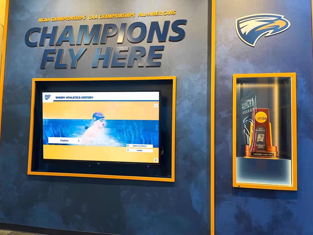
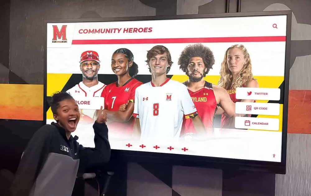
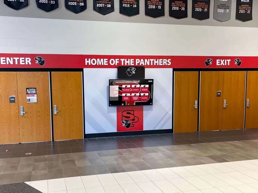
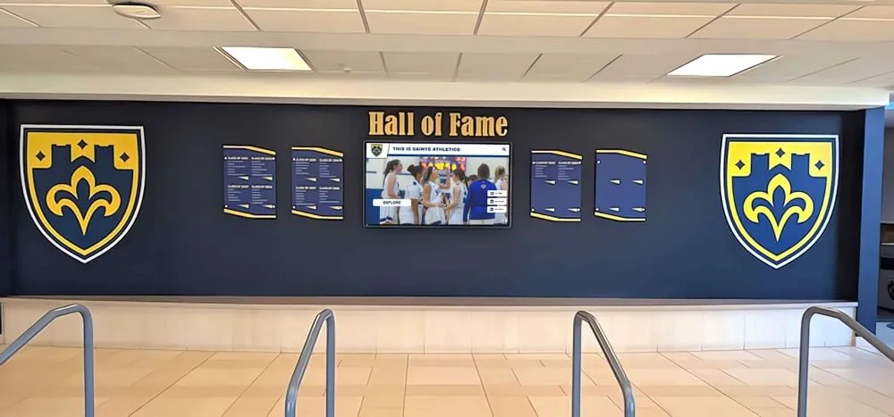
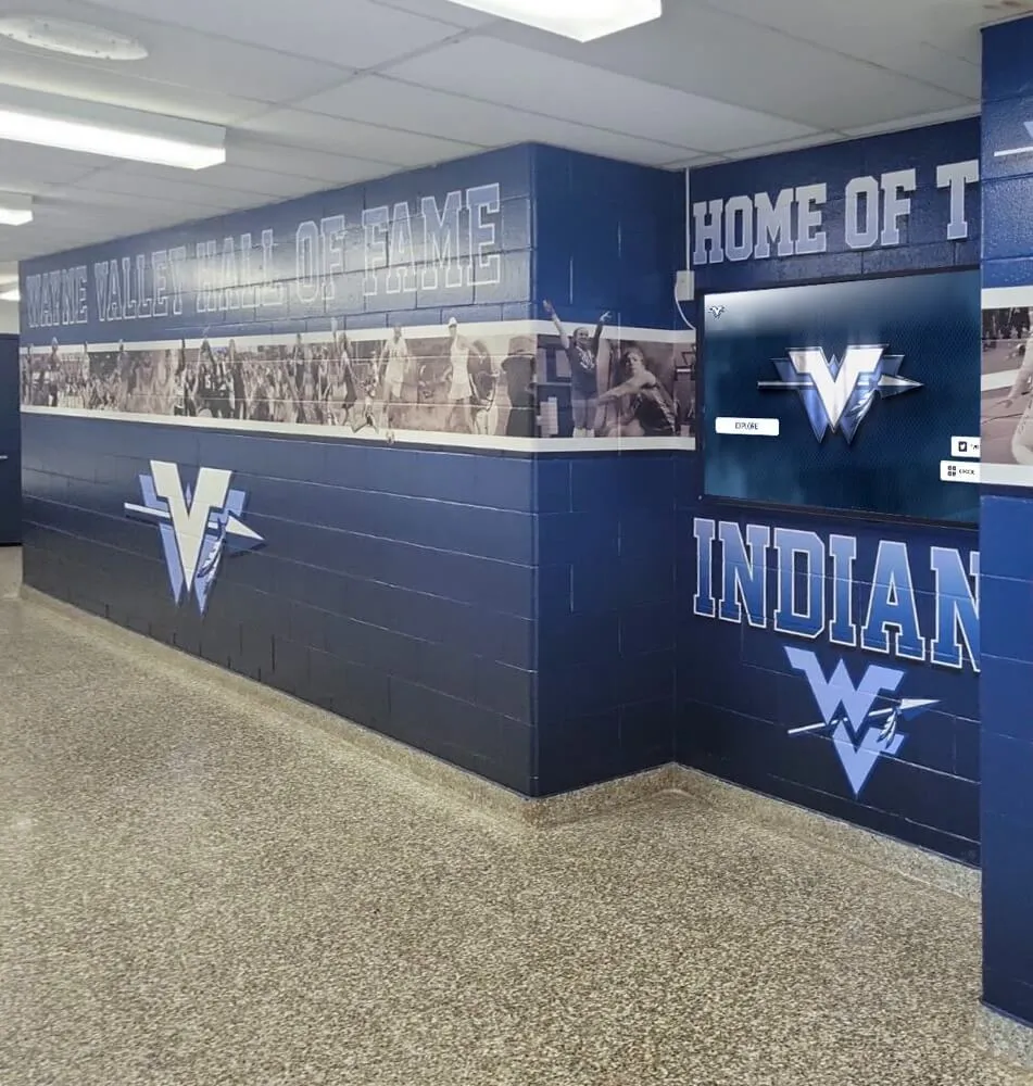
Effective touchscreen design creates intuitive experiences that invite exploration and sustained engagement
Understanding the Fundamentals of Touchscreen User Experience
Before diving into specific design techniques, understanding the core principles that make touchscreen interfaces engaging provides essential foundation for all subsequent decisions.
The Unique Context of Public Touchscreen Interaction
Public touchscreens operate under different constraints than personal devices:
No Prior Training or Familiarity
Unlike personal smartphones where users gradually learn applications, public touchscreens must be immediately usable:
- First-time users with no introduction or tutorial
- Wide range of technical comfort levels from novice to expert
- No time for learning curves or experimentation
- Interfaces must communicate functionality through visual design alone
- Navigation must feel obvious without instruction manuals
- Mistakes and confusion lead to immediate abandonment
This zero-training requirement demands exceptional clarity in visual communication and interaction design. Every element must clearly signal its purpose and function through appearance alone.
Varied Physical Interaction Context
Standing interaction with vertical displays differs from handheld device use:
- Users typically stand 1.5-3 feet from displays
- Extended arm reach required unlike handheld devices
- Arm fatigue develops quickly with prolonged reaching
- Viewing angles differ from seated desktop or handheld mobile use
- Multiple users may interact simultaneously or observe
- Public visibility affects privacy considerations
According to human factors research, extended reaching toward vertical surfaces causes fatigue within 1-2 minutes, making efficiency and clear navigation paths essential for comfortable extended engagement. Design must minimize required arm movement and reaching.
Short Engagement Windows
Public touchscreens compete with other demands on attention:
- Users typically allocate 30-90 seconds initially
- Interfaces must engage immediately or users move on
- Extended engagement (3-5+ minutes) requires progressive value delivery
- Competition from smartphones and other distractions
- Social pressure when others wait nearby
- Clear progress indicators help users gauge time investment
These constraints demand interfaces that deliver value immediately while inviting deeper exploration for those interested.
Core Principles of Engaging Touch Design
Several fundamental principles guide creation of genuinely engaging touchscreen experiences:
Direct Manipulation and Natural Interaction
Touch enables direct interaction with content rather than indirect control:
- Users interact with objects themselves rather than through intermediary cursors
- Natural gestures (tap, swipe, pinch) feel intuitive because they mirror physical actions
- Immediate visual response creates satisfying sense of control
- Realistic physics (momentum, bounce, friction) enhance believability
- Direct manipulation reduces cognitive load compared to abstract controls
- Muscle memory develops quickly with consistent gesture patterns
Research demonstrates that direct manipulation interfaces generate higher engagement and satisfaction compared to indirect control methods, with users perceiving direct touch as more natural and intuitive.
Clear Affordances and Visual Signaling
Touchscreen elements must visually communicate their interactive nature:
- Buttons should obviously be tappable through visual treatment
- Interactive elements distinguished from static content through design
- Consistent visual language for similar actions throughout interface
- Size and spacing signal importance and reduce accidental activation
- Color, shadows, and dimensionality indicate interactivity
- Animation previews demonstrate expected behavior
Without hover states available on desktop interfaces, touchscreen design must communicate interactivity through static visual cues alone. Elements must “invite” touch through appearance.
Immediate and Meaningful Feedback
Touch interactions require instant confirmation of successful action:
- Visual response within 100 milliseconds for perceived immediacy
- Button state changes confirm touch registration
- Loading indicators set expectations during processing
- Completion animations provide satisfaction
- Error messages explain problems clearly and constructively
- Success confirmations reinforce positive actions
According to interaction design research, response delays exceeding 100 milliseconds create uncertainty about whether touch registered successfully, prompting repeated attempts and frustration. Immediate feedback prevents this confusion.
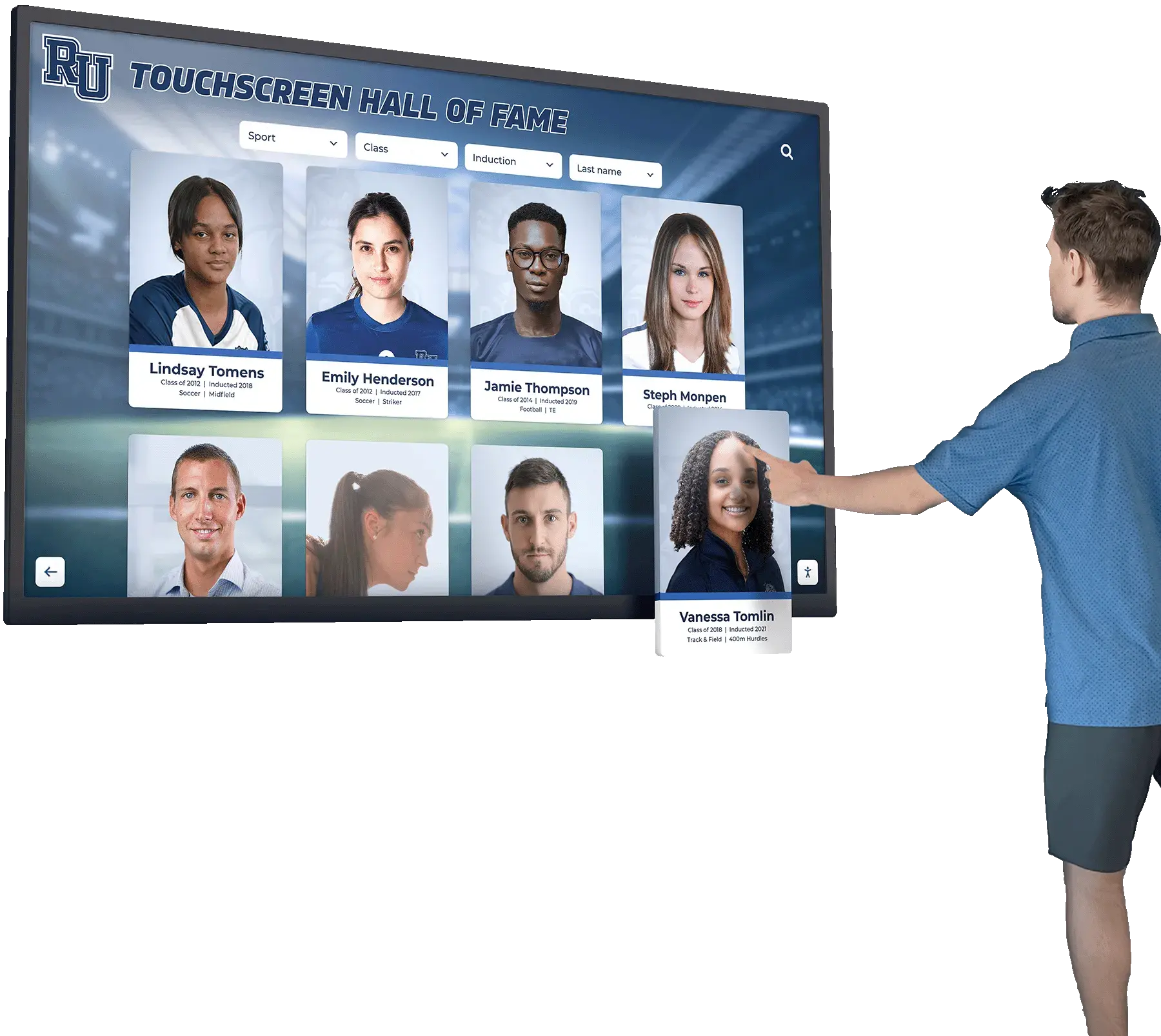
Progressive Disclosure and Information Hierarchy
Large content databases require thoughtful revelation strategies:
- Home screens present entry points without overwhelming choices
- Content reveals progressively as users demonstrate interest
- Clear visual hierarchy guides attention to priority information
- Navigation breadcrumbs prevent disorientation
- Related content suggestions encourage continued exploration
- “Depth” in interface accommodates both casual browsers and focused searchers
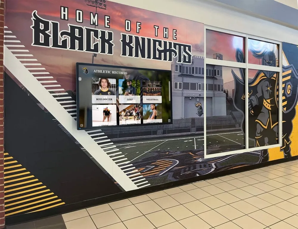
This layered approach prevents overwhelming users initially while ensuring comprehensive content remains accessible for those seeking depth. Learn about effective strategies through interactive display design approaches that balance simplicity with comprehensive functionality.

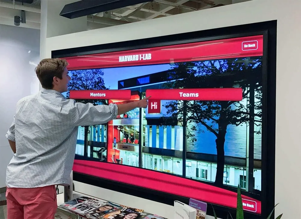
Intuitive design enables users of all ages to explore content confidently without assistance or instruction
Touch Target Design and Interaction Patterns
Physical touch interaction imposes specific requirements that distinguish touchscreen design from other digital interfaces.
Optimal Touch Target Sizing
Button and control dimensions directly affect usability and user satisfaction:
Minimum Touch Target Dimensions
Research-based sizing guidelines ensure comfortable, accurate interaction:
- Minimum 44x44 pixels (approximately 10-12mm) for reliable selection
- Recommended 60-80 pixels for optimal comfort and accuracy
- Larger targets for elderly users or accessibility optimization
- Consider average adult fingertip measures 8-10mm across
- Larger displays should use proportionally larger touch targets
- Test all interactive elements with actual fingers, not mouse pointers
According to Apple’s Human Interface Guidelines and research from touch interface studies, the minimum recommended touch target size is 44x44 pixels, based on average fingertip dimensions and allowing for natural variance in finger size and touch precision.
Touch Target Spacing and Separation
Adequate spacing prevents accidental activation of adjacent elements:
- Minimum 8-12 pixels spacing between small touch targets
- Increase spacing to 16-24 pixels for better error prevention
- Adjacent targets of similar importance should use generous spacing
- White space serves functional purpose beyond aesthetics
- Dense layouts sacrifice usability for screen space efficiency
- Test spacing with users of varying finger sizes and dexterity
Many touchscreen failures result from inadequate spacing causing users to repeatedly hit wrong buttons, creating frustration that overwhelms any other positive aspects of the experience.
Strategic Placement and Reach Zones
Touch target location significantly affects comfort and usability:
- Center regions of display provide most comfortable reach from standing position
- Lower two-thirds of vertical displays minimize arm extension and fatigue
- Critical frequent actions should occupy most accessible zones
- Corners and edges require maximum reach and should contain less frequent actions
- Consider both left and right-handed users in placement decisions
- Test placement with users of various heights (5'0" to 6'6" range)
For displays mounted at typical heights (screen center 54-60 inches from floor), the most comfortable interaction zone spans approximately 40-65 inches from floor—roughly chest to eye level for average-height users.
Natural Gesture Design
Touch interfaces should support gestures that feel intuitive and natural:
Common Touch Gestures and Their Applications
Tap
- Single touch for selection and activation
- Most fundamental and universal gesture
- Should be primary interaction method for most elements
- Quick feedback essential for satisfying tap experience
- Works for buttons, links, cards, and activatable elements
Swipe
- Horizontal swipe for navigation between pages or items
- Vertical swipe for scrolling through content
- Natural gesture feeling similar to physical page turning
- Momentum and physics enhance realism
- Clear visual indicators show swipeable areas
Pinch and Zoom
- Expand/contract fingers to zoom content
- Particularly valuable for photos, maps, and detailed content
- Should feel smooth and responsive without lag
- Reset buttons help users return to default view
- Not all content types benefit from zoom capability
Long Press
- Hold finger on element to reveal additional options
- Useful for contextual menus and alternative actions
- Provide visual feedback that long press is registering
- Less discoverable than tap, so use for secondary functions only
- Common in mobile but less familiar to some public touchscreen users
Drag and Drop
- Touch, hold, and move element to new location
- Valuable for organizing, prioritizing, or categorizing
- Provide clear drop zones and feedback during drag
- Most appropriate for creative or personalization interfaces
- Requires precise touch tracking and responsive feedback
According to touchscreen usability research, interfaces relying primarily on tap, swipe, and simple gestures achieve higher success rates than those requiring complex multi-finger gestures or discovery of hidden gesture patterns.
Interaction Feedback and Response
Clear feedback confirming actions creates satisfying, confident interaction:
Visual Feedback Mechanisms
Immediate visual response confirms successful touch registration:
- Button state changes (color shift, scale, shadow) on touch
- Highlight or selection indicators for activated elements
- Transition animations showing navigation and state changes
- Loading spinners or progress bars during content retrieval
- Confirmation screens for significant or irreversible actions
- Clear error messages with constructive guidance
The key is ensuring users never wonder “did that work?” after touching interface elements. Uncertainty erodes confidence and engagement rapidly.
Timing and Animation
Response timing significantly affects perceived responsiveness:
- Touch response within 100 milliseconds feels immediate
- Delays of 100-300ms perceived as slightly sluggish but acceptable
- Delays exceeding 300ms feel noticeably slow and frustrating
- Animations should enhance understanding, not just decorate
- Transition durations of 200-400ms feel natural
- Consistent timing throughout interface creates polish
Audio Feedback Considerations
Sound can enhance touch interaction when appropriate:
- Subtle click or tap sounds confirm touch registration
- Audio cues provide accessibility support for visually impaired users
- Volume controls enable personal preference adjustment
- Environmental considerations: quiet public spaces require audio-off option
- Audio should never be sole indicator; always pair with visual feedback
- Test audio in actual installation environment for appropriateness
Many public installations operate in environments where audio enhancement works well (museums, exhibits, retail), while others require silent operation (libraries, offices). Design for flexibility. Discover effective interactive recognition displays that balance engagement with appropriate environmental sensitivity.

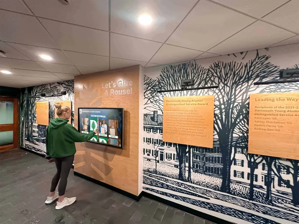
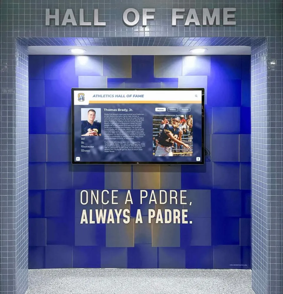
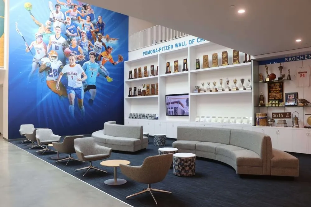
Well-designed touchscreens accommodate multiple simultaneous viewers and collaborative exploration
Visual Design Strategies for Touch Interfaces
Beyond interaction mechanics, visual design determines whether interfaces invite engagement or create confusion.
Layout and Visual Hierarchy
Effective organization guides users’ attention and understanding:
Screen Organization Principles
Structure content for intuitive navigation and comprehension:
- Establish clear visual hierarchy through size, color, and position
- Group related content together with visual connection
- Use white space to separate distinct sections and prevent clutter
- Follow natural reading patterns (top-to-bottom, left-to-right in Western contexts)
- Most important content and actions receive prominent placement
- Consistent layouts across similar content types aid pattern recognition
Research on visual attention demonstrates users initially scan interfaces in F-patterns or Z-patterns, focusing on top-left regions first. Critical information and actions should align with these natural viewing patterns.
Grid Systems and Alignment
Systematic organization creates professional polish:
- Consistent grid structure throughout interface
- Aligned elements feel organized and intentional
- Proper spacing creates breathing room and clarity
- Modular design enables flexible content arrangements
- Responsive grids adapt to content quantity variations
- Balance symmetry with intentional asymmetry for visual interest
Content Density and Breathing Room
Finding optimal balance between information and space:
- Avoid cramming excessive content onto single screens
- White space serves functional purpose reducing cognitive load
- Dense layouts overwhelm and fatigue users quickly
- Generous spacing feels premium and considered
- Progressive disclosure better than displaying everything simultaneously
- Test density with actual content, not lorem ipsum
Color Strategy and Visual Treatment
Color choices profoundly affect usability and emotional response:
Functional Color Application
Strategic color use guides attention and communicates meaning:
- Consistent color coding for categories or content types
- Accent colors highlight interactive elements and calls-to-action
- Neutral backgrounds support comfortable extended viewing
- Sufficient contrast ensures readability (4.5:1 minimum for text)
- Color should never be sole differentiator (support colorblind users)
- Test color choices on actual display hardware under facility lighting
According to Web Content Accessibility Guidelines (WCAG 2.1), text must maintain minimum contrast ratios of 4.5:1 against backgrounds for normal text and 3:1 for large text to ensure readability for users with low vision.
Brand Integration
Organizational identity should enhance rather than overwhelm:
- Incorporate institutional colors thoughtfully
- Balance brand presence with interface usability
- Use brand colors as accents rather than dominating entire interface
- Logo placement establishes authenticity without consuming valuable space
- Consistent typography connects to broader organizational materials
- Visual language should feel unified with other organizational touchpoints
Color Psychology and Emotional Impact
Different color strategies create different responses:
- Warm colors (reds, oranges) convey energy, excitement, urgency
- Cool colors (blues, greens) suggest calm, trust, professionalism
- High saturation creates vibrant, youthful feeling
- Muted tones convey sophistication and restraint
- Cultural color associations vary globally
- Test emotional impact with representative users from actual audience
Typography and Text Presentation
Text must be readable from typical viewing distances:
Font Selection for Touchscreens
Choose typefaces optimized for digital display:
- Sans-serif fonts generally perform better on screens than serif
- Fonts designed for screen display (not print) render better
- Adequate x-height ensures readability at distance
- Multiple font weights support hierarchy without changing typefaces
- Test rendering on actual hardware at viewing distances
- Avoid decorative fonts except for large headings
Size and Scaling Guidelines
Text size must accommodate standing viewing distances:
- Heading text: 72-120 points for visibility from 10+ feet
- Subheadings: 48-72 points readable from 6-8 feet
- Body text: 36-48 points comfortable from 3-5 feet
- Button labels: 40-60 points for clear readability
- Adjust sizes based on actual viewing distances in your environment
- Test with users of varying visual acuity
These recommendations differ dramatically from web or mobile typography because viewing distances and contexts differ substantially. What appears enormous on laptop screens may be barely readable on kiosk displays viewed from 3-4 feet away.
Text Layout and Readability
Formatting affects comprehension and reading comfort:
- Limit line length to 50-75 characters for optimal readability
- Increase line spacing to 1.5-2x font size for comfortable reading
- Left-align text for natural reading flow (avoid center or justify)
- Break long content into short paragraphs with spacing
- Generous margins prevent text extending to screen edges
- Ensure adequate contrast between text and backgrounds
Learn about creating readable, engaging digital recognition interfaces that balance visual beauty with functional clarity.

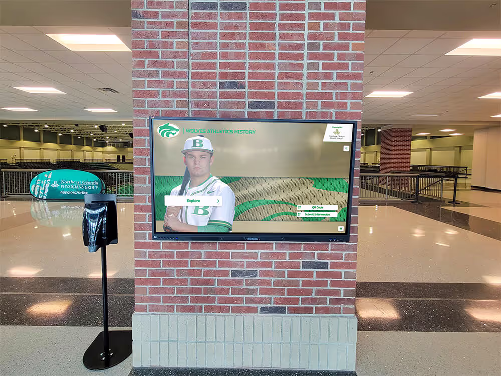
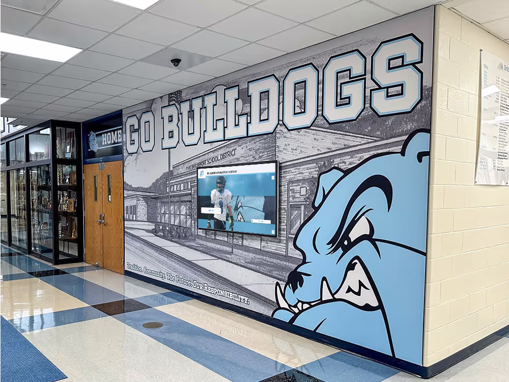
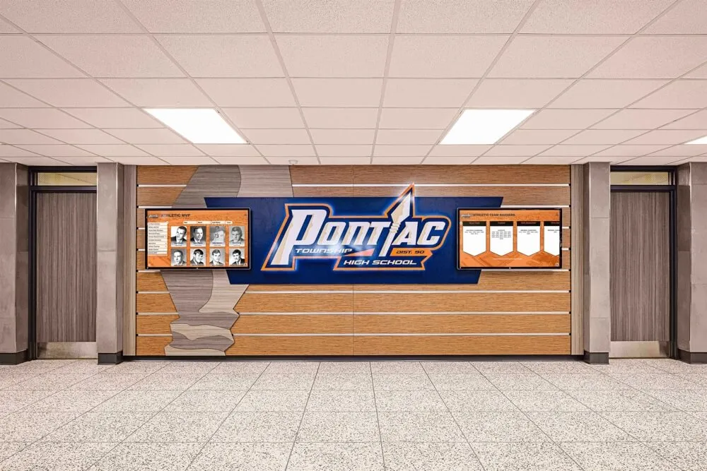
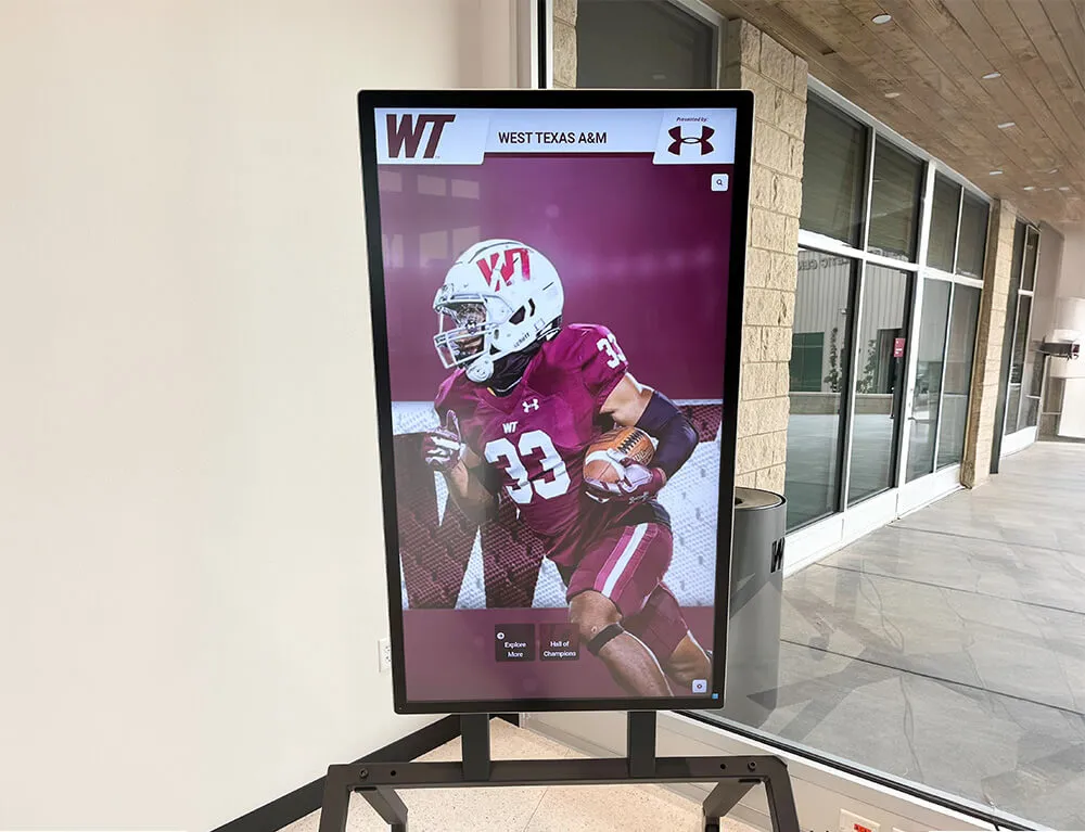
Professional installations integrate touchscreen technology seamlessly with environmental aesthetics while maintaining functional clarity
Navigation Design and Information Architecture
How users move through content determines whether they find value or become frustrated and abandon.
Navigation Patterns for Public Touchscreens
Several navigation approaches work effectively for different contexts:
Persistent Navigation Bar
Always-visible navigation provides constant orientation:
- Top or side bar containing primary navigation categories
- Works well for 5-8 main content sections
- Provides constant wayfinding regardless of location in content
- Familiar pattern from web browsing reducing learning curve
- Consumes screen space limiting content area
- Best for complex sites requiring frequent section switching
Hub-and-Spoke Model
Central home screen with paths radiating to content:
- Users return to home between different content explorations
- Simpler mental model for less tech-savvy audiences
- Clear “home” always available as reset point
- May require extra navigation steps moving between content areas
- Works well for displays with distinct, unrelated content sections
- Reduces cognitive complexity compared to multi-level navigation
Contextual Navigation
Navigation options adapt based on current content:
- More complex but potentially more efficient for experienced users
- Breadcrumb trails essential for showing current location
- Related content suggestions provide natural progression
- Can confuse users if navigation location inconsistent
- Requires excellent visual communication of available options
- Best for sophisticated audiences with clear goals
The appropriate navigation approach depends on content complexity, user sophistication, and typical usage patterns. Consider testing multiple approaches before committing to final implementation.
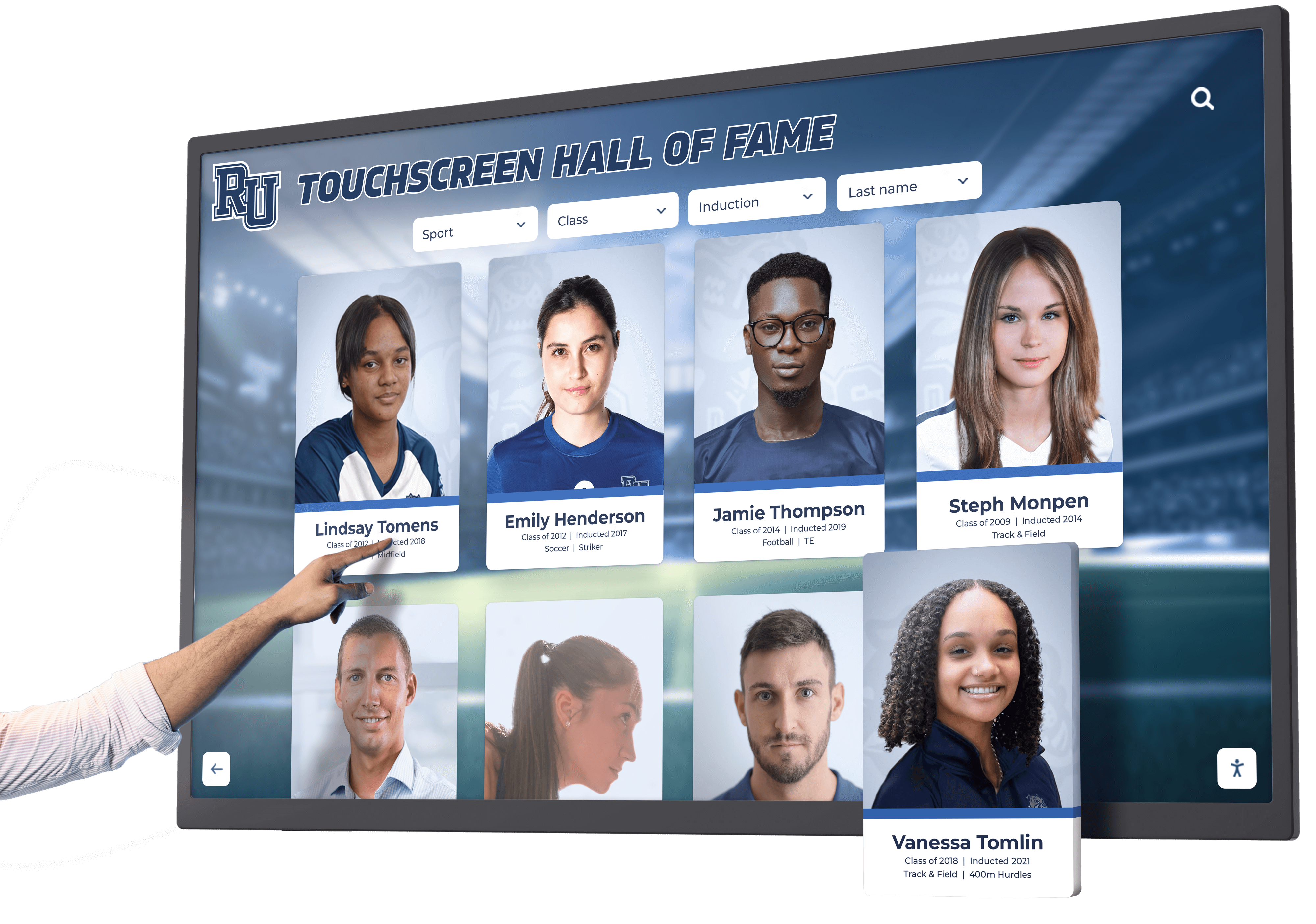
Search and Filtering Functionality
For content-rich experiences, search capabilities become essential:
Effective Search Design
Well-designed search accelerates content discovery:
- Prominent search placement with clear visual invitation to use
- Auto-complete suggestions appearing as users type
- Spelling tolerance and smart search reducing failed searches
- Clear result organization with filtering options
- Result counts setting expectations
- Recent or popular searches prompting common queries
Filtering and Refinement
Filters help users narrow large result sets:
- Multiple filter dimensions (category, date, type, etc.)
- Clear indication of active filters
- Easy filter removal or modification
- Result count updates as filters apply
- Saved or preset filter combinations for common queries
- Balance comprehensive filtering with interface simplicity
Breadcrumbs and Wayfinding
Users should always understand their location:
Location Indicators
Clear wayfinding prevents disorientation:
- Breadcrumb trails showing path from home to current location
- Section indicators highlighting current area
- “You are here” markers on content maps
- Progress indicators for multi-step processes
- Clear “back” and “home” options always available
- Visual styling distinguishing current from other locations
Disorientation causes immediate abandonment in public touchscreens where users won’t invest time understanding complex navigation. Clarity about location and available options keeps users confident and engaged. Explore interactive touchscreen displays that implement effective navigation for large content archives.

Clear navigation and wayfinding enable confident exploration without confusion or frustration
Content Strategy and Presentation
How content presents affects engagement as much as navigation and visual design.
Writing for Touchscreen Interfaces
Digital reading requires different approaches than print:
Scannable Content Structure
Screen-based reading favors scanning over linear reading:
- Front-load important information in opening sentences
- Descriptive subheadings enable quick content assessment
- Short paragraphs (3-4 sentences) reduce reading fatigue
- Bulleted and numbered lists aid scanning and comprehension
- Highlight key information with bold text or callouts
- Provide complete information while enabling efficient scanning
According to digital usability research by Nielsen Norman Group, web users read only about 20% of words on pages, instead scanning for relevant information. Touchscreen content should accommodate both complete reading and efficient scanning behaviors.
Clear, Accessible Language
Content should communicate clearly to diverse audiences:
- Avoid jargon and technical terminology when possible
- Explain necessary specialized terms on first use
- Active voice creates more engaging narrative than passive
- Specific details and examples bring abstract concepts to life
- Conversational tone feels approachable and engaging
- Appropriate reading level for intended audience
Content Length and Depth
Balance comprehensiveness with digestibility:
- Initial screens provide overview and key information
- Progressive disclosure reveals additional detail for interested users
- “Read more” links or expandable sections manage length
- Acknowledge standing viewing context with appropriate length
- Separate comprehensive content from quick-reference information
- Multiple content depths serve casual browsers and serious researchers
Multimedia Content Integration
Rich media enhances engagement but requires thoughtful implementation:
Photography and Visual Content
High-quality imagery attracts attention and conveys information:
- Professional photography standards ensure quality presentation
- Consistent aspect ratios prevent awkward cropping
- High resolution maintains clarity on large displays
- Meaningful captions provide context and identification
- Photo galleries tell visual stories beyond isolated images
- Balance image quantity with loading performance
Video Content Strategy
Video generates high engagement when implemented well:
- Keep videos concise (60-180 seconds ideal for most contexts)
- Compelling opening seconds capture attention immediately
- Captions make content accessible in silent viewing
- Autoplay with mute can attract attention without annoying
- Clear play controls with touch-optimized sizing
- Smooth playback without buffering or stuttering essential
Interactive Elements
Dynamic content invites active engagement:
- Before/after sliders for comparisons
- Expandable sections revealing additional information
- Interactive maps for spatial content
- Timelines for chronological exploration
- Quizzes or assessments for educational content
- Calculators or tools providing personalized value
Interactive elements transform passive consumption into active participation, generating deeper engagement and more memorable experiences. Learn about incorporating digital display content that engages diverse audiences effectively.

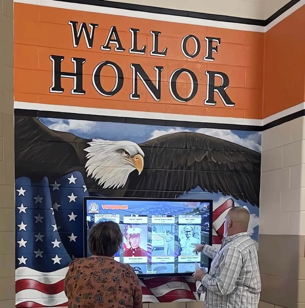
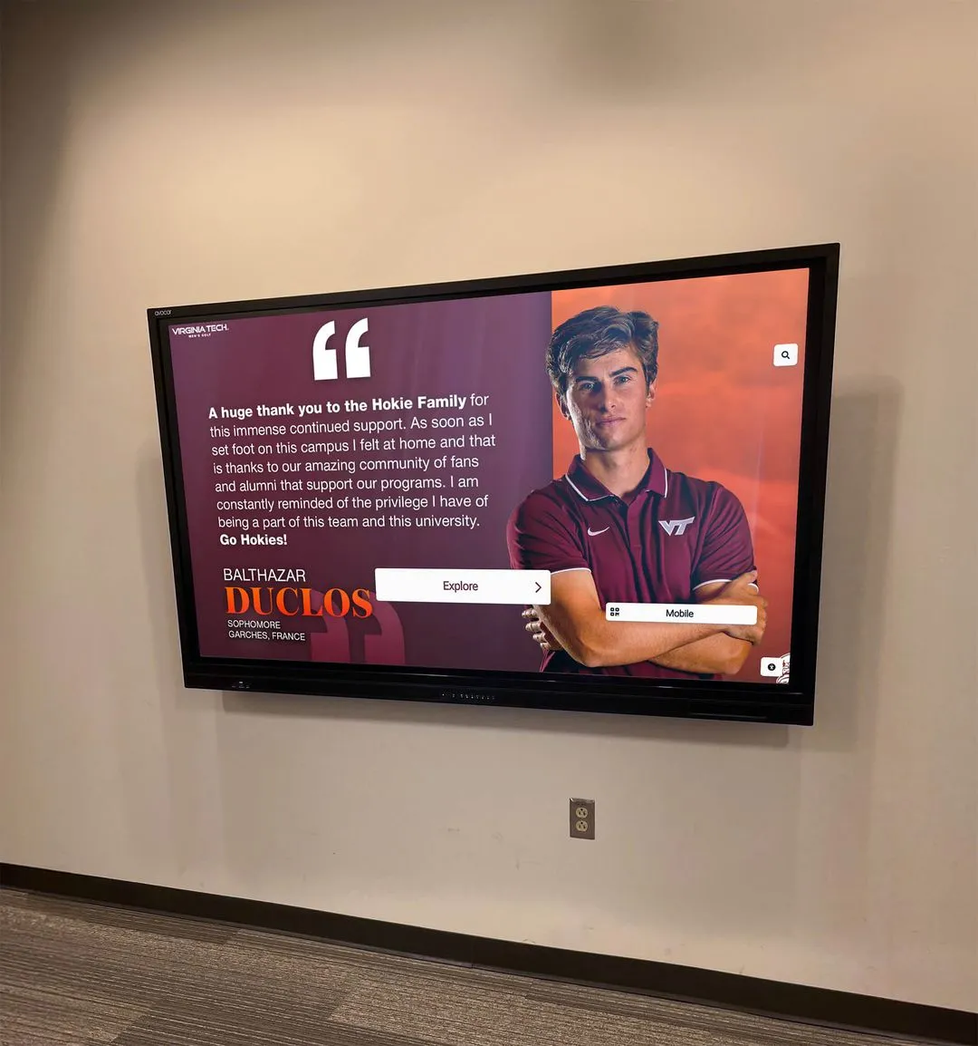
Interactive content selection invites active engagement and creates personalized exploration experiences
Accessibility and Inclusive Design
Touchscreen experiences should serve all users regardless of abilities.
Physical Accessibility Considerations
Installation and hardware affect who can use displays:
Display Positioning and Mounting
Accessible placement follows established guidelines:
- Screen bottom edge maximum 40 inches from floor for wheelchair access
- Interactive controls within 48 inches maximum reach height
- Minimum 30x48 inch clear floor space in front of display
- Adequate maneuvering room for wheelchair approach
- Mounting angle and tilt for comfortable viewing from various heights
- Consideration of ambient lighting to prevent glare
According to Americans with Disabilities Act (ADA) guidelines, interactive displays should maintain accessible mounting heights and provide adequate clearance for users with mobility devices.
Alternative Input Methods
Beyond touch, consider supplementary access:
- Voice control for hands-free navigation
- Physical buttons complementing touchscreen for motor impairments
- Remote web access enabling exploration from personal devices
- QR codes linking to mobile-accessible content
- Staff assistance protocols for users needing support
Digital Accessibility Features
Software design must accommodate various abilities:
Visual Accessibility
Displays should serve users with vision differences:
- Text size controls enabling enlargement for low vision
- High-contrast modes improving readability
- Color contrast meeting WCAG 2.1 standards (4.5:1 minimum)
- Alternative text descriptions for all images
- Screen reader compatibility for blind users
- Avoid color as sole information differentiator
- Clear focus indicators for keyboard navigation
Cognitive Accessibility
Design should support various cognitive abilities:
- Simple, consistent navigation patterns reducing cognitive load
- Clear language avoiding complex terminology or instructions
- Logical information organization following expected patterns
- Adequate time for reading without forced progression
- Forgiving interaction allowing error correction
- Clear error messages explaining problems and solutions constructively
Motor Accessibility
Accommodate varying fine motor control:
- Large touch targets (60-80 pixels minimum) for easier selection
- Generous spacing between interactive elements
- No time-limited interactions requiring speed
- Forgiving gesture recognition tolerating imprecise input
- Alternative input methods beyond precise touch
- Undo capabilities for accidental actions
Research demonstrates that accessibility accommodations often improve usability for all users, not just those with specific disabilities. Universal design principles benefit everyone. Discover approaches for inclusive digital recognition that serve entire communities.

Accessible design accommodates diverse users and enables collaborative group interaction
Testing and Optimization
Great touchscreen experiences emerge through iteration and refinement.
Pre-Launch Testing Strategies
Test designs before full implementation:
Prototype Testing
Evaluate designs early when changes remain inexpensive:
- Paper prototypes validating basic layout and organization
- Click-through wireframes testing navigation flows
- High-fidelity mockups evaluating visual design
- Working prototypes on actual display hardware
- Testing with representative users across age ranges and abilities
- Observation identifying confusion, frustration, or difficulty
Prototype testing reveals design problems when fixes are straightforward and affordable, before committing to complete development.
Usability Testing Methods
Systematic evaluation with real users:
- Task-based testing: Can users complete specific goals?
- Think-aloud protocols: Users verbalize thought process
- Time-on-task measurement: How efficiently do users navigate?
- Error tracking: Where do users make mistakes or get confused?
- Satisfaction surveys: How do users rate the experience?
- A/B testing: Compare alternative design approaches
Environmental Testing
Test in actual installation conditions:
- Lighting conditions at various times of day
- Viewing distances and angles users experience
- Ambient noise levels affecting audio feedback
- Physical reach and comfort during extended interaction
- Performance with actual network connectivity
- Impact of surrounding environment on attention
Ongoing Optimization
Launch begins rather than concludes the design process:
Analytics and Usage Monitoring
Track performance systematically:
- Session duration and engagement time trends
- Popular content and frequently accessed sections
- Search queries revealing user intent and needs
- Navigation paths showing common exploration patterns
- Abandonment points where users leave interface
- Error frequency indicating design problems
- Device and browser analytics for web-accessible content
Iterative Improvement
Continuous refinement based on real usage:
- Regular content updates maintaining freshness and relevance
- Interface refinements addressing discovered usability issues
- Performance optimization ensuring smooth, responsive operation
- New features responding to user needs and patterns
- Seasonal or event-based content variations
- Regular accessibility audits ensuring inclusive access
Organizations treating touchscreen installations as ongoing programs rather than one-time projects achieve significantly better long-term results and sustained engagement. Learn about maintaining digital displays for continued effectiveness.

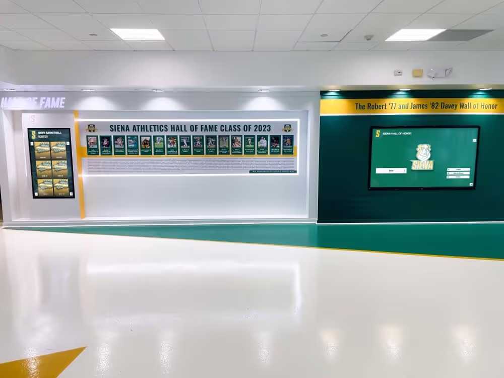
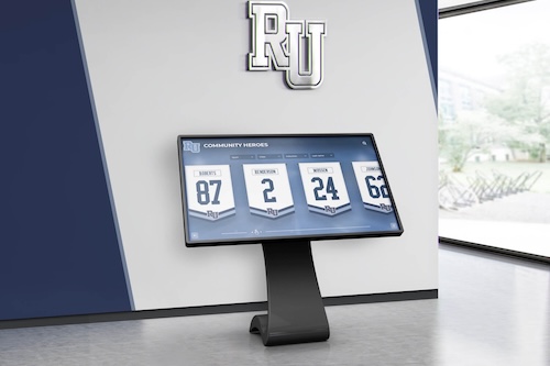
Professional implementations combine hardware, software, and content strategy to create cohesive engaging experiences
Real-World Implementation Considerations
Beyond design theory, practical factors affect touchscreen success.
Hardware Selection and Specifications
Display quality determines presentation effectiveness:
Commercial vs. Consumer Displays
Appropriate hardware ensures reliability:
- Commercial displays rated for continuous operation (16-24 hours daily)
- Extended warranties (typically 3-5 years vs. 1-2 for consumer)
- Higher brightness (300-500 nits) for varied lighting conditions
- Commercial-grade touchscreens designed for public use
- Wider viewing angles maintaining image quality off-center
- Longer operational life (50,000-100,000 hours vs. 20,000-30,000)
According to display industry specifications, commercial units provide 2-3 times longer operational life than consumer televisions, making them essential for institutional applications despite higher upfront cost.
Touch Technology Selection
Choose appropriate touchscreen technology:
- Capacitive touchscreens provide smartphone-like responsiveness
- Supports multi-touch gestures and precise input
- Glass surface easy to clean and maintain
- Most durable for high-traffic public applications
- Infrared touch alternative for very large displays
- Response time under 10 milliseconds for immediate feedback
Size and Resolution Considerations
Display dimensions affect viewing experience:
- 43-55 inch displays for smaller spaces and intimate viewing
- 55-65 inch displays for general institutional applications (most common)
- 65-75+ inch displays for large lobbies and maximum impact
- 1080p resolution adequate for most recognition applications
- 4K resolution recommended for 65+ inch displays
- Viewing distance should be 1.5-2x display height minimum
Software Platform Selection
Choose platforms designed for touchscreen applications:
Purpose-Built vs. Generic Solutions
Specialized software serves touchscreen needs better:
- Recognition-specific platforms designed for interactive exploration
- Content management systems optimized for non-technical administrators
- Touch-optimized interfaces vs. adapted desktop applications
- Integrated analytics tracking engagement and usage
- Web accessibility extending reach beyond physical displays
- Professional support and ongoing development
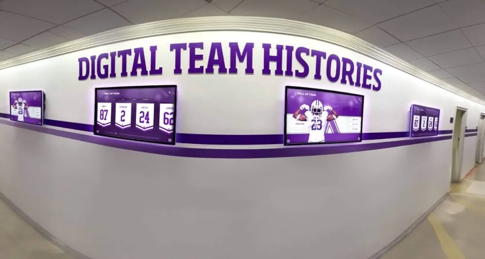
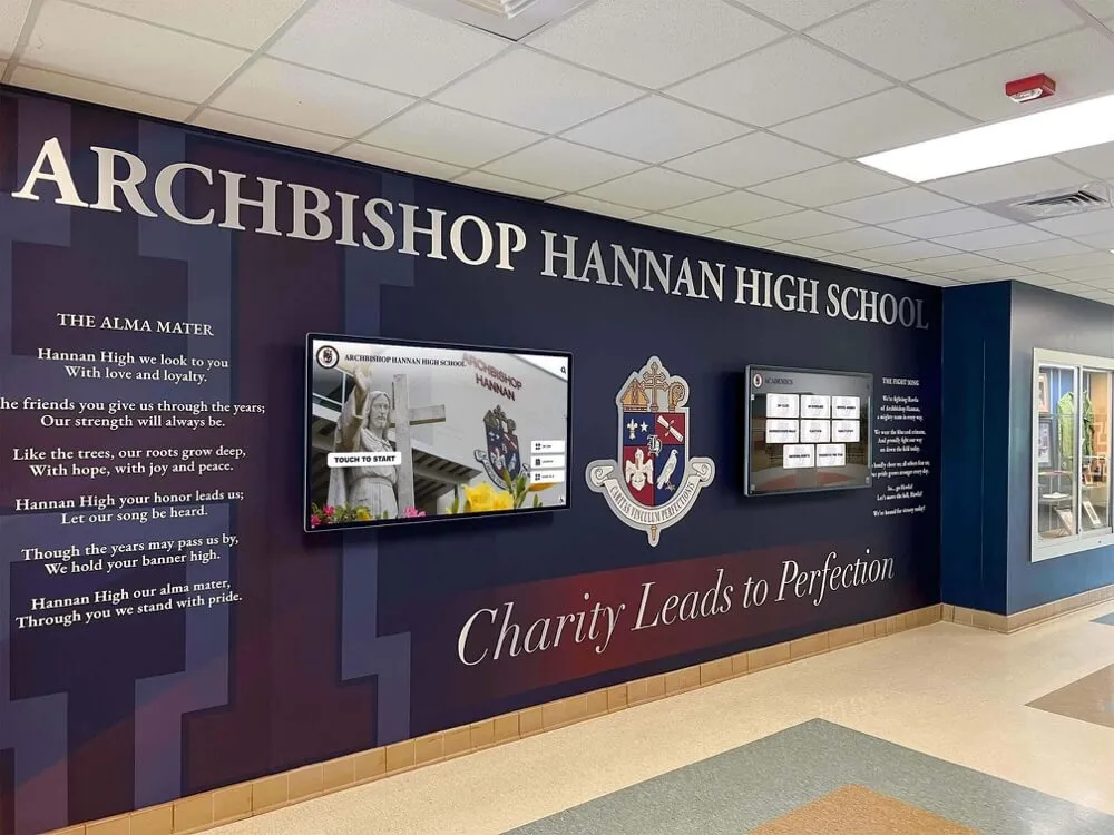
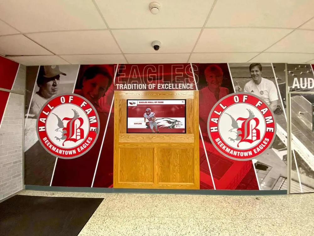
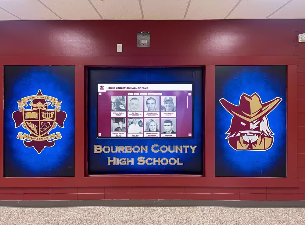
Solutions like Rocket Alumni Solutions provide purpose-built platforms specifically designed for interactive recognition applications, with features addressing challenges organizations face when creating engaging touchscreen experiences.
Essential Platform Features
Evaluate software based on critical capabilities:
- Intuitive content management requiring minimal technical expertise
- Responsive, touch-optimized user interfaces
- Media management for photos, videos, and documents
- Search and filtering for content discovery
- Customization supporting institutional branding
- Analytics and reporting showing engagement patterns
- Ongoing updates and improvements
- Professional implementation support
Installation and Environmental Factors
Physical context affects effectiveness:
Location Selection
Strategic placement maximizes engagement:
- High-traffic areas with sustained viewing time
- Adequate space for interaction and group viewing
- Lighting conditions without glare or washout
- Proximity to related content or activities
- Accessibility for users with mobility limitations
- Security considerations for valuable equipment
Infrastructure Requirements
Supporting systems enable operation:
- Reliable electrical power with dedicated circuits
- Network connectivity for content updates (wired Ethernet preferred)
- Adequate bandwidth for multimedia content and remote management
- Environmental controls maintaining appropriate temperature
- Physical security and vandalism protection
- Maintenance access for cleaning and service
Discover comprehensive implementation guidance for successful touchscreen deployments.

Successful implementations integrate hardware, software, content, and environmental design into cohesive experiences
Conclusion: Creating Touchscreen Experiences That Truly Engage
Designing touchscreen experiences that genuinely engage users requires balancing numerous considerations—intuitive interaction patterns with comprehensive functionality, visual beauty with functional clarity, immediate usability with depth for extended exploration, and technological sophistication with human-centered simplicity. The most effective touchscreen designs feel natural and effortless, allowing content and purpose to take center stage while the interface itself becomes invisible.
Throughout this guide, we’ve explored proven strategies spanning touch interaction fundamentals, visual design principles, navigation architecture, content presentation, accessibility considerations, and real-world implementation factors—all contributing to touchscreen experiences that invite engagement rather than create frustration. Yet perhaps the most important insight is that great design emerges through understanding your specific users, testing with real people, and refining based on actual usage rather than assumptions.
Ready to create a touchscreen experience that truly engages your audience? Modern touchscreen solutions combine sophisticated interaction design with intuitive content management, enabling organizations to create professional interactive experiences without requiring dedicated design teams. Solutions like Rocket Alumni Solutions provide purpose-built platforms specifically designed for engaging touchscreen applications, with professionally-designed templates, customization flexibility, and expert implementation guidance ensuring displays that captivate users while serving organizational goals effectively.
Whether you’re planning your first touchscreen installation or enhancing existing systems, focus on design decisions that serve your specific audience needs, leverage natural interaction patterns, and create experiences that invite exploration rather than requiring instruction. Technology enables new interactive possibilities, but thoughtful human-centered design transforms those possibilities into genuinely engaging experiences.
Your audience deserves touchscreen experiences that feel intuitive, satisfying, and genuinely valuable—not confusing, frustrating, or wasteful of their time. With thoughtful interaction design, clear visual communication, accessible interfaces, and authentic commitment to user-centered refinement, you can create touchscreen experiences that people actually enjoy using and remember positively.
The most successful touchscreen implementations aren’t those with the most sophisticated technology or the most elaborate visual effects—they’re the ones designed with genuine understanding of how people naturally interact, what they need, and what will make their experience satisfying. Start with that understanding, let it guide every design decision, test with real users early and often, and iterate based on their experience. That user-centered approach, more than any specific design technique, ensures touchscreen experiences that truly engage audiences and achieve your goals.
Ready to begin designing your touchscreen experience? Start by observing how your intended users currently interact with similar technologies, understanding their expectations and comfort levels, then use those insights to guide interaction patterns, visual hierarchy, navigation design, and content strategy that serves authentic needs rather than assumed preferences. Great touchscreen design begins with empathy for users and commitment to creating experiences that genuinely serve them.